| |
|
Featured Critiques by Photographer
1
|
|
Critique By:
Hugo de Wolf (K:185110)
8/23/2006 10:00:09 AM
Hi Martin,
I like the drama in this photo - very powerful and even somewhat ominous. The way the dark patches in the clouds seem to blend in with the building is very subtle, and I think the anatgonistic placement of the two skyscrapers only adds to the tension. The reflection is the finishing touch, very well captured!
Cheers,
Hugo
|
| Photo By: Martin Paul
(K:140)
|
|
|
Critique By:
Hugo de Wolf (K:185110)
7/31/2005 9:23:29 AM
Hi Pat, this image does look like an IR shot, but that's something I'm guessing at, as I'm a know-no at IR. Very strong composition, with the barren and empty land. Desolated, isolated and a huge, powerful solitude. A pitty it's rather small, but a great shot, and nice postprocessing. I think the B&W works very well there.
Cheers,
Hugo
|
| Photo By: Patrick Ziegler
(K:21797)
|
|
|
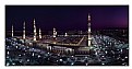
Critique By:
Hugo de Wolf (K:185110)
7/30/2004 4:15:47 PM
Hi Art, Very strong capture, classic and powerful. I like the lighing, and the city covered in the haze. (Note: I noted the sunny foreground.... ) Nice work on the frame, kind of wall poster type. That fits very well with this image, I think. Good shot! ) Nice work on the frame, kind of wall poster type. That fits very well with this image, I think. Good shot!
Cheers,
Hugo
|
| Photo By: Art A
(K:1187)
|
|
|
Critique By:
Hugo de Wolf (K:185110)
11/22/2006 6:43:37 PM
Hi Thilo,
This image reminded me of a photo by a Scott Somebody, who posted a photo of a silhouetted group of people admiring a fiery ball / setting sun through the glass windows of a London Museum (tate modern - I think) Awesome feel.
The comparison is easily made - the almost unreal combination of the people walking about freely in an under-water world - very cool.
The main differnece with the setting sun photo is that the shutterspeeds were undoubedly much slower here - which does show a bit in the edges around the silhouettes, and the motion blur of the fish.
Still, the poses of the people, looing around them in amazement are excellent, and contribute a large deal to the feel of this photo.
In the overall composition, I think the pano-format is very functional here - a pity the pano version is the same size as the one on this page - I'd love to see this one a bit bigger. Also, the clipped off people on the left and (much less so) right of the photo create a minor distraction IMHO
Basically, that's about all I have to say - scrolling back up, I do notice the four brighter spot lights - creating an even stronger surrealism, if not alienated feel to this photo. Very cool!
Cheers,
Hugo
|
| Photo By: Thilo Bayer
(K:50358)
|
|
|
Critique By:
Hugo de Wolf (K:185110)
10/15/2006 9:20:21 PM
Hi Francisco,
Outstanding photo - absoultely very peaceful and Tranquil. The off centered composition, and the near perfect reflection, with only the ever so subtle ripple in the water is great - as is the tonal range. Very well captured.
Cheers,
Hugo
|
| Photo By: Francisco Pinto
(K:250)
|
|
|
Critique By:
Hugo de Wolf (K:185110)
10/11/2006 9:53:36 PM
Hi Latif,
Unusual perspective and excellent tones - a fairitale from 1001 nights. Great shot!
Cheers,
Hugo
|
| Photo By: Latif alobaida
(K:5005)
|
|
|
Critique By:
Hugo de Wolf (K:185110)
4/8/2006 10:52:41 PM
Hi Steven, Good High Key image, and a very good tonal range, and it's a very well balanced composition on its own.
Just thinking out loud: In high key images, I think it's essential to preserve a white space all around the image, as it boxes it in, and prevents a visible edge of the photo when presented against a white background. By capturing a section view, close up or part of a product, the cut edges always indicate the edge of the photo. reducing the functionality of the High key. But then again, how often is a photo placed against a white background? The background of Usefilm isn't white, that's for sure.
Still I think cutting off the any part of a high key image makes the edge of the photo more apparent. And as this is also a horizontally orientated image, it creates an rather large emptiness on top and below the image compared to the non-existent margin on the left and right, which also leads to a slight unbalance in the composition, I believe, but that's a subjective observation.
I do like the metaphore with man and woman you describe, though. It fits well. I think if you'd captured the knife and fork at an angle, with the pointy bits of the fork closer by than the stem, the perspective would've added to the composition without compromising the metaphore, and it would've also solved the edge-issue.
Looking at the panoramic format, I think the material is well captured using a combination of highlighs without blowing them out, and some specular yet non-descript reflections. But there's also some dust (I think, it doesn't look like noise) visible in the mid tones; maybe polishing the cutlery prior to shooting them could solve that, maybe it's something that occured during scanning.
I like it when a photo invites me to ramble on, and it's a good shot, and an even better idea. Good work!
Cheers,
hugo
|
| Photo By: Steven vanHaaster
(K:888)
|
|
|
Critique By:
Hugo de Wolf (K:185110)
3/21/2006 9:10:11 AM
Hi Cesare, Very good use of the panoramic feature of UF! I like the composition a lot too, using the line of rocks to create a strong leading line. Very good photo, with just the right amount of saturation and contrast. Funny thing, though: the large panoramic version looks much softer than the smaller version, something I haven't seen before.
Nice shot!
Cheers,
Hugo
|
| Photo By: Cesare Baggiani
(K:1509)
|
|
|
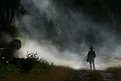
Critique By:
Hugo de Wolf (K:185110)
7/4/2005 5:39:34 PM
Hi Jeff, Great shot, very powerful indeed. The light sure is very strong. And despite the pure beauty of it, I think the shrubs on the right take away a bit of the overwhelming atmosphere created by the silhouette of the man, the shimmer of the path in the foggy light.... It's only a minor detail, and by no means a bad thing. Maybe personal, but it makes my eyes shift from the person to the left and back.
The exposure, showing the details in the foreground and beyond the lighted fog are excellent.
Then again, this is one of those shots that make me think.... Very strong image!
Cheers,
Hugo
|
| Photo By: Jeffry Surianto
(K:768)
|
|
|
Critique By:
Hugo de Wolf (K:185110)
7/22/2004 4:11:20 PM
Hi Mary, Reading your description and the bio in your portfolio, I realise the yellow tone, also in the previous one, is entirely created on purpose.
My only point of critisism would be that although I like the softness in the doll, I think a bit more contrast, showing its true 3D shape would've been nice. It's already slightly there on the left side. Maybe placing a candle between your camer and the scene would've cast some light on the doll. It would've made the doll stand out a bit more, I think.
Cheers,
Hugo
|
| Photo By: Mary Vareli
(K:15826)
|
|
|
Critique By:
Hugo de Wolf (K:185110)
6/29/2004 6:08:21 PM
Hi Bobby, although the perspective is less strong, the lines in this one are better used, IMO. The composition is a bit mored closed too, which, I think is a nice touch. I think this shot would be better off without the reflection of the window, but we've discussed that.
As to the composition, I think it is a good choice to include the deep red part on the left, but as the drops are more focused on the left, the weight of the image is also a bit unbalanced. Other than that a very creative and intriguing experiment.
Cheers,
Hugo
|
| Photo By: Bobby Mun
(K:3709)
|
|
1
|
|