|
|
Critique By:
Roger Williams (K:86139)

8/26/2006 10:24:11 AM
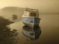
I'm enjoying this series very much, Kevin. I'm sure you are making skilled use of PS, as you always do, but it's very subtle, and doesn't bother even an old grump like me. The lighting is wonderful, and you did indeed "get it right." Now I can't make up my mind which ones to put into my favourites. Hmmm. Why not all? ...maybe!
|
| Photo By: KEVIN TEMPLE
(K:8657)
|
|
|
Critique By:
Roger Williams (K:86139)
11/12/2005 10:26:24 AM
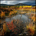
Just water and weeds, huh? Like wine is just grape juice left to ferment...? This is really gorgeous. You know I'm not too keen on highly saturated colours but they really work very well in this one. The distribution of those deep orange/yellow colours around the image couldn't be bettered. Very well captured, sir!
|
| Photo By: Tim Schumm
(K:29196)
|
|
|
Critique By:
Roger Williams (K:86139)
7/6/2005 4:12:00 AM
I like it a lot, but I see a few things that slightly detract from the appeal (for me) and at least one that puzzles me. Nice strong contrast, with just the right suggestion of detail in the almost-blown highlights and the almost-solid shadows. Right on the limits! But I think I see the edge effects of over-sharpening. Perhaps you didn't remember to set dpi to 72? (300dpi and Usefilm will downsize your image AND boost the sharpening!). Also, I think you might have tried to throw the distant scene even further out of focus. I don't know if that was possible, of course, but as it is, it's a bit too insistent for a mere background. I think I see why you included more foreground than usual... to get a sense of space into the picture to balance the fact that the ladies appear rather scrunched up against the railings (and for that matter against the view behond them). But what is that blurring and area of low contrast in the lower L and R corners? Deliberate PS work? Despite the above I really DO like it. And thanks for your encouraging comments, Paul.
|
| Photo By: Paul's Photos
(K:35235)
|
|
|
Critique By:
Roger Williams (K:86139)
4/23/2005 12:03:05 AM
This is a great one, Keith. It's got a place in my gallery of fame. Er, that is my favourites. It'll be an inspiration to soldier on with the macros. Actually I'm having lots of fun with my old-fashioned SLR. I've just discovered the joys of EXTREME telephoto lenses (for me that means, gasp! 135mm). Oh, and circular fisheyes. Still love rangefinders but appreciate the extra dimensions my hobby has recently acquired.
|
| Photo By: Keith Naylor
(K:13064)
|
|
|
Critique By:
Roger Williams (K:86139)
5/17/2004 5:38:24 AM
It's VERY difficult to put into words what you look for in an image. I've just spent 6 months on Usefilm trying to learn how to comment truthfully on what I like about the wonderful photos to be found here. I notice you use a Bessa and 35mm lens. That's a combination I often use (though 21/4 is more common these days). In this one, I like the way it still works well after breaking the "rule" on splayed verticals (feels quite natural to me, as if I really were looking up). I like the warm blacks (slight sepia toning?), and the depth of field that keeps nearby flag and distant buildings all sharp. I love both the almost stereoscopic sense of perspective, and the realistic rendering of the various textures, particularly the ornate lamp and the patterns in relief on the wall (both on the right). Even so, the overall effect is greater than the sum of these individual attractions. Great shot! And congrats on POD!
|
| Photo By: John Strazza
(K:11535)
|
|
|
Critique By:
Roger Williams (K:86139)
4/18/2004 5:42:34 AM
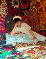
I like this photo very much. "Colourful" is an understatement! But there is quite a difference between the colours and textures in the foreground and those in the background (the wall carpets). Since the businessman is the main element, you could increase the impact he makes by trimming away most of that foreground, which I find a bit distracting. I mean, right up to the pillow/cushion. The he would be thrown up in relief against the darker colours of the background. Also it might have been nice if he had looked this way... but you can't have everything! What do you think?
|
| Photo By: Elahe S. Ahmadian
(K:8695)
|
|