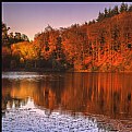
Photograph By Jan Symank
Jan S.
Photograph By The Pilgrim
The P.
Photograph By Gregory McLemore
Gregory M.
Photograph By Tom Breau
Tom B.
Photograph By Mehmet Dağ
Mehmet D.
Photograph By arghya basu
arghya b.
Photograph By Greg Sava
Greg S.
Photograph By Arne Gulstene
Arne G.
 
imageopolis Home Sign Up Now! | Log In | Help  

Your photo sharing community!

Your Photo Art Is Not Just A Fleeting Moment In Social Media
imageopolis is dedicated to the art and craft of photography!

Upload
your photos.  Award recipients are chosen daily.


Editors Choice Award  Staff Choice Award  Featured Photo Award   Featured Critique Award  Featured Donor Award  Best in Project Award  Featured Photographer Award  Photojournalism Award

Imageopolis Photo Gallery Store
Click above to buy imageopolis
art for your home or office
.
 
  Find a Photographer. Enter name here.
    
Share On
Follow Us on facebook 


User Activity
Image Summary
Awards Received
Portfolio Summary
Critiques from Keith
Critiques to Keith
Featured Critiques

Portfolios
Architecture (2)
Landscapes 2 (17)
macro&abstract (7)
People (5)

Categories
Abstracts (3)
Architecture (1)
At Work (1)
Cityscape (2)
From The Field (1)
Landscape (15)
Macro (3)
People (2)
Portrait (1)
Seascapes (2)
Sports (2)


Featured Critiques by Photographer 


  1


Critique By: Keith Naylor  (K:13064)  
5/1/2004 10:22:12 PM

Hi Chris, thanks for posting the orig file, that give me a good feel for your work. I agree with all the work you have done here, it needed doing.

The main thing I get from this photo is that the grass takes on the most important element in the frame. I think this is because itscentral and the brightest. Maybe try to tone it down a little, or, and I think this might be the better option, step right a little to get the house to fill more of the frame than the 50% it does now.

Hopr that helps a little.

Cheers

Keith
        Photo By: Chris Spracklen  (K:32552)

Critique By: Keith Naylor  (K:13064)  
4/17/2004 12:04:19 PM

An impressive image, and as everyone has commented the double entendre work very well indeed.

The lighting is almost perfect, just a tad darker towards the top as previously noted. However its the angle at which the fruit sits that adds most to this composition, the angle is just right. I can't think of any other way to enhance the image.

Congratulations

Keith
        Photo By: John Lamb  (K:9687)


  1


|  FAQ  |  Terms of Service  |  Donate  |  Site Map  |  Contact Us  |  Advertise  |

Copyright ©2013 Absolute Internet, Inc - All Rights Reserved

Elapsed Time:: 0.140625