|
|
Critique By:
Anthony Gargani (K:4527)
4/24/2006 8:47:43 PM
anna,
Thank you for your comments. No problem with being direct.
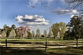
To answer your question: No (emphatically...no). The clouds were as they appeared 'in camera' with only a minor tweak to the exposure to lighten up the foreground. I considered playing with the saturation, but felt it didn't need it, but I did sharpen the image just a tad. Funny thing is, I wouldn't even know how to go about pasting the clouds in lol, and even if I did I'm not comfortable doing that kind of manipulation for a 'straight' photograph.
If I get a chance I will upload (or link) to the original jpeg as shot.
Take care and good light,
Anthony
|
| Photo By: Anthony Gargani
(K:4527)
|
|
|
Critique By:
a n n a (K:1451)
4/24/2006 5:47:15 AM
ok, I understand your intent when including the fence. interesting discussion between yourself and hdw. enough said about that. but for me, vision is locked on those clouds. they appear out of place and I see a darkened area around them as though they've been badly blended during post processing. please forgive my directness, but have you dropped the clouds in from another image, or am I just seeing things?
anna.
|
| Photo By: Anthony Gargani
(K:4527)
|
|
|
Critique By:
Hugo de Wolf (K:185110)
4/21/2006 7:33:05 PM
Hi Anthony,
It seems this is turning out into a very good example of what your thread is about.
I agree with the importance of having a subject in the foreground, it can be very functional to grab and hold the viewers attention. The tree in that respect does fulfill its function as natural framing, yet as the fence presents us (me/ the viewer) with a horizontal barriere it also takes up a rather dominant role. That would fit with your intention of taking a photo of a privat - off limits - domain, the b-count.
That's something I didn't catch when I opened and assessed the image, though. (then we're down to what Chris mentioned, how to assess a photo, and I guess I should've picked up on what you wrote in your about before assuming...) With the "off-limits theme as primary subject, I think composing the fence this way is an appropriate choice...
The image quality may well have to do with the way UF handles the uploaded image. Or me, as I struggle with it. A lot.
Cheers,
hugo
|
| Photo By: Anthony Gargani
(K:4527)
|
|
|
Critique By:
Anthony Gargani (K:4527)
4/21/2006 6:45:57 PM
Hugo, you are certainly a gentleman! I appreciate you stopping by to lend your wonderful eye to my humble shot (I mean this most sincerely, as an admirer of your work!).
Let's see...
Well, I did include the fence intentionally for two reasons-
a. I wanted to place something in the foreground (and also the branches you pointed out)as 'framing' for the shot. This was the scene when I stumbled upon it, and I felt that it gave it a more picturesque and postcard-like composition. I also read somewhere recently that landscapes are 'best' (subjective I know...)when you include something in the foreground to give the shot depth. If I moved closer I would have lost that element.
b. This is a place that I (most likely...) will NEVER get to go. As a private golf course it is very exclusive and requires quite a lot of money to join. I have lived in this town all of my life and this place represents an "off-limits" area to me. I thought the fence and the distance from the golfers represented this well.
Yes, saturation is tricky and often hard to know exactly what others are seeing. I have a calibrated monitor and the balance I went for was to be as accurate as possible but still accent the terrific color of the trees.
I will certainly consider your comments in the future the next time I'm taking this type of shot.
Thanks so much for your time, I appreciate it much!
Take care and good light to you always,
Anthony
|
| Photo By: Anthony Gargani
(K:4527)
|
|
|
Critique By:
Hugo de Wolf (K:185110)
4/21/2006 3:55:23 PM
Hi Anthony,
What strikes me about this photo is the lush, crisp spring feel. It sure creates a very pleasant scene.
In a way the openness and wide vista with the two people playing golf in the distance is a bit obstructed by the fence in the foreground, rather blocking the view thus creating a closed composition. That's something I wouldn't expect in a photo that captures the spring feel in the meadow / golf course; Did you include the fence deliberately? And if so, why?
I think it would be interesting to see the result as well as the change in feel and atmosphere if you'd taken this shot from a position closer to the fence. I think it might well be too empty, though; the twigs in the upper right corner add to the image, and I think it needs a specific feature in the foreground to grab the viewers attention.
Maybe a tad more saturation would also increase the impact of this photo, but that's more subjective, and definitely a personal preference. I do notice a slight decrease in saturation between what I see on screen compared to how I prepared them, so that might the explanation.
Cheers,
Hugo
|
| Photo By: Anthony Gargani
(K:4527)
|
|
|
Critique By:
Dave Arnold (K:55680)
4/16/2006 2:08:26 PM
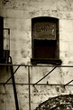
I absolutely love old signs on buildings. Nice find, and a unique one at that. Kudos on your framing of the window with the fire escape and awning frame.
Best wishes,
Dave
|
| Photo By: Anthony Gargani
(K:4527)
|
|
|
Critique By:
Elena Tunik (K:552)
4/14/2006 7:44:33 PM
Very intersting picture. Excellent colors.
Regards.
|
| Photo By: Anthony Gargani
(K:4527)
|
|
|
Critique By:
Aliihsan Pinçe (K:5485)
4/14/2006 6:51:55 PM
amazing colors.
cong.
best regards
Aliihsan
|
| Photo By: Anthony Gargani
(K:4527)
|
|
|
Critique By:
Dave Arnold (K:55680)
4/3/2006 5:38:00 AM
What gorgeous eyes you've captured. I love that little glint in each.
Best,
Dave
|
| Photo By: Anthony Gargani
(K:4527)
|
|
|
Critique By:
Dave Arnold (K:55680)
4/3/2006 5:35:52 AM
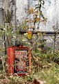
Seems so out of place. And the red of the can amongst that foliage and building background works very well. Whos says not to look around for interesting, unintentionally "posed" junk.
Good photograph, in my opinion.
Thanks for all the advice about my upgrading my Canon in the digital camera forum. I am waiting to see what the 30Ds look like when they come out. Or actually, what my wallet looks like at the time.
Thanks,
Dave
|
| Photo By: Anthony Gargani
(K:4527)
|
|
|
Critique By:
Paul's Photos (K:35235)
3/1/2006 10:59:49 PM
great capture....  nice work nice work
|
| Photo By: Anthony Gargani
(K:4527)
|
|
|
Critique By:
Dhimant Vyas (K:2509)
12/19/2005 3:26:16 PM
Hi Anthony
I like this image a lot! Very very interesting capture!
Yes I went through your portfolio and its very good photos you captured.
Cheers
Dhimant
|
| Photo By: Anthony Gargani
(K:4527)
|
|
|
Critique By:
Gustavo Scheverin (K:164501)

12/17/2005 7:07:46 AM
Excelente retrato, clásico.
Felicitaciones y un abrazo!
|
| Photo By: Anthony Gargani
(K:4527)
|
|
|
Critique By:
Roberto Arcari Farinetti (K:209486)
10/3/2005 10:58:39 AM
sure.. also me.. when was young in a day of rain..
this was my fashion..!
nicely frame.
roby
|
| Photo By: Anthony Gargani
(K:4527)
|
|
|
Critique By:
Roberto Arcari Farinetti (K:209486)
10/3/2005 10:57:59 AM
hello Anthony..
happy face and smile.. roby
|
| Photo By: Anthony Gargani
(K:4527)
|
|
|
Critique By:
Roberto Arcari Farinetti (K:209486)
8/28/2005 12:54:18 PM
I wait your new photo.. if is possible!
roby
|
| Photo By: Anthony Gargani
(K:4527)
|
|
|
Critique By:
Debby Biri (K:4775)
8/1/2005 4:09:51 PM
Oh, no, it's an invasion of the plastic bag creatures. Cute shot.
|
| Photo By: Anthony Gargani
(K:4527)
|
|
|
Critique By:
Roberto Arcari Farinetti (K:209486)
6/29/2005 8:17:06 PM
good frame and bloccked moment..
fine eye
roby
|
| Photo By: Anthony Gargani
(K:4527)
|
|
|
Critique By:
Anthony Gargani (K:4527)
6/7/2005 6:46:59 AM
Hello again Matej!
Re: cropping-I see what you mean, I'll try and play around with it a bit more. It could stand to loose a little on the left side I think (this is in front of an open parking garage).
Re: Lighting-this was taken around 8pm right after a thunderstorm. What you are seeing on the building are the last fading rays of sunlight breaking through the clouds off to the left. Just prior to this shot it was pitch black. I didn't think it took away from the shot so I left it in.
Thanks again, for the time you took to comment and make suggestions. It's nice to get some real help on my shots.
Take care,
Anthony
|
| Photo By: Anthony Gargani
(K:4527)
|
|
|
Critique By:
Anthony Gargani (K:4527)
6/7/2005 6:42:01 AM
Hey Matej,
Thanks so much for taking the time to check out my shots. I appreciate the feedback and the the suggestion.
Actually I used a PS plugin to get this one. I also recently calibrated my monitor, and found it was set too dark so in all honesty, didn't realize the blacks were so 'light'. Thanks for pointing it out.
Sorry to take so long to get back to you, I've been shooting youth sports and I've had a whole bunch of pics to process and get online.
Take care my friend...
Anthony
|
| Photo By: Anthony Gargani
(K:4527)
|
|
|
Critique By:
Matej Maceas (K:24381)
5/31/2005 6:21:23 PM
Now there's a girl who likes being photographed :-)
Tonal range looks flat on my monitor (opening the histogram confirms this), try bumping up the blacks.
|
| Photo By: Anthony Gargani
(K:4527)
|
|
|
Critique By:
Matej Maceas (K:24381)
5/31/2005 6:21:07 PM
Hi Anthony,
I needed to open up this photo about three times in order to consolidate my thoughts about it (too much work in the recent months, causing me to be too lazy to properly think during my free time). Hopefully by now I will be able to write something at least a bit intelligent. Here's what struck me:
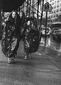
- Light. I like the warmth of the yellow, orange and red car lights that, together with the large dark area in the top left, gives the photo a night type of atmosphere. There's a certain quality about streetshots taken at night that appeals to me. (Night would also be consistent with the title - but then, I don't pay much attention to titles.) The light in the top right quadrant lessens the impact, because it looks more like daylight (which I think it actually is).
- Two people walking towards you, two walking figures on the roadsign. An obvious element, but worthy of mentioning explicitly. Such 'accidental' similarities are always nice.
- Weird 'fashion' combined with a tilted angle. Good combination.
- Just slightly too much space at the bottom. Not sure I should offer such criticism, given the way I feel about cropping my own work :-) Anyway, I think a crop off the bottom would strengthen the diagonal composition. See below.
|
| Photo By: Anthony Gargani
(K:4527)
|
|
|
Critique By:
Ben Mok (K:4084)
5/27/2005 9:47:15 AM
First ghost and now cockroaches?
A funny moment well captured Anthony!
Cheers,
Ben
|
| Photo By: Anthony Gargani
(K:4527)
|
|
|
Critique By:
FatiH KirtisH (K:1181)
5/26/2005 7:50:41 AM
this is the NY photography style very famous
Best regards
FK
|
| Photo By: Anthony Gargani
(K:4527)
|
|
|
Critique By:
Hamed Noori (K:6805)
5/26/2005 5:35:56 AM
Very good . Bravooo
|
| Photo By: Anthony Gargani
(K:4527)
|
|
|
Critique By:
Kamran (K:3526)
5/25/2005 8:05:05 PM
Great pic and love the mood of this pic u know i miss your comments on my pics so please take a look and let me know what u think
kamran
|
| Photo By: Anthony Gargani
(K:4527)
|
|
|
Critique By:
Kevin Collier (K:19076)
5/25/2005 4:57:42 PM
Nice find - great tones and comp - K
|
| Photo By: Anthony Gargani
(K:4527)
|
|
|
Critique By:
John Loreaux (K:86210)
5/24/2005 1:33:43 PM
Hello Anthony! Long time no see! Neat shot with excellent tones!Very good composition! Take care My friend! My best....................John
|
| Photo By: Anthony Gargani
(K:4527)
|
|
|
Critique By:
Ben Mok (K:4084)
5/24/2005 8:14:11 AM
that's a good one
Would be even nicer if the coats actually cover the whole body....
|
| Photo By: Anthony Gargani
(K:4527)
|
|
|
Critique By:
vito lentini (K:13130)
5/24/2005 7:25:02 AM
nice ghost! congrt ciao vito+++++
|
| Photo By: Anthony Gargani
(K:4527)
|
|