|
|
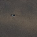
Critique By:
Steve Marshall (K:645)

4/3/2014 2:37:15 AM
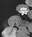
Great shot, well done on the awards. I like the way the trees on the left lead the eye back to the sun. Not so sure about the floating log or whatever in the lower right, but I guess you couldn't do much about that!:)
|
| Photo By: Nick Lagos
(K:2203)
|
|
|
Critique By:
Steve Marshall (K:645)
5/13/2012 11:04:03 AM
For me this one works much better than the other. Having the main lines on the angle instead of straight up and down makes it that bit more dynamic. Well seen.
|
| Photo By: mike cable
(K:-4301)
|
|
|
Critique By:
Steve Marshall (K:645)
5/12/2012 2:10:06 PM
A bit unusual to see flowers done in b&w, but this works very well.
|
| Photo By: Barbara Socor
(K:13559)
|
|
|
Critique By:
Steve Marshall (K:645)
5/12/2012 2:03:17 PM
That's really nice. And the composition/crop is perfect.
|
| Photo By: Sylvia H.
(K:22195)
|
|
|
Critique By:
Steve Marshall (K:645)
5/10/2012 3:53:10 PM
Yes, I do think that works better. As is often the case, less is more.
|
| Photo By: mike cable
(K:-4301)
|
|
|
Critique By:
Steve Marshall (K:645)
5/10/2012 2:42:50 PM
I like this a lot. Hard to tell exactly what it is, but it doesn't matter. Very subtle, well seen.
|
| Photo By: Sylvia H.
(K:22195)
|
|
|
Critique By:
Steve Marshall (K:645)
5/10/2012 1:09:13 AM
To my eye, those 3 "lobes" in the upper part of the image are the strongest part, so I'd be trying to emphasise them. Maybe a square crop around them somehow (I like square)? And for me, the purple colours in the lower 1/3 don't work quite as well as those lovely greens above. But it's all just personal taste - the attached is only one possibility. It's very nice as it is - well spotted!
|
| Photo By: mike cable
(K:-4301)
|
|
|
Critique By:
Steve Marshall (K:645)
5/9/2012 12:30:57 PM
That is very tasty! I'm surprised there haven't been any comments yet. Did you do any post-processing on it? I think it could be even nicer with a little more contrast and maybe a bit of cropping.
|
| Photo By: mike cable
(K:-4301)
|
|
|
Critique By:
Steve Marshall (K:645)
2/2/2012 2:07:40 PM
Well seen - I think there are a lot of images in there! I presume it's part of a building, yes?
|
| Photo By: Barbara Socor
(K:13559)
|
|
|
Critique By:
Steve Marshall (K:645)
11/25/2011 1:08:22 PM
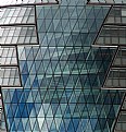
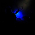
Aren't these reflections fantastic? I love the wobbly crookedness of them - I always assumed that glass windows would be very flat, but the reflections prove otherwise. Well seen and well captured.
|
| Photo By: mike cable
(K:-4301)
|
|
|
Critique By:
Steve Marshall (K:645)
8/12/2010 1:39:17 PM
I really like the shot, but it looks to me like it could be just a bit sharper. This kind of subject is one that needs to be razor-sharp.
|
| Photo By: Andy Seehusen
(K:3372)
|
|
|
Critique By:
Steve Marshall (K:645)
8/12/2010 1:36:48 PM
That's a fun shot - nice juxtaposition of elements.
|
| Photo By: Roger Skinner
(K:81846)
|
|
|
Critique By:
Steve Marshall (K:645)
7/26/2010 1:25:39 PM
This is a great find and a great image, but I'd be going in closer and including less. I think there are several images in there.
|
| Photo By: Fabio Keiner
(K:81109)
|
|
|
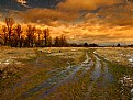
Critique By:
Steve Marshall (K:645)
7/23/2010 1:58:21 PM
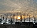
I'm surprised there were no other comments on this - I like it a lot. I reckon if you darkened the sky down and increased its contrast it could be even better. And maybe the sun should be a little less central.
|
| Photo By: jane march
(K:453)
|
|
|
Critique By:
Steve Marshall (K:645)
7/10/2010 3:57:15 PM
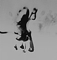
I like the idea here, but for me this one doesn't work as well as a lot of your other dance images. There's not quite enough in it (for me) to see it as other than an abstract. That's fine, but the space on the right doesn't contribute much, and the mark halfway down the left edge tends to draw my eye there, then out of the image. But do keep going with these!
|
| Photo By: Gabriella M.
(K:33863)
|
|
|
Critique By:
Steve Marshall (K:645)
7/4/2010 12:35:36 PM
Ah, thank you Ania. Reminds me so much of a dear departed little furry friend of many years. He was very special to us.
|
| Photo By: Ania Zielińska-Hoşaf
(K:61374)
|
|
|
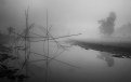
Critique By:
Steve Marshall (K:645)
7/3/2010 1:55:22 PM
What a fabulous image. Just enough detail so we know what's going on, but lots of mystery too. I love the way the shoes have ended up! Beautiful work, thanks for sharing it.
|
| Photo By: Gabriella M.
(K:33863)
|
|
|
Critique By:
Steve Marshall (K:645)
6/27/2010 3:50:18 PM
I'm surprised there are no other comments on this one. I thinks it's beautiful, quite dream-like. Just enough detail to keep the eye interested. Would look good on any wall!
|
| Photo By: Carmen Fuchs
(K:6967)
|
|
|
Critique By:
Steve Marshall (K:645)
6/26/2010 3:42:05 PM
Both great images, but this one works better for me than the other. I like the balance between the two building elements, and the sky is a bit more dramatic. Great stuff, and good choice to go b&w.
|
| Photo By: Keith Saint
(K:13784)
|
|
|
Critique By:
Steve Marshall (K:645)
6/26/2010 11:59:04 AM
Ah yes, this one works much better for me than the other. The stone is in focus as it should be, and it's perfectly fine that the bottom of the image drifts out of focus, because the eye doesn't tend to go there. Nice image.
|
| Photo By: david henderson
(K:16659)
|
|
|
Critique By:
Steve Marshall (K:645)
2/21/2010 1:07:56 AM
Well seen. Things like this are all around, but it takes an eye like yours ( and sometimes mine ;-) )to see them and bring them to our attention.
|
| Photo By: RC. Dany
(K:64104)
|
|
|
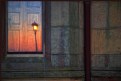
Critique By:
Steve Marshall (K:645)
2/19/2010 10:31:50 AM
Couldn't be anyone's image but yours - delightful! The muted colours in the wall are delicious. My only question is - does it really need the right-hand part, that is, the drainpipe and the wall to the right of it? I have tried covering it up, and sometimes I think it is better without it, and sometimes I'm not so sure....
|
| Photo By: Malules Fernandez
(K:54810)
|
|
|
Critique By:
Steve Marshall (K:645)
2/6/2010 9:31:57 AM
Well seen, this is my kind of shot! I think you could go in even closer and bring out more of the detail.
|
| Photo By: Fabio Keiner
(K:81109)
|
|
|
Critique By:
Steve Marshall (K:645)
2/6/2010 9:29:21 AM
I like that a lot - very eye-catching. Is it done in camera, or post-processing?
|
| Photo By: mike cable
(K:-4301)
|
|
|
Critique By:
Steve Marshall (K:645)
2/6/2010 9:24:19 AM
Nice shot. I was down in that area over Christmas, but never got a sky as nice as that one!
|
| Photo By: Stephen Wilson
(K:337)
|
|
|
Critique By:
Steve Marshall (K:645)
1/10/2010 3:33:00 AM
Great angle and composition on one of the most-photographed (and often badly-photographed) things in London. Nice to see one shot on film too!
|
| Photo By: Shane O'Neill
(K:3054)
|
|
|
Critique By:
Steve Marshall (K:645)
1/6/2010 10:43:56 AM
Congratulations on the award. This has the richness of an oil painting.
|
| Photo By: Radovan Magdalenic
(K:32881)
|
|
|
Critique By:
Steve Marshall (K:645)
12/5/2009 12:15:19 PM
I like this a lot, but I wonder if it really needs the right-hand part? Try cropping off about 1/3 and see what you think. I think I like it better - there's plenty enough in the rest to entertain the eye.
|
| Photo By: Satyaki Bhattacharyya
(K:312)
|
|
|
Critique By:
Steve Marshall (K:645)
11/25/2009 10:15:55 AM
I like the idea of this, but for me it hasn't quite worked. For me there is not quite enough there - I want to see just a little bit more. Not much more, but a bit.
|
| Photo By: Jacek Mysliborski
(K:2854)
|
|
|
Critique By:
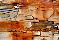
Steve Marshall (K:645)
11/23/2009 8:02:21 AM
Love these textures and colours, but for me there is just a bit too much in the frame. I'd suggest going in closer and isolating smaller sections. I reckon there are probably half a dozen great images in there. Impressive quality from the LX3, too.
|
| Photo By: mike cable
(K:-4301)
|
|