|
|
Critique By:
Serge Moscow (K:-2917)

4/27/2015 1:23:56 PM
Nice photo. Imho, details are necessary. I mean, all parts of photo should be detalized well. It looks like you specially darkened some parts. I doubt about this...
Regards,
Serge
|
| Photo By: siamak jafari
(K:20075)
|
|
|
Critique By:
Serge Moscow (K:-2917)
4/25/2015 7:02:32 AM
Hm, you used very similar composition again (your's shot http://www.imageopolis.com/image.asp?id=1660660#.VTuds5ONh2 A). It looks like a repetition. I don't see "added value" here in comparison with previous one. May be, large crop, detailed image of the part of flower would be more interesting here...
|
| Photo By: Greg Sava
(K:11996)
|
|
|
Critique By:
Serge Moscow (K:-2917)
4/25/2015 2:30:50 AM
My variant below.
Regards,
Serge
|
| Photo By: Radovan Magdalenic
(K:32881)
|
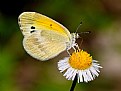
|
|
Critique By:
Serge Moscow (K:-2917)
4/23/2015 1:34:00 PM
Very good macro: crisp, detailed, noble restrained colors.
Warm regards,
Serge
|
| Photo By: Greg Sava
(K:11996)
|
|
|
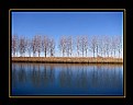
Critique By:
Serge Moscow (K:-2917)
4/21/2015 12:24:54 AM
Nice landscape. As for me, a little bit unbalanced composition. Probably, right side could be cutted a little (symmetrical to reflection in water). But there is a beautiful green tree at the right, so I'm not sure...
Regards,
Serge
|
| Photo By: Colin Jennings
(K:149)
|
|
|
Critique By:
Serge Moscow (K:-2917)
4/21/2015 12:20:03 AM
Classical subject. Nice colors. Horisont is disputable. You used trees, I'd use line of water. Trees looks oversharpened. I'd stress reflecs in water ("clarity").
Regards,
Serge
|
| Photo By: Michele Beccia
(K:16477)
|
|
|
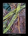
Critique By:
Serge Moscow (K:-2917)
4/18/2015 7:46:32 AM
Very nice macro.
I'd make softer the background and crop a little bit.
Regards,
Serge
|
| Photo By: Brian Grant
(K:176)
|
|
|
Critique By:
Serge Moscow (K:-2917)
4/18/2015 12:16:11 AM
Dear Alfons,
1. Finally all is up to your, because you're the author.
2. In principle, the question is as follows: (i) we'd like to maky a mirror copy of reality or (ii) we'd like to create an expressive image. Or - in another words - or you're considering yourself as an techniсian who are working at Xerox device; or an artist who tries to express his vision.
3. Yes, at noon light of Sun is perceived by eyes as white. But at your's color shot this light just have not any color.
4. I've changed not white piece of photo, but the cloud at the left and color of water.
Regards,
Serge
|
| Photo By: Alfons Rial
(K:7600)
|
|
|
Critique By:
Serge Moscow (K:-2917)
4/17/2015 12:53:02 PM
Not enought colours here, imho. Or it'd be B&W.
My variant below
Regards,
Serge
|
| Photo By: Alfons Rial
(K:7600)
|
|
|
Critique By:
Serge Moscow (K:-2917)
3/22/2015 1:38:49 PM
Alfons, of course, I know about economic limitations from my own experience:)
I just would like to say, that your's shots of architecture are quite serious. These are real photographs. It's close to art of photography. And it's pity, that you cannot use better lens.
At the moment I'm considering different wide-angle lenses, btw. Canon 16-35/4 is quite expensive. May be, Tokina AT-X 116...
Regards,
Serge
|
| Photo By: Alfons Rial
(K:7600)
|
|
|
Critique By:
Serge Moscow (K:-2917)
3/22/2015 12:57:44 AM
Dear Alfons, for such kind of photography you probably need high quality wide-angle lens. You like architecture, it's quite evident. But 18-135 is not good enough.
I like this photo with interesting perspective and atmosphere.
Regards,
Serge
|
| Photo By: Alfons Rial
(K:7600)
|
|
|
Critique By:
Serge Moscow (K:-2917)
3/6/2015 2:13:48 PM
After digital images it looks as low contrast:) But really it's OK.
Nice photo.
Regards,
Serge
|
| Photo By: Claudio Simonini
(K:-1628)
|
|
|
Critique By:
Serge Moscow (K:-2917)
3/4/2015 12:08:16 PM
Or like this
|
| Photo By: Barbara Socor
(K:13559)
|
|
|
Critique By:
Serge Moscow (K:-2917)
3/4/2015 12:07:49 PM
Quite often I use color from my picture. Smthng like this
|
| Photo By: Barbara Socor
(K:13559)
|
|
|
Critique By:
Serge Moscow (K:-2917)
3/4/2015 11:58:00 AM
Image is very nice. I doubt about thickness of the black frame.
Regards,
Serge
|
| Photo By: Barbara Socor
(K:13559)
|
|
|
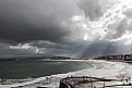
Critique By:
Serge Moscow (K:-2917)
3/3/2015 5:30:02 AM
Nice shot, crisp and good composition (extremely coincidence of lines of mountain and clouds).
I'd crop a little from the top, some part of clouds is not necessary here, imho.
Regards,
Serge
|
| Photo By: Ahmed Maher
(K:794)
|
|
|
Critique By:
Serge Moscow (K:-2917)
3/3/2015 5:25:34 AM
1. Clouds could be considered as a "screen" for demonstration of colors game.
2. Your's variant is noisy.
|
| Photo By: Salvador María Lozada
(K:69375)
|
|
|
Critique By:
Serge Moscow (K:-2917)
3/3/2015 5:24:09 AM
Clouds are beutifull. Your's treatment could be changed, imho. You're rising contrast and clarity - but simultaneiusly you lost fine transitions of colors.
From my point of view, treatment should depend from type of clouds. If it's for e.g. storm - contrast and clarity. If this is just sunset into clouds - more saturation and local change of WB (as an option).
Regards,
Serge
|
| Photo By: Salvador María Lozada
(K:69375)
|
|
|
Critique By:
Serge Moscow (K:-2917)
3/1/2015 10:52:15 PM
Very good photo!
Regards,
Serge
|
| Photo By: mike cable
(K:-4301)
|
|
|
Critique By:
Serge Moscow (K:-2917)
3/1/2015 4:58:07 AM
Very nice photo, congratulations with your's awards!
My variant below (just to try another idea, not as a critics).
Regards,
Serge
|
| Photo By: Srna Stankovic
(K:172232)
|
|
|
Critique By:
Serge Moscow (K:-2917)
3/1/2015 3:38:24 AM
Paul, high contrast will led to absence of information in shadows here. Instead of contrast very high clarity was used here.
Regards,
Serge
|
| Photo By: Serge Moscow
(K:-2917)
|
|
|
Critique By:
Serge Moscow (K:-2917)
2/27/2015 12:34:29 PM
Nice model and nice portrait.
The model is calm and gentle, so I'd decrease contrast on the face.
My variant below.
Regards,
Serge
|
| Photo By: Fatima Hasoumi
(K:373)
|
|
|
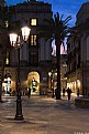
Critique By:
Serge Moscow (K:-2917)
2/24/2015 12:07:46 PM
I'd correct geometry and cut streetlight in left upper corner. It's beautiful - but not necessary for this scene. IMHO.
Regards,
Serge
|
| Photo By: Alfons Rial
(K:7600)
|
|
|
Critique By:
Serge Moscow (K:-2917)
2/24/2015 1:00:11 AM
Very nice photo - interesting composition, beautiful colors.
Regards,
Serge
|
| Photo By: Alfons Rial
(K:7600)
|
|
|
Critique By:
Serge Moscow (K:-2917)
2/24/2015 12:57:04 AM
Nice photo, but the sky is noisy. You can run noise reduction for blue color only.
Regards,
Serge
|
| Photo By: Roshan Kumara
(K:2827)
|
|
|
Critique By:
Serge Moscow (K:-2917)
2/22/2015 1:18:00 AM
My variant below. Imho, WB is shifted to green. Then, composition is not optimal yet (in particular "open" arc of the bridge from the left looks not so good). And a little bit more saturated.
I'm not satisfied with my variant.
Warm regards,
Serge
|
| Photo By: Alfons Rial
(K:7600)
|
|
|
Critique By:
Serge Moscow (K:-2917)
2/21/2015 7:32:01 AM
From my point of view, the reflectioin in this case is not so expressive. I'd cut bottom part.
Regards,
Serge
|
| Photo By: Alfons Rial
(K:7600)
|
|
|
Critique By:
Serge Moscow (K:-2917)
2/16/2015 11:55:33 PM
Great photo, Alfons! Congratulations.
Regards,
Serge
|
| Photo By: Alfons Rial
(K:7600)
|
|
|
Critique By:
Serge Moscow (K:-2917)
2/16/2015 12:09:42 AM
Interesting composition. I like this photo.
Probably, it'd be better to move POV down a little to show whole ark at the right.
Regards,
Serge
|
| Photo By: Alfons Rial
(K:7600)
|
|
|
Critique By:
Serge Moscow (K:-2917)
2/9/2015 11:43:41 AM
Beautiful pastel tones. A little bit noisy and low contrast. My variant below
Regards,
Serge
|
| Photo By: Peter Hurtubise
(K:1124)
|
|