|
|
Critique By:
Andy Ly (K:716)

8/14/2004 7:44:49 PM
Thanks! The exposure was f/16 @ 5 minutes.
|
| Photo By: Andy Ly
(K:716)
|
|
|
Critique By:
Andy Ly (K:716)
12/12/2003 2:02:38 AM
Hi Eolo,
I think her eyes are a bit scary with the strong makeup. The look you have on her would normally go well with many of your fashion images, but I personally feel that for a maternaty image, it should be a little bit more delicate. Other than that, your exposure and detail is beautiful.
|
| Photo By: Eolo Perfido
(K:91)
|
|
|
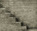
Critique By:
Andy Ly (K:716)
6/23/2003 8:56:29 PM
I like this image a lot. The tonal separation is great and all the values are snappy to say the least. This is a very good example everyone should yeild to, when shooting B&W. With great tonal separation in hand, I could see this image with a lot more real whites. The values end at around Zone VII and could really use Zone VIII in some areas to make the image more dramatic.
As far as subject matter goes, I cannot find a central subject. I've spent quite some time trying to figure out what you were trying to convey through this image. My only conclusion is that you were aiming for an abstraction. If that was the case, I find that this image would benefit much more if shot with a longer focal length to flatten it's perspective.
|
| Photo By: Alisa Mudge
(K:7511)
|
|
|
Critique By:
Andy Ly (K:716)
6/23/2003 8:48:00 PM
Hi Alisa. I think this image would benefit more from a longer focal length to flatten the perspective. This would give it a more abstract appearance you are going for. Otherwise, more DOF would help to bring the back wall into focus giving it a better blend between the two.
|
| Photo By: Alisa Mudge
(K:7511)
|
|
|
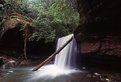
Critique By:
Andy Ly (K:716)
6/23/2003 8:43:03 PM
You've overdodged the center-left area of this image, the dodging bled into the water as well.
|
| Photo By: Alisa Mudge
(K:7511)
|
|
|
Critique By:
Andy Ly (K:716)
6/8/2003 8:43:24 PM
Hi TJ,
I think your image has a lot of potential and it doesn't look as bad as people are making it out to be. Though I must admit, there are a few things that you should've fixed before submitting this image. In Photoshop, make sure you do a color balance, fixing shadows, midtones, and highlights. In your image, I find the yellowish cast too excessive. If you are going for a warm sutset effect, a subtle tone of yellow will do, but having it overpower the rest of the color separation only makes it look muddy. You can lower that yellow cast value by going adjusting Hue/Saturation in photoshop. Choose the Yellow channel, and turn down the saturation.
Also, with the sky being cyan, it is quite obvious that there was a lot of haze that day. The best way to combat that is by using a polarizer. This should darken the sky, giving it a navy blue appearance and should also help remove the general cyan cast throughout the image.
When photographing a landscape like this, be sure to check all 4 sides of your frame! On the left side, you have a shack that's half cut off, on the right, you have a big tree that's half cut off, and on the top, you've cropped off the tip of a mountain.
If you intend to include something, be sure you do it fully, otherwise you leave us with an image that looks like it was done haphazardly. The only time it is advisable to crop off the edges of an object is to show it's enormity.
Also, be sure to use the Unsharpen Mask feature in Photoshop. With your image, using 130% Sharpen, 0.5 Radius, and 4 Threshold worked really well. Give it a try!
I've attached a sample from your image:
|
| Photo By: TJ M
(K:414)
|
|
|
Critique By:
Andy Ly (K:716)
4/23/2003 4:19:05 PM
Nice Composition! I really like how the horizontal lines gives a sense of horizonalism.
|
| Photo By: Phillip Cohen
(K:10561)
|
|
|
Critique By:
Andy Ly (K:716)
3/1/2003 11:37:25 PM
Great work!!! Bravo!!!
|
| Photo By: Andrew Polushkin
(K:311)
|
|
|
Critique By:
Andy Ly (K:716)
2/25/2003 4:31:52 AM
We have a name for people who document with their cameras. We call them photojournalists.
|
| Photo By: dave jones
(K:608)
|
|
|
Critique By:
Andy Ly (K:716)
2/17/2003 7:46:52 PM
Quit bitching damnit, your images are getting more views than mines!
|
| Photo By: ryan bailey
(K:61)
|
|
|
Critique By:
Andy Ly (K:716)
2/16/2003 10:11:33 PM
Ryan,
Very controversial image you got here. I personally do not advocate the exploitation of homeless people. Nevertheless, I am wondering why you posted this image here. I am pretty certain you realize that this site is to share and comment on creative photography. Your subject matter: If you want people to look at your image without giving you a biased opinion based on you being an evil person for taking advantage of an innocent person, then your image must be executed damn well. Then the only thing people can say is.. "man, this image is beautifully printed" and then can they look at your work seriously and what you are trying to convey.
On the other hand, you might think that this photo is cool, who knows. But the image does not tell me anything; more than it does leave an impression of you as the photographer.
If you want to engage the audience, you will need to do more than just point your camera and shoot at what goes on daily within your life.
|
| Photo By: ryan bailey
(K:61)
|
|
|
Critique By:
Andy Ly (K:716)
2/16/2003 9:20:24 PM
Hey John,
I can see what you're trying to do in this image. It is quite interesting; I mean, how often do you see someone landing their bike onto a cherished plaque dedicated to some dead guy?
Where this image fails is during it's initial phase of execution. For this image to have it's full impact you will have to take our attention away from the beautiful city's surroundings. A big zoom will be able to help take the emphasis on the beautiful garden and the beautiful buildings within the premisis. A fill flash will also help to freeze motion without sacraficing image quality.
Good luck!
|
| Photo By: john longo
(K:0)
|
|
|
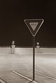
Critique By:
Andy Ly (K:716)
1/16/2003 4:39:27 AM
It's about time they added Valet Parking to our local beaches! =)
|
| Photo By: Larry Edwards
(K:843)
|
|
|
Critique By:
Andy Ly (K:716)
1/13/2003 6:31:52 PM
I was wondering when you'd upload this damn image! It's about time. And what a better time to.. Winter.. gives me that cold feeling just looking at it.
Technical: Pull down the midtones just a bit.. this will help make the ground more luminous.
|
| Photo By: chris meyer
(K:597)
|
|
|
Critique By:
Andy Ly (K:716)
12/2/2002 4:10:09 AM
Great image, Michael. I had an interesting observation. As the image is right now, it is quite clear that he's fishing at a lake, since the layers of trees helps us to identify that. But if you cropped off those tree layers, it looks like he's fishing of the edge of the sun. 
|
| Photo By: Michael G. Mill
(K:58)
|
|
|
Critique By:
Andy Ly (K:716)
11/27/2002 10:19:00 PM
Hey Chris, you should reupload this image. This one looks like it has been resized by usefilm. I think they've changed the maximum dimension to 640 x 640.
|
| Photo By: chris meyer
(K:597)
|
|
|
Critique By:
Andy Ly (K:716)
11/26/2002 12:43:17 AM
This is great work, you should really take this negative into the darkroom and make a nice silver print for framing.
|
| Photo By: Keith Loveday
(K:348)
|
|
|
Critique By:
Andy Ly (K:716)
11/21/2002 3:09:10 AM
Hey! He kinda looks like the guy in The Drew Carey Show - Drew's Boss.
|
| Photo By: Steve Kaufman
(K:2748)
|
|
|
Critique By:
Andy Ly (K:716)
11/21/2002 3:05:15 AM
Adorable image, Steve!!!
First thing that came to mind, "nOoOoO! Anything but the lens element!"
Andy
|
| Photo By: Steve Kaufman
(K:2748)
|
|
|
Critique By:
Andy Ly (K:716)
11/20/2002 4:03:38 AM
Chris is right.. You might want to make sure that light isn't hitting your lens also, this drastically kills the contrast of your image and could make it look absolutely flat.
For a shot like this, instead of using a 50mm, you should try something like a 80mm or a 135mm. That way, you can flatten the perspective and not have to worry about getting so close. Especially since you intend on shooting at f/11.
Try to compose your vantage point so that your subject falls within the focal plane, this is so you won't have to stop down so much. At the angle you're shooting, you will have to consider the DOF you gain from stopping down, yet you will have to consider the loss of edge sharpness from stopping down too much. It's a balancing act, but that's what makes it so fun eh?
|
| Photo By: Kim Culbert
(K:37070)
|
|
|
Critique By:
Andy Ly (K:716)
11/20/2002 3:52:52 AM
Hey Chris, I was probing (no, not that kind) and was wondering if you shot this image from inside a car or something. The only logical conclusion is if you shot it through a thick peice of glass. Otherwise, it may very well just be internal flaring. Shooting wide open also causes a huge amount of light scatter, so I wonder if that's it as well.
Oh yeah, great image, blah blah, here, you get a 10.
|
| Photo By: chris meyer
(K:597)
|
|
|
Critique By:
Andy Ly (K:716)
11/20/2002 3:48:56 AM
MmMmMmMmmMm.... Caroline...
|
| Photo By: chris meyer
(K:597)
|
|
|
Critique By:
Andy Ly (K:716)
11/20/2002 3:41:52 AM
Umm... I think you forgot to reverse the image.
|
| Photo By: nathan combs
(K:2242)
|
|
|
Critique By:
Andy Ly (K:716)
11/20/2002 3:12:40 AM
Oh hey, it looks like you got around to using the recipe. How do you like it?
|
| Photo By: John Myers
(K:4308)
|
|
|
Critique By:
Andy Ly (K:716)
11/4/2002 1:58:55 AM
Excellent image, Chris. I like how the tickets are arranged to give you that impression of spam.
|
| Photo By: chris meyer
(K:597)
|
|
|
Critique By:
Andy Ly (K:716)
10/21/2002 2:06:10 AM
Cute kids. Be careful when sharpening your images, when it's overdone, the highlight area will exhibit patch-like patterns. When you start to see this, that mean's you've gone too far
|
| Photo By: sewen
(K:0)
|
|
|
Critique By:
Andy Ly (K:716)
10/17/2002 2:27:02 AM
Wow, this is cool! Look at the DOF. It's like the cat is peering in from another demension.
|
| Photo By: John Myers
(K:4308)
|
|
|
Critique By:
Andy Ly (K:716)
10/3/2002 1:59:37 AM
I agree with the guy who agreed with Terrence.
|
| Photo By: Jason Bennett
(K:213)
|
|
|
Critique By:
Andy Ly (K:716)
10/1/2002 11:34:36 PM
Hey Adam,
Fun stuff! Wow, I didn't realize there were so many San Diegans. Update your information and include your email address. We may just have to call you up when all of us San Diegans decide to get together for a photo trip.
Andy
|
| Photo By: Adam Kimmerly
(K:382)
|
|
|
Critique By:
Andy Ly (K:716)
10/1/2002 4:10:31 AM
Hi Sean,
I've been working with Tri-X for quite some time now and have done quite a bit of sensitometry testing with the film. I've tested Tri-X film to be at ISO 160, with a normal developing time of 6.5 minutes using D-76 1:1 70F. What does this mean? By shoot it at ISO 400, you are underexposing your film by 1.3 stops. Then by developing for 9 - 10 minutes, you're simply making up for the underexposure of your highlights. This is the equivilant of "pushing" your film, which evidently presents a lot of grain. Many people do not realize it, but it is also very important to keep your temperature consistant throughout. If you present the film with even moderate changes in temperature, reticulation occurs, which gives you an increase of grain. From now on, shoot it at ISO 160 and develop it for 6.5 minutes, then work from there to fine tune everything. Good habits will give you good results.
|
| Photo By: Sean Fitzgerald
(K:310)
|
|