|
|
Critique By:
Adam E. J. Squier (K:9803)
12/7/2004 6:04:09 PM
Oh yeah, I meant to write about that above. There was no manipulation on this image other than color balancing and downsampling for the Web. Both girls were running. I was lucky with the one on the left -- her head didn't move much.
|
| Photo By: Adam E. J. Squier
(K:9803)
|
|
|
Critique By:
Adam E. J. Squier (K:9803)
9/29/2004 10:57:05 PM
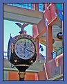
This is quite amazing. Not the photo. ;-) I was looking through the thumbnails and I saw that clock and thought "I know that clock." Strange, because I haven't lived in Oceanside for a couple years, now, and rarely went downtown to Horton Plaza except to go to dinner at that restaurant on the upper level that serves ostrich.
Anyway, It's amazing how certain things can trigger memories.
Now, about the photo: I like the colors and lines contrasting with the traditional-looking clock. I wish the "Wilsons" sign was cloned out. Also that stupid "Westfield" sign that's there, now that they bought out all the shopping malls in the area.
The man at the top adds some interest -- I almost missed him.
This photo brought back some good memories of San Diego, thanks. I don't have too many of them.
|
Photo By: Lori Stitt
(K:75282)

|
|
|
Critique By:
Adam E. J. Squier (K:9803)
9/12/2004 11:14:35 PM
Not sure if the thumb bothers me or not. On the one hand (heh), it shows that it's just a normal person and not a model. On the other, a manicure wouldn't have been out of the question.
Nice focus selection and could be a "decisive moment" image. I love the smoke.
|
| Photo By: Dino Ablakovic
(K:206)
|
|
|
Critique By:
Adam E. J. Squier (K:9803)
9/12/2004 11:10:45 PM
I love the painted hubcaps. This is close to one of my dream cars (or buses). I want one with all the little windows along the top and the front windshields that open. Called a "Deluxe" here in the U.S., I believe.
|
| Photo By: Ted vandenBergh
(K:5119)
|
|
|
Critique By:
Adam E. J. Squier (K:9803)
9/5/2004 8:51:28 PM
A polarizer would probably help a lot, here. If you're trying to get rid of reflections, you could shoot through a big piece of black card (with a hole cut out for the lens). That's not very convenient.
I had a similar problem a few years ago and the folks here on Usefilm.com helped out. Here's the thread:
http://www.usefilm.com/photo_forum/1/57/
Unfortunately, the images don't show up in the thread anymore.
|
| Photo By: Del Metheny
(K:25617)
|
|
|
Critique By:
Adam E. J. Squier (K:9803)
8/7/2004 3:00:20 PM
Thanks, Mary Sue. I knew I wanted the shallow DOF for this image. Luckily, the camera could do a 1/1600 exposure, as it was a pretty bright day.
I had some retouching to do: chocolate on cheeks, kool-aid "moustache" (that's still there a bit), and some lightening around her left eye.
At first I didn't like the messy hair in her face, but then I thought it made it more "real" than posed. Like I wrote, it was just a "grab" shot. At a church picnic. ;-)
|
| Photo By: Adam E. J. Squier
(K:9803)
|
|
|
Critique By:
Adam E. J. Squier (K:9803)
7/8/2004 12:47:16 AM
Looks a bit soft. Probably from camera shake. This would have been a perfect pose except for the microphone. Two or three steps to the right and it would have been out of the way and a much better image.
The colors are great, and the feeling is there, just a few technical things going on.
|
| Photo By: Adam Batsakis
(K:51)
|
|
|
Critique By:
Adam E. J. Squier (K:9803)
6/12/2004 11:10:42 AM
I'd crop in from the top so her eyes aren't right in the middle of the frame. If I printed an 8x10 of this, I'd crop out as much of the top as possible, even if it meant cutting out part of her head.
|
| Photo By: Antonio Díaz
(K:2710)
|
|
|
Critique By:
Adam E. J. Squier (K:9803)
5/1/2004 10:33:14 AM
Photographs like these always make me smile. The quality of the light is fantastic. There are a few technical things that could make it better.
I understand if you were going for a warm portrait, but this image is a little too red. The white balance is off a bit. Looks like it was shot under tungsten light with a white balance set to daylight. Also, the blanket in the background (with the red stitching) is a little distracting.
If this were my image (which it's not but that's why it's here, eh?), I'd balance the color to make it a little less red/yellow and use Photoshop to clone out the red stitching. I might even go so far as to flip the earring over so the the heart is right-side-up. No, on second thought, I wouldn't touch the earring. The highlight would be in the wrong place.
Alternatively, I might turn it into a black/white image so I wouldn't need to worry about the white balance or the red stitching.
|
| Photo By: Ali Hachem
(K:772)
|
|
|
Critique By:
Adam E. J. Squier (K:9803)
4/27/2004 5:20:33 PM
I'd like some help on this one. I ended up with some dark shadows on some faces. I had two lights bounced into umbrellas with an even ratio. Angled about 45 degrees to the sides and at about 8 feet (2.5 m) high.
I'm thinking it might have worked better with a more frontal angle and higher lighting, but I didn't want to introduce any glare on glasses or heads, etc.
I may be out of luck, as it is a pretty big group, and shadows are bound to happen. Should I have done something differently with this equipment?
Limited to two monolights with umbrellas.
|
| Photo By: Adam E. J. Squier
(K:9803)
|
|
|
Critique By:
Adam E. J. Squier (K:9803)
4/24/2004 10:23:33 AM
It's so beautiful when you can capture expressions of children as they look out windows -- and you do a great job of it.
Again, a little too dark and muddy for my taste. Are you using a Mac? If so, and you don't mean for the photos to look so dark, let me know and I'll give you some tips -- I went through all that a few months ago. They probably look fine on your screen.
|
| Photo By: Pat Fruen
(K:12076)
|
|
|
Critique By:
Adam E. J. Squier (K:9803)
4/24/2004 10:13:15 AM
It seems a little dark and muddy, but it could very well be my monitor. I don't see any definition in the eyes. I like the shallow depth of field, enough for the whole head, but not the hair in the back. Are the catchlights from a window or softboxes? It looks like window light but they're so rectangular, it makes me wonder.
Technicalities aside, it's a beautiful capture (as usual). I love how the hairs on the chin (or cheek) are showing -- not by the hair of my chinny, chin, chin. ;-)
|
| Photo By: Pat Fruen
(K:12076)
|
|
|
Critique By:
Adam E. J. Squier (K:9803)
4/24/2004 10:05:01 AM
Very nice closeup. The blanket in the background is a little distracting because of the pattern, but it also adds a splash of color. I wonder what it would look like as a black and white image. It would probably make the blanket not as distracting
|
| Photo By: Ali Hachem
(K:772)
|
|
|
Critique By:
Adam E. J. Squier (K:9803)
4/9/2004 4:54:35 AM
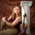
A new CD, eh? Here I thought it was a senior portrait. The background complements the violin well. Lighting is good.
I just don't get the column. I know a lot of folks use them, but they just seem out of place in most photos. This one is tilting a bit. Well, maybe it's not. It looks tilted but then the sides look straight. Probably because of the angle of the bow.
I'd straighten the image so that it's visually straight rather than by measuring the distance. CCW just a smidgen. Make sense? Especially when this will be in a jewel box and not have any mat to separate it from its surroundings.
|
| Photo By: Louise Vessey
(K:13862)
|
|
|
Critique By:
Adam E. J. Squier (K:9803)
4/9/2004 4:41:58 AM
Thanks for the comment, Louise. I try to keep the lighting as even as possible to give the kids room to move around (and they do -- a lot). It also helps when shooting digitally to have even lighting. It doesn't handle small lighting ratios as well as film.
The vignetting idea is good. I usually just color correct and remove blemishes on portraits like this. Not a whole lot of PS work.
The parents did love this photo, they just didn't see the finger until I pointed it out. Then they laughed for a good five minutes.
|
| Photo By: Adam E. J. Squier
(K:9803)
|
|
|
Critique By:
Adam E. J. Squier (K:9803)
4/1/2004 4:24:55 PM
A.d.: The background was from a screen on a window he was leaning against.
|
| Photo By: Adam E. J. Squier
(K:9803)
|
|
|
Critique By:
Adam E. J. Squier (K:9803)
2/15/2004 4:30:52 AM
Looks like you used a wide angle lens. Kind of looks distorted. The portrait doesn't do anything for me. The eyes are so intense. Amazing.
|
| Photo By: mandy welsh
(K:3146)
|
|
|
Critique By:
Adam E. J. Squier (K:9803)
2/2/2004 6:32:29 AM
I love the technique. Do you mind if I copy it sometime? This reminds me of another image on this site (somewhere) of a portrait shot through a window screen that's been sprayed with water. Maybe that's yours, too. I didn't bother to search for it.
Nice job getting rid of distracting reflections (while keeping good ones). Did you shoot this in a light tent, or did you use another method for the reflections?
|
| Photo By: Dan Lightner
(K:12684)
|
|
|
Critique By:
Adam E. J. Squier (K:9803)
1/26/2004 12:18:51 PM
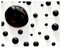
These kinds of photos are fun to make, aren't they. I have a couple up here on Usefilm, too. Next time, try to get rid of the reflections (it's pretty difficult, especially with black. What did you use to make the drops?
http://www.usefilm.com/image/106998.html
http://www.usefilm.com/image/117567.html
|
| Photo By: mustafa ilker helvacioglu
(K:3825)
|
|
|
Critique By:
Adam E. J. Squier (K:9803)
1/25/2004 2:57:25 PM
Hey, THAT'S not a squirrel. ;-)
|
| Photo By: Leonardo Bosnia
(K:4053)
|
|
|
Critique By:
Adam E. J. Squier (K:9803)
1/25/2004 2:50:14 PM
Roger, thanks for the comment. If I recall correctly, the trees were that color. They aren't as deeply colored in Southern California. Most likely the washed-out-ness was caused by the high altitude. Also, sadly, the smog from Redlands creeps up here.
I always shot print film unless I had a specific need to use slide film. Now I don't use film (ha!) at all.
It looks like I used a polarizer, too, judging from the sky changing colors in a weird way. Like I wrote earlier, not composed too well. ;-)
|
| Photo By: Adam E. J. Squier
(K:9803)
|
|
|
Critique By:
Adam E. J. Squier (K:9803)
1/24/2004 7:00:07 PM
Thanks for the comments. I loved the way his eyelashes looked so sharp in this image contrasting with the overall softness from the window light.
|
| Photo By: Adam E. J. Squier
(K:9803)
|
|
|
Critique By:
Adam E. J. Squier (K:9803)
1/21/2004 6:57:06 AM
Yep, that's a screen back there. He's leaning against a window (that goes almost to the floor). Filled up my memory card on this shoot. About 150 images on a half-gig card.
This is also my first posting since "going digital." More to come soon.
|
| Photo By: Adam E. J. Squier
(K:9803)
|
|
|
Critique By:
Adam E. J. Squier (K:9803)
12/12/2003 4:16:16 AM
The one leg of the ladder not being on the floor bothers me. That's not necessarily bad, but if this is a commercial shot, it is. If it's to create tension in the image, it works well.
|
| Photo By: Kim Taylor
(K:2816)
|
|
|
Critique By:
Adam E. J. Squier (K:9803)
12/8/2003 12:02:44 PM
This looks perfect. I'm so glad you got the tips of the baby's fingers in there. You also managed to keep enough space on the sides if you wanted to make an 8x10 print. Might have been nice to see the boy's hand, but it's certainly not necessary. Good job.
|
| Photo By: Eveline Shih-Pitcairn
(K:4406)
|
|
|
Critique By:
Adam E. J. Squier (K:9803)
12/8/2003 6:25:01 AM
My first thought was that the water was too bright. Then I thought that there should be more detail in the boys. My final thought was that you captured the moment and the feeling, and that's all that matters. It's easy to find "technical flaws" (in quotes because they're not really technical flaws) but in the end, the most important thing is the emotion the image brings, and that's what you have here.
|
| Photo By: Ron Browne
(K:1282)
|
|
|
Critique By:
Adam E. J. Squier (K:9803)
12/1/2003 3:43:51 PM
Nice capture but the blacks have lost their detail. It's probably in there somewhere, they just look muddy to me.
|
| Photo By: Steven Vigar
(K:303)
|
|
|
Critique By:
Adam E. J. Squier (K:9803)
10/20/2003 6:46:03 AM
This kind of image is neat to see -- especially if you periodically photograph your daughter with the same bear to show how fast she grows.
I think it would be better if the diaper (below her legs) were in b/w, too as it looks kind of weird.
|
| Photo By: Dan Holmes
(K:78)
|
|
|
Critique By:
Adam E. J. Squier (K:9803)
10/14/2003 5:14:25 AM
The first thing I thought of was "hey, that's a strat," and I now find that I was right. The black space to the left looks funny because of the angle. The cropped knob detracts, though I'm not sure what you could do about it. It would be nice to see the whole knob, but then you'd have other parts cropped and would make it look too busy over on that side.
The blue dot on the top edge also detracts. This might look better as a b/w image -- it pretty much is already and the oranges and blues wouldn't be issues.
|
| Photo By: Spencer E.
(K:4032)
|
|
|
Critique By:
Adam E. J. Squier (K:9803)
10/10/2003 2:50:14 PM
Looks way too cramped. Needs a bit more room around it on top, bottom, and a little on the right side. Otherwise, very nice. I like the colors and different textures involved.
|
| Photo By: Salvo Valenti
(K:17038)
|
|