|
|
Critique By:
Rose Hooper (K:899)

12/19/2004 8:44:25 AM
I wish there was a tad more depth of field on this.
|
| Photo By: Gaja Snover
(K:4462)
|
|
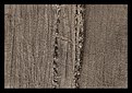
|
Critique By:
Rose Hooper (K:899)
11/27/2004 9:00:16 PM
This is an interesting idea, but it seems to lack dynamism. Excellent job capturing the texture. Now to apply it to a dynamic and exciting composition...
Cheers, Roy
|
| Photo By: Andy Ly
(K:716)
|
|
|
Critique By:
Rose Hooper (K:899)
11/27/2004 8:58:32 PM
I'm going to be picky here TK, since you've got capturing the person's expressions mastered.. You need to be careful about the background. While having the setting is important, in this case, the window and clutter immediately behind him is distracting. The venue was undoubtedly difficult to shoot in. Moving the subject around a little may have helped but would have changed the light quality (unless you were using a portable light for the front-right light). At the very least tidying the table behind him would have been worthwhile.
The strong light coming from the front-right is great, however the light from directly behind is distracting, as is the strong shadow from the object to the very right that us cut off.. moving that object would also have helped.
Cheers, Roy
|
| Photo By: Terrence Kent
(K:7023)
|
|
|
Critique By:
Rose Hooper (K:899)
11/20/2004 12:14:37 AM
I don't see any way this could be better, Andy. How big have you printed it?
|
| Photo By: Andy Ly
(K:716)
|
|
|
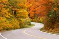
Critique By:
Rose Hooper (K:899)
11/11/2004 4:45:34 AM
If you like this one, check out the rest of them at http://www.royhooper.ca/gallery/AuroraBorealis
|
| Photo By: Rose Hooper
(K:899)
|
|
|
Critique By:
Rose Hooper (K:899)
10/16/2004 11:28:50 PM
Hi Eric,
This was a 30 second exposure after sunset, shot in Ogunquit, ME.
|
| Photo By: Rose Hooper
(K:899)
|
|
|
Critique By:
Rose Hooper (K:899)
10/15/2004 4:04:50 AM
This image is great. I believe I told you that when you first showed me it. If you bump the contrast just a tad, then the background should go nearly black, which I believe will add some punch.
|
| Photo By: Darrell Larose
(K:736)
|
|
|
Critique By:
Rose Hooper (K:899)
10/13/2004 5:08:09 AM
I meant to say that the posted image is not precicely what the camera saw. I did what I would consider to be the appropriate adjustments to the raw image file before posting.
|
| Photo By: Rose Hooper
(K:899)
|
|
|
Critique By:
Rose Hooper (K:899)
10/13/2004 4:54:27 AM
Hey Pat -- The image is changed from the original. It has more contrast, a tad more saturation, and has had the white balance adjusted (as if I had used a warming filter and velvia).
|
| Photo By: Rose Hooper
(K:899)
|
|
|
Critique By:
Rose Hooper (K:899)
10/13/2004 4:50:34 AM
You're seeing three things going on that give the apparent softness that may not be obvious in such a small version. This is a longer exposure - 1/6th of a second. This is a telephoto image (70mm x 1.6). There is intentional camera shake on the tripod (used my hand to operate the shutter) to soften the edges of the leaves a bit more.
|
| Photo By: Rose Hooper
(K:899)
|
|
|
Critique By:
Rose Hooper (K:899)
10/13/2004 4:22:52 AM
To be honest, I don't like it overly contrasty and over-sharpenned. The full resolution file looks nice and sharp and detailled after a tad of unsharp mask and pushing the contrast/gamma up too high doesn't look good on my (calibrated) monitor. The oranges turn red, and the greens turn black.
|
| Photo By: Rose Hooper
(K:899)
|
|
|
Critique By:
Rose Hooper (K:899)
10/12/2004 9:31:50 PM
Hey, I recognize that butterfly!
Good capture!
|
| Photo By: Darrell Larose
(K:736)
|
|
|
Critique By:
Rose Hooper (K:899)
9/27/2004 4:02:03 AM
Bob, you say you're no good, and you show me this kind of picture!
You're really good at this!
|
| Photo By: Bob Jarman
(K:3145)
|
|
|
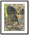
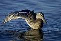
Critique By:
Rose Hooper (K:899)
9/27/2004 4:00:15 AM
Whoa. The duck looks so bizzare from that angle. Great capture
|
| Photo By: Darrell Larose
(K:736)
|
|
|
Critique By:
Rose Hooper (K:899)
9/27/2004 3:24:40 AM
I think I prefer it upside down.
|
| Photo By: Rose Hooper
(K:899)
|
|
|
Critique By:
Rose Hooper (K:899)
9/26/2004 10:57:07 PM
That is not a very constructive comment Piero. Do you dislike it, if so, why?
|
| Photo By: Rose Hooper
(K:899)
|
|
|
Critique By:
Rose Hooper (K:899)
9/8/2004 1:53:10 AM
I recognize this! Nice and abstract, but would probably be stronger in B&W.
|
| Photo By: Darrell Larose
(K:736)
|
|
|
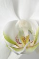
Critique By:
Rose Hooper (K:899)
9/8/2004 1:52:22 AM
A job well done Mary. You should be proud. Nice choice of aperture.
|
| Photo By: Mary Sue Hayward
(K:17558)
|
|
|
Critique By:
Rose Hooper (K:899)
8/16/2004 4:21:50 AM
Mary sue, the only post-processing I did was to bump the levels up about 0.65 stops. I did essentially no post-processing. I believe the softness is partly from the camera, partly from the lens being at F/32, and partly from a tiny bit of natural motion/vibration during the 3s exposure. I even forgot to change the white balance from auto to cloudy! The image inline in the comments is with +0.05 post-processing exposure (+0.6 stop exposure compensation in camera) and set to cloudy white balance, and closely resembles the original saturation of the flower.
|
| Photo By: Rose Hooper
(K:899)
|
|
|
Critique By:
Rose Hooper (K:899)
8/16/2004 4:18:52 AM
Maybe a bit yellower? 
|
| Photo By: Rose Hooper
(K:899)
|
|
|
Critique By:
Rose Hooper (K:899)
8/16/2004 2:56:29 AM
Awesome bob! Perfect timing. Is this cropped at all?
|
| Photo By: Bob Jarman
(K:3145)
|
|
|
Critique By:
Rose Hooper (K:899)
5/26/2004 3:46:21 AM
Bob and you were saying this wasn't wall material? Bah, Bob, bah! I would want this on my wall!
|
| Photo By: Bob Jarman
(K:3145)
|
|
|
Critique By:
Rose Hooper (K:899)
3/25/2004 9:04:18 PM
Hmmm maybe this version...
|
| Photo By: Rose Hooper
(K:899)
|
|
|
Critique By:
Rose Hooper (K:899)
10/18/2003 11:03:18 PM
This is a lovely simple composition with much for the eye to explore. My eye is forced to re-enter the image after it hits the top endge of the left ribbon. I then explore the right side, and find myself looking back at the balls on the left.
Great work.
|
| Photo By: Barry Walthall
(K:5312)
|
|
|
Critique By:
Rose Hooper (K:899)
10/18/2003 10:59:05 PM
I always enjoy water drop images, as cliche as they are. The colours in this one make it more interesting than the usual water droplet shot.
|
| Photo By: Dan Lightner
(K:12684)
|
|
|
Critique By:
Rose Hooper (K:899)
10/18/2003 10:57:14 PM
This is a lovely, simple image. Well done. If I was to suggest something needs improving, that would be that a touch more light on the stem would be good.
|
| Photo By: Jim Mullinaux
(K:528)
|
|
|
Critique By:
Rose Hooper (K:899)
8/29/2003 5:13:24 PM
This is a good idea, but somehow the cropping doesn't work for me. Lighting is good, idea is great.
|
| Photo By: Kym Skiles
(K:1520)
|
|
|
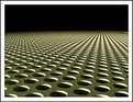
Critique By:
Rose Hooper (K:899)
8/1/2003 5:36:13 PM
This is a waste of a post. Might be considered a good background. Overexpose it some more, then use it as a part of a slide sandwich background.
|
| Photo By: lowell whipple girbes
(K:13151)
|
|
|
Critique By:
Rose Hooper (K:899)
7/30/2003 8:03:33 PM
Hmmm, on second look the color is a bit more blueish than it should be. Should be pretty neutral grey.
|
| Photo By: Rose Hooper
(K:899)
|
|
|
Critique By:
Rose Hooper (K:899)
7/4/2003 8:27:04 PM
missing sharpness is from the jpeg conversion.
|
| Photo By: Rose Hooper
(K:899)
|
|