|
|
Critique By:
Peter McDonald (K:4951)
11/3/2014 8:07:08 AM
Thanks I always try to keep the skin tones ok. it was taken for a broadsheet new paper
and on the cheaper newsprint they use it looks ok as all photos have added contrast so that they don't look so flat in print
|
| Photo By: Peter McDonald
(K:4951)
|
|
|
Critique By:
Peter McDonald (K:4951)
11/2/2014 2:03:45 PM
Hi its not rocket science the more photos you take and print or show the better you get. great image
|
| Photo By: Nanda Baba das
(K:78053)
|
|
|
Critique By:
Peter McDonald (K:4951)
10/23/2014 10:13:29 AM
Thanks only just come back to usefilm site after a few years away nice to noticed first photo back
|
| Photo By: Peter McDonald
(K:4951)
|
|
|
Critique By:
Peter McDonald (K:4951)
10/23/2014 10:13:14 AM
Thanks only just come back to usefilm site after a few years away nice to noticed first photo back
|
| Photo By: Peter McDonald
(K:4951)
|
|
|
Critique By:
Peter McDonald (K:4951)
10/23/2014 2:22:02 AM
Thank you it was hard work climbing up the hills and then trying not to get run over by speedING mountain bikers on the very tight trails back down
lighting was harsh as it was bright sunshine in the open and dark shadows under the trees
just take lots of images and only show the good photos
|
| Photo By: Peter McDonald
(K:4951)
|
|
|
Critique By:
Peter McDonald (K:4951)
12/29/2011 11:24:09 PM
hi nice image,
the bird has plenty of space to move into the center of the photo
giving a sense of movement, exposure of the bird is great as water usually causes the camera to under expose,
a fast shutter speed has captured the falling water perfectly
|
| Photo By: Dario Bolzoni
(K:547)
|
|
|
Critique By:
Peter McDonald (K:4951)
12/29/2011 7:40:22 PM
hi nice use of depth of field and the insect
if i was really picky i would have the insect looking in to the photo rather than out of the photo
but i have tried to take photos like this as well and they do not stay still in one spot for very long
nice work
|
| Photo By: Luigi Andena
(K:3580)
|
|
|
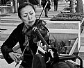
Critique By:
Peter McDonald (K:4951)
12/28/2011 10:19:14 PM
hi nice street photography image
you got in nice and close to the subject to show the face and volin
well done
|
Photo By: Rick Smith
(K:5490)

|
|
|
Critique By:
Peter McDonald (K:4951)
11/26/2010 4:14:21 AM
hi is that junior
|
| Photo By: Michael Moran
(K:108)
|
|
|
Critique By:
Peter McDonald (K:4951)
7/5/2010 11:24:45 AM
hi there
nice pose and lighting, was it taken on flash at the brides home?
theses photos bring out more character of the sitter than the studio posed versions
|
| Photo By: roger bourland
(K:2762)
|
|
|
Critique By:
Peter McDonald (K:4951)
7/5/2010 11:20:38 AM
hello nice framing and use of depth of field
nice to see people still being able to take great photos on film
|
| Photo By: Vu Khanh Truong
(K:670)
|
|
|
Critique By:
Peter McDonald (K:4951)
6/15/2010 11:49:00 AM
hello there, thank you for your comment on my photo
yours is very good as well, nice framing with the smoke the main feature and the sureal colours of the dncers pull it all togeather
|
| Photo By: Kallol Majumdar
(K:27691)
|
|
|
Critique By:
Peter McDonald (K:4951)
6/14/2010 10:23:11 AM
hi nice lighting but there are a few problems
ie the models legs, look at magazines its full lenght, waist up and head n shoulders
bathing suit photos use a lot of props, ie beach chairs, towels etc
if model photo is too long get her to sit down, curl up etc
take a look at pics on use film, but again the lighting is very good not blowing out the models skin and hair
|
| Photo By: Paul Lara
(K:88111)
|
|
|
Critique By:
Peter McDonald (K:4951)
6/13/2010 9:59:32 PM
hi there nice framing and perspective, the sepia really brings out the buildings old world charm
thanks for your comment on the go karts, my photos are needed the next day trying to keep up with television
at least you can relax and not stress out getting these great pictoria scenes
|
| Photo By: Dan Wilson
(K:21104)
|
|
|
Critique By:
Peter McDonald (K:4951)
6/13/2010 9:53:26 PM
hi nice photo
if i was really picky monkeys are always in beautiful green bush, so more colour than less
framing or cropping is good but still a little too much space above the heads
this can be hard as sizes of photographic paper is diff to camera sensors
and finally print it out and put it on a wall or postcard to show what a good photographer you are
|
| Photo By: Brent Mills
(K:758)
|
|
|
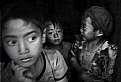
Critique By:
Peter McDonald (K:4951)
6/1/2010 6:33:37 PM
hi you have been busy in this photo, nice use of that hard gritty black and white style of the sixties and seventies.
the use of depth of field and camera blur leads me to think it was taken under low light conditions
but the boy in the middle the center of interest is sharp, so again nice work
|
| Photo By: Jonjon Pham
(K:144)
|
|
|
Critique By:
Peter McDonald (K:4951)
5/13/2010 10:42:51 AM
its very nice to be able to pass photos of people that have come before
remember to put her name and details with photo you and your children may know her but what about their children
|
| Photo By: Wolf Zorrito
(K:78768)
|
|
|
Critique By:
Peter McDonald (K:4951)
5/12/2010 11:04:49 AM
hi not enough imfo, you can tell its a boy but with out reading the title he could be anywhere
but nice framing and exposure
|
| Photo By: Sue Webster
(K:50)
|
|
|
Critique By:
Peter McDonald (K:4951)
5/12/2010 10:52:16 AM
hi there you seem to be keen on black and white do you convert them in photoshop
again good looking space and depth of field and as wolf say a little bit worried
cheers peter
|
| Photo By: Sue Webster
(K:50)
|
|
|
Critique By:
Peter McDonald (K:4951)
5/12/2010 10:49:38 AM
hi nice work your daughter is looking into the photo, she is sharp but the back ground is not
and the greeny sepia is not too over done
|
| Photo By: Sue Webster
(K:50)
|
|
|
Critique By:
Peter McDonald (K:4951)
3/5/2010 12:06:30 PM
hi nice framing and colour but surely the letters should be MM
|
| Photo By: Michael Moran
(K:108)
|
|
|
Critique By:
Peter McDonald (K:4951)
2/24/2010 6:44:21 PM
hi there
very nice framing and colour
the pose a little lower, less rock and more of wife and sea
cheers pete
|
| Photo By: jacques brisebois
(K:73883)
|
|
|
Critique By:
Peter McDonald (K:4951)
2/24/2010 6:41:56 PM
hello nice framing and DOF
good texture and contrast
she looks attractive perhaps a little more of a smile
|
| Photo By: Brajesh Dhandhania
(K:21)
|
|
|
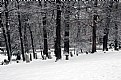
Critique By:
Peter McDonald (K:4951)
2/24/2010 6:39:08 PM
hi there
nice framing and path leads you in and out of the photo giving you a 2 demensional effect
also looks very cold hope you wrapped up warmly
|
| Photo By: Nanda Baba das
(K:78053)
|
|
|
Critique By:
Peter McDonald (K:4951)
2/24/2010 6:36:25 PM
hi thanks for your comment, your stone carving and statue are very good also
|
| Photo By: Peter McDonald
(K:4951)
|
|
|
Critique By:
Peter McDonald (K:4951)
2/20/2010 10:50:06 AM
hi there, nice abstract ie thinking outside the square
that canon camera diet must be good for you
|
| Photo By: Michael Moran
(K:108)
|
|
|
Critique By:
Peter McDonald (K:4951)
2/15/2010 6:27:19 AM
hi looking at your photos you have a few in black and white
your photos are very tonal, meaning lots of good whites ,greys and blacks
i will have to shoot some more black and white film and experiment
|
| Photo By: Olga Vareli
(K:22477)
|
|
|
Critique By:
Peter McDonald (K:4951)
2/15/2010 6:23:40 AM
hi there
i think you may of thought the photo was too busy in colour so here it is in black and white
what do you think. peter
|
| Photo By: Peter McDonald
(K:4951)
|
|
|
Critique By:
Peter McDonald (K:4951)
1/27/2010 6:52:39 PM
thank you
it had just finished raining and the light was nice and soft
|
| Photo By: Peter McDonald
(K:4951)
|
|
|
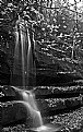
Critique By:
Peter McDonald (K:4951)
1/27/2010 6:51:37 PM
hello there
very nice black and white of a waterfall,
black and white has the texture and tone that colour will never get to
nice framing
good work
|
| Photo By: Vijay Kurhade
(K:10118)
|
|