|
|
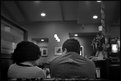
Critique By:
Rafael Torcida (K:1926)
3/13/2006 8:51:50 PM
Beautiful and original idea. The narrow DOF makes the photograph quite interesting, as if the world that waits after this final call is unknown and yet-to-be-discovered. I like it.
|
| Photo By: Arne Gulstene
(K:172)
|
|
|
Critique By:
Rafael Torcida (K:1926)
11/5/2005 1:48:07 PM
Beautiful atmosphere captured with the camera. Greys use is terrific and the aperture used makes the quiet mood for the photograph. Very nice!.
|
| Photo By: Suzi Q.
(K:426)
|
|
|
Critique By:
Rafael Torcida (K:1926)
10/24/2005 10:06:44 PM
much nicer indeed!!!!!
|
| Photo By: Sergio M. Cameno
(K:7856)
|
|
|
Critique By:
Rafael Torcida (K:1926)
10/22/2005 10:33:17 PM
Remember when I told you about the dangers of usefilm?. Well, this is it. Honestly, this photograph is uninspired and too simple. How many clouds shots have we ever seen?. Not trying to change anybody's opinion!. But, imho, quite standardized...
|
| Photo By: Sergio M. Cameno
(K:7856)
|
|
|
Critique By:
Rafael Torcida (K:1926)
10/22/2005 11:54:42 AM
brilliant composition. The archs lead the eye to the subject of the photograph. Colours combine pretty well. It has a dreamy feeling all about. Really nice!.
|
| Photo By: Bosnia Photo
(K:3088)
|
|
|
Critique By:
Rafael Torcida (K:1926)
9/26/2005 9:10:07 PM
WoW!, Tamara, this one is superb!. Not only you got a great BW texture, the composition is also amazing. The only thing I'm not 100% sure is the cap of the tub. But this is a great, almost dreamy shot.
|
| Photo By: Tamara N
(K:2617)
|
|
|
Critique By:
Rafael Torcida (K:1926)
8/30/2005 3:14:53 PM
ahaa... at last a powershot S2 shot  . hehehe... nice. I would change the location of the trees, putting them either left or right in the composition (in this case probably in the right side).I like how you used depth of field. What about cropping a little bit the upper part of the photograph?, making it more rectangular and cinematic . hehehe... nice. I would change the location of the trees, putting them either left or right in the composition (in this case probably in the right side).I like how you used depth of field. What about cropping a little bit the upper part of the photograph?, making it more rectangular and cinematic  . .
|
| Photo By: Sergio M. Cameno
(K:7856)
|
|
|
Critique By:
Rafael Torcida (K:1926)
8/26/2005 12:44:28 PM
Oh my god!. BUstamante????... no PLEASE!!!!!!!. Well, everything looks ok in this photograph, and this is its major fault IMHO. Placing horizon line just in the middle of the photograph makes it a little bit boring (just like any song by Bustamante :P). Nice colours, well defined. You should try to get more risky .
|
| Photo By: Sergio M. Cameno
(K:7856)
|
|
|
Critique By:
Rafael Torcida (K:1926)
8/25/2005 12:38:47 PM
Photograph is OK. Nice exposure metering and good BW handling. Only problem for me is the oversharpening you've applied. You can see white halos in the edges of the branches due to oversharpening. You should control the unsharp mask threshold to avoid the halos.
|
| Photo By: Sergio M. Cameno
(K:7856)
|
|
|
Critique By:
Rafael Torcida (K:1926)
6/3/2005 10:57:13 PM
fun and exiting... I really like this one... but may be it's because I love Margaritas?????. I'm not sure about the white sky.... could it be a little bit distracting?. Have you tried to apply a gradient over it and blend it with the rest of the photo?. I'm not sure if it will work or not.
|
| Photo By: Tamara N
(K:2617)
|
|
|
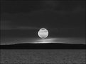
Critique By:
Rafael Torcida (K:1926)
6/3/2005 10:54:46 PM
Buf!!!, what a great shot Tamara. This is just amazing. I love how you've broken rules and set the sun in the middle, and presented the sunset in black and white.... it looks so beautiful... and original!!.
Well Done!!
|
| Photo By: Tamara N
(K:2617)
|
|
|
Critique By:
Rafael Torcida (K:1926)
5/2/2005 9:43:58 AM
fiiiuuuu.... scary shot Girish!. Good use of DOF and nice colour and contrast... you managed to create an scary atmosphere. I really feel terrorized looking at this one!. Well Done!.
|
| Photo By: Girish Chonkar
(K:6903)
|
|
|
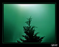
Critique By:
Rafael Torcida (K:1926)
4/18/2005 11:18:26 AM
Beautifully done abstract. Isolation is perfect and the tones you used look quite elegant and smooth. Well done.
|
| Photo By: Laurie Gould
(K:11942)
|
|
|
Critique By:
Rafael Torcida (K:1926)
4/18/2005 11:15:25 AM
A nice and creative work based on the typical dome photographs. I like the idea of cropping the whole dome and only show a part. It makes the image more dynamic. Well done.
|
| Photo By: Galal El Missary
(K:84569)
|
|
|
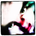
Critique By:
Rafael Torcida (K:1926)
4/18/2005 11:14:12 AM
I saw this one the other day, and it continues intriguing me. I've seen this is a mix of two photographs taken with a cell phone. I think it's a great idea, and the results are really disturbing. It's like you don't want to look at it, but it has something that pull your eyes and you're forced to look. Very creative work.
|
| Photo By: Kostas Tzanetos
(K:22012)
|
|
|
Critique By:
Rafael Torcida (K:1926)
4/18/2005 10:29:16 AM
I love the simplicity of this shot. The basic tonal range and the burnt background create a dreamy effect very nice. Well done Taunis!. Less is more .
|
| Photo By: Teunis Haveman
(K:37426)
|
|
|
Critique By:
Rafael Torcida (K:1926)
4/14/2005 7:34:25 PM
WoW!, amazing abstract picture here. You isolated a typical scene quite well, and your bouncing play of lines is just... well... exhilarating. That combined with the nice orange tones makes the result quite uplifting. Nice abstract indeed!.
|
| Photo By: Kostas Tzanetos
(K:22012)
|
|
|
Critique By:
Rafael Torcida (K:1926)
4/8/2005 9:04:50 AM
Thank you Kevin, I really like your comment and I'm glad I could make you shiver. The photograph is based on a piece of music that it's kind of somber so that's what I tried to achieve.
About the grain, yes it's forced with PS because I think this grain goes well with the somber mood, and I really love grain in photography.
Thanks again for you comment!.
|
| Photo By: Rafael Torcida
(K:1926)
|
|
|
Critique By:
Rafael Torcida (K:1926)
2/22/2005 11:02:45 PM
Beautiful macro portrait. Amazing light! and the grain effect looks really good. Well done!.
|
| Photo By: carlo raingini
(K:11977)
|
|
|
Critique By:
Rafael Torcida (K:1926)
2/21/2005 10:15:22 PM
Amazing landscape!. Colour use is terrific. The reflection works wonderfully well. Only drawback is horizon line... slightly dropped to the right... easily fixable with PS .
|
| Photo By: William Wilson
(K:380)
|
|
|
Critique By:
Rafael Torcida (K:1926)
2/21/2005 10:13:37 PM
Beautiful portrait!!. You captured the spirit of these two boys really well. Only distracting element is the face in the backgroun, between the boys. The background look really good with the rest of the photograph. I like it very much!. Well done.
|
| Photo By: Kinta Olia
(K:48)
|
|
|
Critique By:
Rafael Torcida (K:1926)
2/21/2005 10:11:20 PM
Great light play Tamara! I like it very much!. Colour selected is one of my favourites too... but that's my personal taste .
|
| Photo By: Tamara N
(K:2617)
|
|
|
Critique By:
Rafael Torcida (K:1926)
2/19/2005 8:23:42 PM
Beautiful fair photograph. Good use of the slow shutter. Slightly oversaturated for my personal taste.
|
| Photo By: Lea Mulqueen
(K:7396)
|
|
|
Critique By:
Rafael Torcida (K:1926)
2/19/2005 12:04:48 PM
Hi Tamara,
many thanks for you kind words and for visiting my new photoblog site. I'm really happy you liked it. Thanks!
|
| Photo By: Rafael Torcida
(K:1926)
|
|
|
Critique By:
Rafael Torcida (K:1926)
2/18/2005 9:55:41 PM
WoW!. Very good photograph Judita!. I like it very much. The only drawback is the chromatic noise on the shot. I find it annoying. May be you could desaturate the shot or apply some colour2bw technique to avoid the effect. A bw noise would look great in this shot!.
|
| Photo By: Judita Sendak
(K:600)
|
|
|
Critique By:
Rafael Torcida (K:1926)
2/18/2005 9:54:10 PM
Beautiful combination of portrait and landscape. Good use of light and tones. The only distracting element is the shadow in the lower right corner but probably it couldn't be avoided. Well done!.
|
| Photo By: ugur cetin
(K:5895)
|
|
|
Critique By:
Rafael Torcida (K:1926)
2/18/2005 9:42:46 PM
Taunis, thanks for your comments .
Should I go to the psychologist?, HAhahaha... just kidding....
|
| Photo By: Rafael Torcida
(K:1926)
|
|
|
Critique By:
Rafael Torcida (K:1926)
2/13/2005 11:20:22 PM
Reading the comments of this photograph I've realized I'm not the first one getting absolutely amazed with this photograph. The only drawback I can find is the slow size you used to upload the picture. I would like to see this as big as possible . Congratulations for a perfect job!.
|
| Photo By: Barry Wakelin
(K:7838)
|
|
|
Critique By:
Rafael Torcida (K:1926)
2/12/2005 1:30:07 AM
Disturbing and powerful work canses. The low key lightning works wonderfully well here, creating intriguing hints of the place where the photo was taken and just giving us minimal details.
Full of atmosphere!.
|
| Photo By: canses
(K:1048)
|
|
|
Critique By:
Rafael Torcida (K:1926)
2/12/2005 1:27:01 AM
Ohhhh!!!!.... The Intercontinental Amstel Hotel!!!. I once spent a full weekend in this amazing (and quite expensive :P) hotel -fortunately using reward points- and it's so cute outside and inside. BTW, Taunis, this week I went to Amsterdam again, just for business but I had a great time in the city... I love Amsterdam!!! (and not exactly because of the red light district ).
Anyway, composition and exposure are great (I find quite beautiful the mirrored image of the hotel). The only problem I see is the slightly blurred image, probably because of the long exposure you had to use. Also, the white balance could be better adjusted.
Thanks for making my thoughts went back to that wonderful weekend some years ago!.
|
| Photo By: Teunis Haveman
(K:37426)
|
|