|
|
Critique By:
Gerhard Hoogterp (K:4863)
9/7/2009 8:57:18 AM
Quite a nice shot, but I see a few spots which give the idea of a dirty sensor or lens. Two under the butterfly, two in the right-top corner and one the right side, next to the point of the leaf..
|
| Photo By: Photowala
(K:486)
|
|
|
Critique By:
Gerhard Hoogterp (K:4863)
9/29/2008 9:23:18 PM
Hee, Theun.. long time..
Dit is ook weer een prachtig plaatje.. Is dat sneeuw wat ik zie of is het de reflectie in het water? Vermoed het laatste, maar ben niet helemaal zeker.. Hoe dan ook: een plaatje..;)
|
| Photo By: Teunis Haveman
(K:37426)
|
|
|
Critique By:
Gerhard Hoogterp (K:4863)
9/29/2008 8:08:20 PM
Mooi plaatje.. eigenlijk als altijd.. Vertrouwd vakwerk.
En goed je weer eens terug te zien. Het was al lang heel erg leeg op m'n friends page..
|
| Photo By: Hugo de Wolf
(K:185110)
|
|
|
Critique By:
Gerhard Hoogterp (K:4863)
7/11/2008 1:41:06 PM
Serious critiques I cannot give you.. But serious compliments.. Very nice piece of work and a wonderful idea. I do wonder though why the pano software wouldn't be able to stitch this panorama? As long as there are matching points for the pano-software to work with it should be able to work it's magic.. Did you try to use software?
|
Photo By: AJ Miller
(K:49168)

|
|
|
Critique By:
Gerhard Hoogterp (K:4863)
5/12/2008 8:46:17 PM
Indeed a great use of light and very nice that you got some movement in the hair..
|
| Photo By: Paul Lara
(K:88111)
|
|
|
Critique By:
Gerhard Hoogterp (K:4863)
4/8/2008 4:10:43 PM
3th page and nobody reacted? Weird. While I usually don't have much to comment on your images I do enjoy watching them and I see a steady improvement in the quality of your fashion photo's. You're getting quite good at it.. For this image I can see that besides a very nice image, you had fun placing your logo..;)
The only issue which disturbs me somewhat is the weird effect from the hand under the arm (left side of the photo). As the colors from the hand and the arm are very much the same the first impression is a bit weird.
|
| Photo By: Paul Lara
(K:88111)
|
|
|
Critique By:
Gerhard Hoogterp (K:4863)
3/28/2008 8:40:37 PM
Interesting effect making for a nice abstract.
|
| Photo By: Ahmet Baki Kocaballi
(K:13618)
|
|
|
Critique By:
Gerhard Hoogterp (K:4863)
12/31/2007 9:50:53 AM
Maar terecht! Een prachtig plaatje..
|
| Photo By: Pim de Ruijter
(K:2170)
|
|
|
Critique By:
Gerhard Hoogterp (K:4863)
9/15/2007 10:05:09 AM
Great shot, very moody..
|
| Photo By: Milena G
(K:1098)
|
|
|
Critique By:
Gerhard Hoogterp (K:4863)
7/6/2007 7:34:52 AM
Nice shot,but a bit to much blue I think. the poppy goes to purple and the background towards blue.. (on my non-calibrated screen that is..;)
But as a composition you've made a very nice shot with a good use of dof to separate the subject from the background.. well done.. now only those colors..;)
|
| Photo By: nima ojani
(K:128)
|
|
|
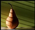
Critique By:
Gerhard Hoogterp (K:4863)
4/4/2007 7:52:16 AM
Very nice.. compliments! Maybe a small reflector (backside of an old photo?) on the right side to get a little detail on the dark side of the moon.. euh.. pear..
|
| Photo By: Chris Nichols
(K:7068)
|
|
|
Critique By:
Gerhard Hoogterp (K:4863)
12/12/2006 9:03:37 PM
My first reaction was "a bit busy in the background", but after looking a little longer i think that that's what makes this photo. A feeling of estrangement, that she's not part of the group or that she turned her back at the group.. Either way.. strong shot!
|
| Photo By: Paul Lara
(K:88111)
|
|
|
Critique By:
Gerhard Hoogterp (K:4863)
11/7/2006 10:10:15 PM
Well, your photo is a lot more dramatic than the snapshot in the comments.. The red gives it a very dramatic touch, but the clouds feel a bit "glued on" maybe as a side result of the post-processing..
Nevertheless. A nice done image..
|
| Photo By: Kostas Tzanetos
(K:22012)
|
|
|
Critique By:
Gerhard Hoogterp (K:4863)
10/26/2006 10:50:30 AM
Nice abstract. Well done!
|
| Photo By: Ahmet Baki Kocaballi
(K:13618)
|
|
|
Critique By:
Gerhard Hoogterp (K:4863)
10/18/2006 9:08:34 AM
The one on the left has a very happy look over him/her.. Nice shot with a nice warm and happy feel over it.
|
| Photo By: Meg Metcalfe
(K:6114)
|
|
|
Critique By:
Gerhard Hoogterp (K:4863)
10/17/2006 8:14:51 PM
En mag je dat zomaar op een publieke site zetten? Vaak doen ze nogal geheimzinnig over dit soort dingen.. Maar goed..
Wederom een fraaie foto.. mooie en sprekende details. Om de een of andere manier is het middelste plaatje wat "saai" vergeleken met de andere twee, maar aan de andere kant brengt dat ook wel weer wat rust in het midden.. Kortom, weer een heel fraai geheel..
|
| Photo By: Hugo de Wolf
(K:185110)
|
|
|
Critique By:
Gerhard Hoogterp (K:4863)
10/4/2006 2:21:38 PM
Ook weer een heel fraai plaatje. Enerzijds een interesant en creatief concept, aan de andere kant moet je ook elke keer maar weer iets vinden om een dergelijke foto te kunnen maken.. Heel fraai..
|
| Photo By: Hugo de Wolf
(K:185110)
|
|
|
Critique By:
Gerhard Hoogterp (K:4863)
9/10/2006 9:13:04 PM
Fun shot, but I think you overdid it a little with the noise. I'm not sure if you wanted noise or to simulate film grain, but for both it's to much..
|
| Photo By: Branimir Fagarazzi
(K:38367)
|
|
|
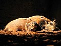
Critique By:
Gerhard Hoogterp (K:4863)
9/8/2006 1:12:01 PM
Definitly a nice shot, but with some points on which improvement is possible. First I think you could crop the image a little closer. There's a lot which doesn't really add to the image. The second is that the animal isn't completely sharp. Especially the eyes feel a bit soft. And in an ideal world the branch in front of it's head would be there..
All that said, it's still a nice image. Just keep on working on the matter. Welcome on usefilm..
|
| Photo By: Jeffery Parker
(K:172)
|
|
|
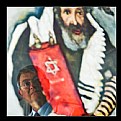
Critique By:
Gerhard Hoogterp (K:4863)
9/5/2006 8:35:52 PM
A very nice image! Especially the care you took to make as well the rabbi as the person appear clear and recognizable in the image. Together with the previous image this makes a nice series. Any more to come?
|
| Photo By: Hugo de Wolf
(K:185110)
|
|
|
Critique By:
Gerhard Hoogterp (K:4863)
9/1/2006 8:38:20 PM
Definitely a blue period.. Nicely seen and a great shot as per usual.. Nicely seen and a great shot as per usual..
|
| Photo By: John Griep
(K:2521)
|
|
|
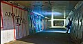
Critique By:
Gerhard Hoogterp (K:4863)
8/27/2006 8:42:50 PM
Hi Hugo,
While this photo is better in that it's darker and has more contrast, my main problem with the photo was that it didn't show what you described in the text: A dark and gloomy nightly shot. The light in the bottom left gave me more the idea of our second dutch heat-wave, middle of the day..
But this photo is definitely better than the original. The shadows also have a lot less noise which is always good.
|
| Photo By: Hugo de Wolf
(K:185110)
|
|
|
Critique By:
Gerhard Hoogterp (K:4863)
8/24/2006 2:45:53 PM
I see you removed the "black" and "gloomy" references from the description.. Leaving a grafity filled tunnel, which is is and it is well done.
To bad it now seems that my reaction has nothing to do with the photo as such anymore..
|
| Photo By: Hugo de Wolf
(K:185110)
|
|
|
Critique By:
Gerhard Hoogterp (K:4863)
8/24/2006 11:45:19 AM
Sorry, this is way burned out.. try again with a few stops less light or use the bracket option which your camera doublessly will have..
|
| Photo By: Sule Baycan
(K:241)
|
|
|
Critique By:
Gerhard Hoogterp (K:4863)
8/24/2006 11:30:26 AM
While the idea is nice, I miss the feeling of "night" in the image. Actually it looks like the middle of the day. That said, the consequence is that I also miss the gloomy part. I think you cleaned it up to much.. B&W with the light in the left-bottom corner cropped would do.. a little noise and there you go.. (imho of course..;-)
Was the guy there or did you ask him to pose?
|
| Photo By: Hugo de Wolf
(K:185110)
|
|
|
Critique By:
Gerhard Hoogterp (K:4863)
7/21/2006 11:42:00 AM
Only now notice this is your first photo here.. Welcome to usefilm!
|
| Photo By: Abdullah mohammed
(K:3)
|
|
|
Critique By:
Gerhard Hoogterp (K:4863)
7/21/2006 11:40:53 AM
I like the idea but see some space for improvements though. The orange is a bit too small compared to the frame. It feels somewhat lost in all the blackness and I would also move it a little lower. I guess it's a matter of feeling, but there's a bit of uneasyness in the current location.
Besides that, great idea.. well done!
|
| Photo By: Abdullah mohammed
(K:3)
|
|
|
Critique By:
Gerhard Hoogterp (K:4863)
7/13/2006 7:50:07 AM
Ach.. the kind of photo's I would love to make.. But.. The netherlands are flat and overdeveloped.
Anyhow, a very nice photo with one, slightly confusing thing: When you look into the photo the sheep give a feeling of size to the image. Then, looking to the left there's a tree which gives me a different feeling of size.. I assume it's a small tree, but still..
Nevertheless.. Great shot!
|
| Photo By: Jo T
(K:2305)
|
|
|
Critique By:
Gerhard Hoogterp (K:4863)
7/9/2006 7:51:26 PM
Nicely going.. but here the blue one should, for my feeling, be also in the middle.. It now disturbs the regularity of the ball being in the middle..
|
| Photo By: Aliihsan Pinçe
(K:5485)
|
|
|
Critique By:
Gerhard Hoogterp (K:4863)
7/9/2006 1:53:58 PM
Long time no see..
Beautiful capture with enough detail left in the white. Well done!
|
| Photo By: Pim de Ruijter
(K:2170)
|
|