|
|
Critique By:
Matej Maceas (K:24381)

4/18/2008 5:10:16 PM
Good to see you back Roger :)
|
| Photo By: Roger Williams
(K:86139)
|
|
|
Critique By:
Matej Maceas (K:24381)
7/22/2007 11:02:52 AM
One of my favourite "special effects" :)
I recently saw this slideshow by a photographer who uses tilt for sports photography, check it out:
http://www.nytimes.com/packages/html/magazine/20070531_VINC ENT_FEATURE/blocker.html
|
| Photo By: Giuliano Guarnieri
(K:36622)
|
|
|
Critique By:
Matej Maceas (K:24381)
6/19/2007 5:47:03 PM
Toto je dobreeee... Myslim ze by sa s touto fotkou dalo paradne vyhrat v tmavej komore, skusajuc rozne expozicie a kontrast v jednotlivych castiach, odhalit vsetky tie odtiene a struktury a jemne prechody - a nazvacsovat na pekne velky format, nech to vsetko dobre vidno. Pre mna ozaj dobra fotka.
|
| Photo By: Marian Klucovsky
(K:172)
|
|
|
Critique By:
Matej Maceas (K:24381)
4/30/2007 10:01:38 PM
Yeah, I thought it looked familiar :-)
|
| Photo By: Audrey Reid
(K:5872)
|
|
|
Critique By:
Matej Maceas (K:24381)
1/29/2007 6:00:55 PM
Hi Uschi, I just wanted to say what a nice photo this is.
|
| Photo By: The Koe
(K:29)
|
|
|
Critique By:
Matej Maceas (K:24381)
9/24/2006 4:19:59 PM
I don't think the camera did a good job here - the sky looks very unrealistic to me. Change of colour in three discrete steps, purple power lines... Does it always do that?
|
| Photo By: Roger Williams
(K:86139)
|
|
|
Critique By:
Matej Maceas (K:24381)
9/11/2006 11:41:50 AM
Roger,
I also find the Bessa very good - it's really easy to get used to, it's small, light, and looks good too :-) The exposure meter seems fairly accurate, although especially with the 21mm lens I have to be careful about where I point it at to get a correct reading. So far I've only had two problems:
1) When loading the film, the leader tends to loosen up quite a lot on the take-up spool, so I have to manually hold it tight in place for about three turns to make sure the film will advance properly. Is this typical for the camera, or do you think it's something wrong specifically with my piece?
2) After developing the films, I found out I need to pay more attention to the way I'm holding the camera - I had the bottom right corner of quite a few frames covered by a finger. One would think that after four years of shooting, that kind of stuff doesn't happen ;-)
|
| Photo By: Matej Maceas
(K:24381)
|
|
|
Critique By:
Matej Maceas (K:24381)
8/6/2006 7:36:45 AM
Yes, perfectly acceptable.
What is the 'women only' poster about?
|
| Photo By: Roger Williams
(K:86139)
|
|
|
Critique By:
Matej Maceas (K:24381)
8/6/2006 7:25:11 AM
Another chance for me to use fspviewer. Nice! I get a feeling of human presence even though there aren't any people in the photo (where was everyone? the clock shows only a few minutes past 3).
I tried to read some of the book titles but the resolution is too coarse even with the large file... Are they readable on the original raw file? I'm thinking of this because you've been posting panos shot on 6xlong film and here's a move to a sub-35mm sensor. Are you experiencing any limitations (or necessity for a different approach) as a result of the smaller format?
|
| Photo By: Roger Williams
(K:86139)
|
|
|
Critique By:
Matej Maceas (K:24381)
8/2/2006 4:22:34 PM
Hi Marco,
I fixed the print after the bleaching stage to make sure that the bleached parts will stay bleached, and not be redeveloped by subsequent toners.
|
| Photo By: Matej Maceas
(K:24381)
|
|
|
Critique By:
Matej Maceas (K:24381)
5/24/2006 6:11:24 PM
Thanks Gayle. Here's another one for you, taken a few days ago. f/1.4 handheld in low light at about 40cm, so lots of fun :-)
|
| Photo By: Matej Maceas
(K:24381)
|
|
|
Critique By:
Matej Maceas (K:24381)
5/6/2006 8:26:15 PM
Ah yes, he's obvious now that you've pointed him out for me :-)
By the way, I just downloaded a bunch of your 360degree panorama photos to view using FSPViewer... I must say it's a totally different experience to the flat images - but you know that far better than me!
|
| Photo By: Roger Williams
(K:86139)
|
|
|
Critique By:
Matej Maceas (K:24381)
5/6/2006 8:34:33 AM
I've only found three... (man with glasses, hat and blue jacket, older lady with grey hair, man in white baseball cap underneath the tree)
|
| Photo By: Roger Williams
(K:86139)
|
|
|
Critique By:
Matej Maceas (K:24381)
4/6/2006 7:41:07 PM
I like it very much.
|
| Photo By: Elangovan S
(K:10675)
|
|
|
Critique By:
Matej Maceas (K:24381)
4/2/2006 10:21:05 AM
There's an inconsistency between focus and tonality, those rather bright clock faces in the background tend to pull my eye away from where the focus is telling me to look.
|
| Photo By: Jeroen Wenting
(K:25317)
|
|
|
Critique By:
Matej Maceas (K:24381)
4/2/2006 10:12:29 AM
Hi Elangs,
I don't know how to interpret this photo, the colours are obviously very strong and I would guess they are supposed to drive the photo, but in terms of content it's kind of halfway between abstract and non-abstract. What were your intentions?
|
| Photo By: Elangovan S
(K:10675)
|
|
|
Critique By:
Matej Maceas (K:24381)
4/2/2006 10:01:56 AM
I also think it merits a print. The crop on the left is not a problem, but do consider printing with a black border to keep the eye in the photograph - I think this is extremely useful and effective when you have a lot of white areas like here, it will close the photo in a natural way. Also consider printing with a softer grade and/or do some burning to do away with all those blown highlights (shirt, balloons; sky as well but that's optional - it probably wouldn't hurt if you could get some hints of cloud detail out of the negative, but it won't ruin the photo if it stays as it is).
|
| Photo By: Roland Lacson
(K:12214)
|
|
|
Critique By:
Matej Maceas (K:24381)
4/2/2006 9:53:07 AM
Two related comments/observations from me.
First, I've just read Hugo's thoughts on the character of the scenery and its suitability for panoramic format, and he expressed more or less what I think as well. There are relatively few strong elements, leaving a lot of 'unused' space, but at the same time they are not few enough for me to perceive the photo as intentionally minimalistic. So it's something inbetween, and I'm having trouble interpreting it. Of course I also read your replies to Hugo and the whole 'problem' may be with what kind of scenery each of us prefers... (I was born and for 9 years lived in an agricultural region, with lots of very flat landscape, and I never found it very exciting).
Second, as has already been stated, there's a number of lines that lead to the jogger, suggesting that he is, if not the main subject, then at least intentionally a very dominant one (this message is also strengthened by the fact that he is the only dynamic element in a static scene - I'm not counting some other people in the background, who are dynamic but almost invisible). But, he is not very dominant in terms of size in the frame... so there is this uncertainty, a conflict if you will, between what one aspect of the composition is telling me (the converging lines) and what a second aspect of the composition says (the manner in which the frame has been filled).
That is my first reaction, which has been living as a general idea in my for several days now, but only today have I managed to organize it into sentences :-) If anything else comes up, I'll let you know.
|
| Photo By: Roger Williams
(K:86139)
|
|
|
Critique By:
Matej Maceas (K:24381)
3/31/2006 8:45:22 PM
Thank you Hugo.
|
| Photo By: Matej Maceas
(K:24381)
|
|
|
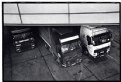
Critique By:
Matej Maceas (K:24381)
3/28/2006 6:44:20 AM
Thanks Audrey. The print is ok, considering the negative, which is not quite what is should be... rating Neopan 1600 at 1600 does not seem to work for me :-)
The overhang is burned in about 30% so that it doesn't tonally compete with the trucks too much. I'm glad that seems to have worked.
|
| Photo By: Matej Maceas
(K:24381)
|
|
|
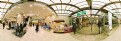
Critique By:
Matej Maceas (K:24381)
2/26/2006 4:39:43 PM
Of your recent stitched fisheye photos, this could well be the best subject/technique match (at least when looked at like a print). The architecture of the store is such that the distortion is not so obvious and the result looks fairly natural even in this non-VR form. I like it.
|
| Photo By: Roger Williams
(K:86139)
|
|
|
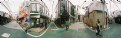
Critique By:
Matej Maceas (K:24381)
2/26/2006 4:39:25 PM
I'm curious what it would look like if you didn't remove duplicate people. It could be fun to do this in a more crowded place and actually try to get everyone into as many shots as possible :-)
|
| Photo By: Roger Williams
(K:86139)
|
|
|
Critique By:
Matej Maceas (K:24381)
2/25/2006 11:26:43 PM
Did this originally have any significant color in it?
|
| Photo By: João Magalhães
(K:2067)
|
|
|
Critique By:
Matej Maceas (K:24381)
2/16/2006 7:05:42 PM
Christian, you touch upon an interesting subject.
The first time I printed on this paper (more than a year ago?), I didn't like it at all - the texture was just way too strong, distracting and unrealistic for my taste. I could probably attribute it to bad subject/paper match rather than bad paper as such... but in fact when I look at that first print today, it's not so bad even with that subject. Apparently my taste has been changing.
Now when I was pondering which paper to use for this forest photo, I decided to give Chamois another try. I can say that I'm satisfied with the result - the paper texture is in line with the texture of the bark, and gives it an almost three-dimensional quality when viewed at an angle; and the creamy base combines well with the brown toning.
|
| Photo By: Matej Maceas
(K:24381)
|
|
|
Critique By:
Matej Maceas (K:24381)
2/4/2006 2:26:39 PM
No complaints, other than that the closest focusing distance is actually quite long, so it does not have all that much added value as a portrait or close-up lens. It's useful when I can't get close to the subject.
It's also rather heavy :-)
|
| Photo By: Roger Williams
(K:86139)
|
|
|
Critique By:
Matej Maceas (K:24381)
2/3/2006 7:29:29 PM
How's this then? :-)))
|
| Photo By: Roger Williams
(K:86139)
|
|
|
Critique By:
Matej Maceas (K:24381)
1/25/2006 11:10:59 AM
"Did you feel it was worth the effort?"
Yes, very much.
|
| Photo By: Matej Maceas
(K:24381)
|
|
|
Critique By:
Matej Maceas (K:24381)
12/31/2005 10:45:45 AM
Happy new year Christian
|
| Photo By: Christian Barrette
(K:21125)
|
|
|
Critique By:
Matej Maceas (K:24381)
12/29/2005 7:22:46 AM
Self unportrait seems reasonable.
|
| Photo By: João Magalhães
(K:2067)
|
|
|
Critique By:
Matej Maceas (K:24381)
12/28/2005 9:58:02 AM
Excellent.
Selfportrait, right? :-)
|
| Photo By: João Magalhães
(K:2067)
|
|