|
|
Critique By:
Hermen Pen (K:9168)
2/19/2019 11:12:24 AM
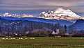
With the many layers in this image (farmland, church, forest line, blue colored hills, snow covered mountain peak, clouds) you have created a great sense of depth. The title of your photo suggests that the white birds are the main subject. For that, I think they are placed a bit too much to the edge of the frame - the church and especially the white mountain are drawin my attention much more. Still, they do certtainly add to the scenery.
|
Photo By: Paul Harrett
(K:791)

|
|
|
Critique By:
Hermen Pen (K:9168)
2/16/2015 1:36:32 PM
Good eye - a touch of Martin Parr ;)
|
| Photo By: Tony Smallman
(K:23858)
|
|
|
Critique By:
Hermen Pen (K:9168)
1/16/2008 8:36:56 PM
Hi Jowie,
the exposure is very good. A possible improvement: 'something'in the foreground could make the image more interesting. Also the stones under water could act as a kind of foreground. A polarizing filter could help to reduce the reflection and in this way make the stones more visible.
regards,
Hermen
|
| Photo By: Jowie
(K:361)
|
|
|
Critique By:
Hermen Pen (K:9168)
1/16/2008 8:30:43 PM
Hi Susan,
some suggestions:
- use a smaller depth of focus (i.e. larger aperture, smaller f number).
- focus on the filaments.
regards, Hermen
|
| Photo By: Susan Hornung
(K:21)
|
|
|
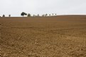
Critique By:
Hermen Pen (K:9168)
1/9/2008 9:48:48 PM
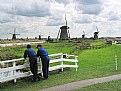
Hi Govert,
Nice minimalistic view. I would suggest to crop a bit from the top side (as the sky is not very interesting). This puts more emphasis on the ploughed land in the foreground (which is interesting).
regards,
Hermen
|
| Photo By: Govert Nieuwland
(K:674)
|
|
|
Critique By:
Hermen Pen (K:9168)
1/9/2008 9:42:57 PM
A very happy new year to you too, Titia!
|
| Photo By: Titia Geertman
(K:5582)
|
|
|
Critique By:
Hermen Pen (K:9168)
9/19/2007 5:41:56 PM
Hi Jowie, You posted this photo in the Photo Help project. What would you like to have help with?
regards, Hermen
|
| Photo By: Jowie
(K:361)
|
|
|
Critique By:
Hermen Pen (K:9168)
9/18/2007 5:30:03 PM
You creaetd a very graphical image with these shadows and reflections, well done!
|
| Photo By: Stanislaw Mac
(K:126)
|
|
|
Critique By:
Hermen Pen (K:9168)
3/5/2007 9:11:25 PM
Just found an interesting article on photographing a lunar eclipe.
http://skytonight.com/howto/astrophotography/3304036.html
|
| Photo By: Hermen Pen
(K:9168)
|
|
|
Critique By:
Hermen Pen (K:9168)
3/5/2007 9:02:59 PM
Hi Nick,
thanks for the compliment :)
I used a tripod and a 200 mm lens with 1.4x converter, the maximum focal length I could achieve with my gear. I set the camera to spot metering and autofocus (which, to my surprise, still worked during the totality!)
Here are the exposure details for the eight shots
1st row from left to right:
ISO 200; 1/200 s; f/8
ISO 200; 1/60 s; 8
ISO 200; 1/30 s; f/8
ISO 200; 1/30 s; f/8
2nd row from left to right:
ISO 200; 1/2 s; f/6.7
ISO 400; 1/2 s; f/5.6
ISO 800; 1/2 s; f/4
ISO 800; 1 s; f/8
I did not want to go to exposure times longer than 1 second, to prevent a too large motion blur. The exposures are slightly inconsistent, I was fiddling around with the settings. I am less satisfied with the left shots in the lower row. I think I should have exposed longer there. You can find an exposure table for the moon eclipse on the internet (google for mreclipse). The long exposure times mentioned here are only feasible if you have a tripod with a rotating head that compensates for the earth's rotation.
regards, Hermen
|
| Photo By: Hermen Pen
(K:9168)
|
|
|
Critique By:
Hermen Pen (K:9168)
3/1/2007 9:53:09 PM
Hi Dave,
for me the "Virtual Photographer" plug-in for Photoshop often does a good job in converting colour to black and white. Besides converting to B&W it contains also a lot ofYou can download it for free from the Optik Verve Labs website, so maybe give it a try.
good luck,
Hermen
|
| Photo By: Dave Arnold
(K:55680)
|
|
|
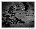
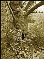
Critique By:
Hermen Pen (K:9168)
2/22/2007 5:46:53 PM
Beautiful mysterious tree! Could be casted for a fairy tale.
|
| Photo By: Fabio Keiner
(K:81109)
|
|
|
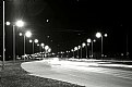
Critique By:
Hermen Pen (K:9168)
2/22/2007 5:27:17 PM
Like Ashley I think the bright spots are lens flares - light reflected inside your lens that appear as ghost images. The chance of flare is higher in the presence of very bright light sources, like the street lights in this image. In general, zoom lenses suffer more from flare than prime lenses and wide angle lenses more than telephoto lenses. It may help to use a lens hood to reduce the flare. On the other hand, you can also think of using the flare effect creatively and make it part of your composition.
|
| Photo By: Rose Hare
(K:2523)
|
|
|
Critique By:
Hermen Pen (K:9168)
2/22/2007 5:14:03 PM
Annemette, you have a good eye for the ordinary things - and how to make them look interesting :) This is a very nice example.
|
| Photo By: Annemette Rosenborg Eriksen
(K:55244)
|
|
|
Critique By:
Hermen Pen (K:9168)
2/22/2007 5:03:58 PM
Smart composition! A minor point of critique: the title says "Snow and water" but, just looking at the image, it is difficult for to see that the background in the lower right part consists of snow. This is a pity because this would give some additional 'layer' to the image. I mean: at first sight, you see an abstract image, at second sight you see the reality behind it. Maybe a slightly longer exposure would have made the texture of snow more visible? Do you also have a coloured version of this image? I would be curious to see it.
|
| Photo By: Peter De Rycke
(K:41212)
|
|
|
Critique By:
Hermen Pen (K:9168)
2/22/2007 4:54:29 PM
A beautiful and carefully arranged palette of colours!
|
| Photo By: Peter De Rycke
(K:41212)
|
|
|
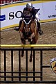
Critique By:
Hermen Pen (K:9168)
2/18/2007 9:43:41 PM
Hi Kara,
some tips for capturing action images:
- a larger aperture will bring in more light, allowing a shorter shutter time without the image getting too dark. In this case that would have an additional benefit: the depth of focus would have been smaller, and therefore the background (the Sony sign) would have been more blurred and therefore less distracting.
- for shots from the front: think ahead (where will my subject be when I press the shutter button ?) You can put the camera to manual focus, and focus at the point where the action will take place. In this case you could have focused a little bit behind the fence. In this way the camera does not have to (auto)focus, therefore the camera will react faster to pressnig the shutter button.delay after pressing the shutter button.
- for shots from aside: get your subject in the viewfinder and move your camera in the same direction as the moving subject (this is called 'panning'). In this way you can take a longer shutter time compared to the situation that you hold your camera still. An additional benefit is that the background will become blurred, which adds to the sense of motion. In my portfolio you can find an example of this technique (http://www.usefilm.com/Image.asp?ID=475767)
The latter two techniques require some practicing, so do not be disappointed when it does not work out the first few shots!
Hope this helps.
regards,
Hermen
|
| Photo By: Kara BigCanoe
(K:1328)
|
|
|
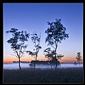
Critique By:
Hermen Pen (K:9168)
2/7/2007 9:57:40 PM
The fog really 'makes' this image, it creates a number of different layers which makes it interesting, well done! I see that this location must be close to where I live, I will definitively have a look there, in the near future!
|
| Photo By: Hugo de Wolf
(K:185110)
|
|
|
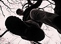
Critique By:
Hermen Pen (K:9168)
12/27/2006 8:20:43 PM
Never seen an autoportrait taken from such angle :) Good idea!
|
| Photo By: Olga-Eva Krajciova
(K:19240)
|
|
|
Critique By:
Hermen Pen (K:9168)
8/10/2006 7:54:28 PM
Hi Maarten, thanks for your comment! I agree that the image would be stronger without the man. Because it was so crowded, I had to take this more or less haphazardly, with the zoom at the widest angle and the camera far above my head. So I could not really time it. But it is something to bear in mind for next year... To be on time and get a good position. I am sure there will be some people who'll take a similar pose again 
|
| Photo By: Hermen Pen
(K:9168)
|
|
|
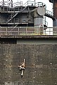
Critique By:
Hermen Pen (K:9168)
7/11/2006 9:42:35 PM
Hi Dave,
thank you for your taking the time to review my image, and for your suggestion. I spent only a limited amount of time on the climbers when visiting this site (after all, I'd wish I had spent more...) I did not take the close-up, but I think the original shot is sharp enough to perform a 'digital zoom' to get an impression of how it would look like, see attached image.
|
| Photo By: Hermen Pen
(K:9168)
|
|
|
Critique By:
Hermen Pen (K:9168)
5/2/2006 8:22:23 PM
Hi Hugo,
The new arrangement looks more balanced to me (in particular, with respect to the amount of blur). And I like the new sign: it is more suggestive, and it it fits better to some of the themes you chose (adventure, extreme).
regards,
Hermen
PS one other association that came into my mind when looking at the images was the photocollage "Pearblossom Highway" by David Hockney. Not that it resembles your arrangement, but it has some elements in common: multiple images and desert Perhaps you know it - if not, Google for it, maybe you find it inspiring.
|
| Photo By: Hugo de Wolf
(K:185110)
|
|
|
Critique By:
Hermen Pen (K:9168)
5/1/2006 8:09:44 PM
A spider in a shattered web!
|
| Photo By: Fabio Keiner
(K:81109)
|
|
|
Critique By:
Hermen Pen (K:9168)
5/1/2006 8:07:37 PM
Hi Hugo,
an interesting experiment... Not many thoughts are coming up yet. Maybe I should let it sink into my mind for a while, maybe I should wait for your next posts. But I will not withold you from my first thoughts:
- The rightmost photo looks odd in combination with the other three. The viewpoint is different and it is more blurred. One immediately has the impression that it is shot from a car, contrary to the image next to it, and, to a lesser extend, the leftmost image.
- I want to go back! (I visited Death Valley seven years ago, and it IS a mesmerizing place...)
regards,
Hermen
|
| Photo By: Hugo de Wolf
(K:185110)
|
|
|
Critique By:
Hermen Pen (K:9168)
4/25/2006 10:50:37 PM
Hi Marco,
thanks for your comment. This was a backlit shot, I had to do some PS work to lighten the figures in the foreground. The two did actually stand there; at Kinderdijk, there is one mill that has been thrown open to the public, and they belonged to the staff
|
| Photo By: Hermen Pen
(K:9168)
|
|
|
Critique By:
Hermen Pen (K:9168)
4/22/2006 11:00:45 PM
The blur in this image makes it very dynamic. However I would have liked to see some part (for example the horse at the back side) really sharp.
|
| Photo By: Zandra T
(K:3635)
|
|
|
Critique By:
Hermen Pen (K:9168)
4/22/2006 9:11:52 PM
Hi Andy,
It looks like you made this shot from a distance using a long focal point. This makes the objects in your image look very much pressed together. In this scene it might have helped to get a little bit closer and isolating parts of the scene, maybe using a lens with a shorter focal length.
regards,
Hermen
|
| Photo By: Andy Seehusen
(K:3372)
|
|
|
Critique By:
Hermen Pen (K:9168)
4/22/2006 8:40:06 PM
Hi Kurt,
You had a good timing in this shot! The background is a bit disturbing, though. because it is too much in focus. I have two suggestions for improvement:
(1) Use a larger aperture to get the background out of focus. Of course this requires very good focussing on your subject, otherwise it will get out of focus as well. In this case, this would mean thay you would have to use a faster lens (i.e. with a larger maximum aperture). Another advantage of such a lens is that autofocus will be faster.
(2) Drawback of the previous suggestion is that you may have to buy a new lens, which will be considerably more expensive than your kit zoom lens. But you may consider also suggestion (2): put your camera on shutter priority and set the shitter time to about 1/100 to 1/50 s. Now follow the dog with the camera while it is running (this is called panning). This will also make the background unsharp, due to motion blurring, while the dog will still be relatively sharp. Some parts , for example the legs, may be unsharp, but this may also be an advantage because it adds to the sense of motion. See the attachment for an example, here I applied this technique during a cycling race.
Good luck,
Hermen
|
| Photo By: Kurt Pas
(K:2267)
|
|
|
Critique By:
Hermen Pen (K:9168)
1/13/2006 3:05:06 PM
Hi Hugo,
an excellent 'classic' landscape photo! The colours are beautiful, and so is the magnificent framing of the mountain by the clouds.
I think that the softness is due to motion blur of the landscape itself. This is consistent with your observation that it is particularly present in the in the foreground. Besides of the grass, also the water is blurred, while the trees, the clouds and the mountain are pretty sharp. The subjects in the background must also have moved in this 1/5 second - maybe with the exception of the mountain . But because these subjects are much further away, they appear less blurred.
regards,
Hermen
|
| Photo By: Hugo de Wolf
(K:185110)
|
|
|
Critique By:
Hermen Pen (K:9168)
1/10/2006 2:33:01 PM
Hi Hugo, talking about these classes: I think I was very lucky with the teachers I got. Their approach and photographic style was far from conventional (have a look at their studio web site: dijdelenco.nl). Also, the workshops we did were sometimes in places that I would not even have thought of before joining their classes (old industrial areas in Germany, Charleroi, night photography in the harbour of Antwerp). For me as a student this was very refreshing. I still like my good old landscapes, but now I know there is much more than that.
But don't be envious - I am sure you can find a good teacher as well, if you look around. And of course you can make your own assignments and challenges (well... you do that already, for example with your triptychs). Trying out a lot of different things, experimenting and discussing the results with others is the best way to improve yourself. Being in a class is only of secondary importance. For me it is just sort of convenient to have a weekly meeting ('stok achter de deur').
Regarding your comment to my photo: I don't remember making the tilt with consideration. I was just struck by the loneliness that this scene radiated, with this lonesome man on a large, almost deserted parking place. I think that the image tilt was just a -not undesirable- side effect of secretly taking the shot ('shooting from the hip'). Still I think the result could have been better - the large van is probably too distracting, and the man is merging too much with the background. But that is the consequence of this kind of photography - the limited control of composition can turn out good or bad...
|
| Photo By: Hermen Pen
(K:9168)
|
|