|
|
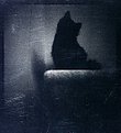
Critique By:
Aurore Lynch (K:1687)
7/11/2006 5:48:29 AM
I think the first image is beautiful and thought provoking all on it's own, and I find the second image only distracting. The first image evokes a raw, personal, emotional response, and then the second tell me that I'm not allowed to just feel it for myself, but that the artist is trying to SAY something, dammit, so I need to sit and ponder and work out what the two photos mean from the artist's point of view. Some people like that, but to me it ruins the enjoyment and beauty of an image. It's my own opinion, but maybe food for thought.
|
| Photo By: marcin klepacki
(K:944)
|
|
|
Critique By:
Aurore Lynch (K:1687)
7/8/2006 4:55:52 AM
Andrew, do you sell your work? I've never cared much for having somebody else's work on my walls, but I'd love yours. Do you have a new website yet?
|
| Photo By: Andrew Polushkin
(K:311)
|
|
|
Critique By:
Aurore Lynch (K:1687)
7/8/2006 4:34:48 AM
Probably because I have psychological problems. I haven't been inspired in some time. I'm sure it'll come back, maybe when we move and I can have a darkroom again. One day, one day (I keep telling myself). My $500 scanner bores the hell out of me, same with photoshop. *shrug*
|
| Photo By: Aurore Lynch
(K:1687)
|
|
|
Critique By:
Aurore Lynch (K:1687)
9/13/2004 3:34:56 AM
?
|
| Photo By: Terrence Kent
(K:7023)
|
|
|
Critique By:
Aurore Lynch (K:1687)
9/13/2004 3:27:45 AM
I sort of holgarized it, though i really can't approximate that look in ps. I didn't like the centering was a big thing, but that holga look seems to work better with centered images and I was trying to avoid cropping it.
|
| Photo By: Terrence Kent
(K:7023)
|
|
|
Critique By:
Aurore Lynch (K:1687)
9/9/2004 7:30:17 AM
ha ha!
Well, it's what I meter for, anyhow!
|
| Photo By: Aurore Lynch
(K:1687)
|
|
|
Critique By:
Aurore Lynch (K:1687)
8/30/2004 1:37:30 PM
Well that makes it one hell of a wedding photo!
But would you share what you've done here? Where did that extra light (coming from your direction) come from? Flash? And if it's flash where did the color cast come from? Wrong film? PS? The foreground actually looks like it might have been painted with light. I'm dying to know how you did it! (AuroreLynch1179@comcast.net)
Fan-f*&#ing-tasticly beautiful!!
|
| Photo By: marcin klepacki
(K:944)
|
|
|
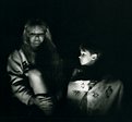
Critique By:
Aurore Lynch (K:1687)
8/29/2004 2:09:10 AM
Carlheinz's digital cross processing? Really? I thought he only used film. Or do you mean 'normal' film adjusted in ps to look xprocessed? I did look through his portfolio, and the xprocessed-looking work I saw actually was xprocessed in developing according to him. Will you point me to it?
I guess I forgot to put in the comments, that is actually me on the left. ; ) My digital gives a nice reflection in the lens so I can see what I'm shooting. I look intent simply because I hate to smile in pictures, and he looks intent because I've trained him not to smile at the camera... lol.
|
| Photo By: Aurore Lynch
(K:1687)
|
|
|
Critique By:
Aurore Lynch (K:1687)
8/28/2004 8:16:06 PM
Duh! Download and add as attachment! I'm a fool.
|
| Photo By: Aurore Lynch
(K:1687)
|
|
|
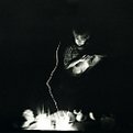
Critique By:
Aurore Lynch (K:1687)
8/28/2004 8:11:09 PM
I tried to reply to you a month ago but couldn't get it to post. Figured out later it's because I supplied a link to that other dreaded critique site. Wanted to show you the original.
Anyhow, the original is pretty well exposed, i think, though i haven't looked at the neg in awhile. The original print is rich in greys (ick!). I exposed this on vc paper with magenta filtration dialed in at a max 130M. Because the eye is blurred in the original (blinked) I tried to disguise the flaw by making it more deliberate. I spread some dishsoap on a haze filter, smooshing it around until it left the perfect blur, and set it under the enlarger lens where the red 'safelight' filter usually sits.
And voila...
|
| Photo By: Aurore Lynch
(K:1687)
|
|
|
Critique By:
Aurore Lynch (K:1687)
8/22/2004 5:40:01 PM
Tmax always drove me nuts too. The worst is if you do your own processing... pain to develop right. Tmax is picky and maybe good for those zone system fanatics, but TriX is a great all-purpose b&w film for all conditions (it can be pushed and pulled very effectively). I also LOVE the look of Fuji Neopan 400, just beautiful grain and contrast. I've been using TriX exclusively for a long time because it's so versatile (and cheap!) but looking back through old images inspired me to pick up more neopan, you just can't beat that look.
Of course, real b&w costs a fortune to print. You can get a flatbed capable of scanning it pretty cheaply now, though, so negs-only developing and then scanning and maybe going back later to get prints of your favorite images is going to be the best way to go (unless you have the cash to burn; hey, go for it! lol). And don't even think about shooting that C-41 b&w!! The grain is ugly and the contrast is really flat; basically, it's the consumer-grade b&w (anything else automatically gets the 'pro' label cause it can't be processed and printed for 6.99 at the quickie lab).
Whereabouts in mass are you? I grew up there (born in springfield). I'm sure you can find a nice custom lab nearby, I live in a medium-sized city and we've got at least two REALLY great ones (with traditional darkrooms for fine printing) and a handful of other less specialized but nonetheless still professional labs. I still recommend ritz (actually i go to wolf, could be slightly different) for processing negs, they do a fine job and it's quick and less expensive.
Certainly you can get slower films if you like. I've never blown up any such images so I can't say much there. You should be able to search images by film here on usefilm though. If you're unsure of what to buy, try to find a knowledgeable salesperson at ritz and let them know what you're looking for in a slow film. Hopefully you'll get some good advice.
You sound like me 3 years ago. heehee. It will be interesting to see where you go with all this pho-to-graphy stuff. ; ) The difference between what I was shooting at your 'stage' and what I'm doing now are night and day. Have fun!
|
| Photo By: Sara Cosby
(K:2704)
|
|
|
Critique By:
Aurore Lynch (K:1687)
8/22/2004 9:16:55 AM
Do you proposition all the ladies this way? ; )
I haven't printed it yet. My new home is too small; my darkroom is currently in several cardboard boxes, forlornly. I'm going to see how it prints off my mother's consumer-level printer (a new canon model in the $150 range). I have the fancy scanner but not a printer; but i don't like the digi-stuff anyhow. Maybe I might consider the high prices that come with having a print hand-made at a pro lab if that doesn't work out.
|
| Photo By: Aurore Lynch
(K:1687)
|
|
|
Critique By:
Aurore Lynch (K:1687)
8/22/2004 9:05:04 AM
"Could you please offer any and all suggestions that might make this better??"
professional film ; )
|
| Photo By: Sara Cosby
(K:2704)
|
|
|
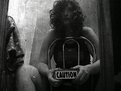
Critique By:
Aurore Lynch (K:1687)
8/22/2004 8:48:51 AM
This appeals to me for some reason (really not my type of image at all). I think the muted vintage-y colors affect me somehow. But to now contradict myself I must encourage you to get away from the consumer film! The colors can be ok, sometimes, in the right light, but are usually not great, sharpness is less than ideal, and the grain is always hideous. Probably an effect of the film being tweaked for 'all-purpose' imaging; i.e. it can be stored at room temperature longer, will give more acceptable results when used in different lighting, and then it is usually developed at wal-mart. I don't shoot much color but if I did it would be Kodak Portra 400vc or Fuji NPH 400. Gorgeous colors and spectacular grain texture. And a nice versatile 400 speed. Not sure what light they're optimized for. You can get more information via google. I buy my film at ritz/wolf or bhphoto.com.
And as it happens, I like the soap bottle included in the image. The cropped version has this look like 'I'm a snapshot but I'm trying to look like a portrait photo' which doesn't work cause there's a faucet in the background, while the original version says 'I'm just a really cool snapshot'. Personally I prefer the honesty of the original, and it's sorta kitschy, too, which always appeals to me. Crop just a little off that side, leaving the soap bottle, and see how it looks. Along with the crop you already made on the right.
And you know, if you like this square frame, you might look into medium format... heehee. You'll never go back...
|
| Photo By: Sara Cosby
(K:2704)
|
|
|
Critique By:
Aurore Lynch (K:1687)
8/6/2004 4:47:12 AM
I don't usually like glamour-type photography, half nude women, etc. But your style is fantastic. Colors really appeal to me, as well as the softness you sometimes use and the poses and expressions. Really lovely stuff. My general dislike probably just stems from the fact that these types of images are often shot by/for people who aren't so interested in quality and art. ; ) Goes to show that a good photographer can make any subject look amazing.
And I must add, being perfectly honest, that I believe your film images are far superior to the digital ones. I noticed without even realizing you used both that some images just had nicer color and grain; a smoother softer look to them. And on closer inspection, I noticed that the nicer ones were film (I have to buy some Fuji NPH now... not a big user of color, but I do know Fuji Neopan is my fav b&w). Just an innocent observation, even if it does come from a big film user...
: )
|
| Photo By: larry white
(K:368)
|
|
|
Critique By:
Aurore Lynch (K:1687)
8/6/2004 4:28:34 AM
I don't think you're crazy. I see it like you're saying we can all see from the same eyes... not that we do, most of the time, but we can, if we try. In fact, I would have assumed, had you said nothing, that you shot this for another article, something regarding universality in some way. I like the series... lots.
Are you still affiliated with Parsons (noticed the student image)? Thought about going there...
|
| Photo By: dwight Marshall
(K:326)
|
|
|
Critique By:
Aurore Lynch (K:1687)
8/5/2004 9:22:05 PM
http://www.photo.net/photodb/photo?photo_id=2584506
I fixed everything you mentioned. What do you think? Well, I know you said you didn't like the open mouth, but it's my personal favorite of all the images, so I went ahead and edited that one.
|
| Photo By: Aurore Lynch
(K:1687)
|
|
|
Critique By:
Aurore Lynch (K:1687)
8/5/2004 8:39:19 PM
Lovely. Would have made a great entry for the shadows project as well. Very nice tones and contrast. Congrats.
|
| Photo By: Petros Pavlopoulos
(K:366)
|
|
|
Critique By:
Aurore Lynch (K:1687)
8/5/2004 7:45:21 PM
Heh... plastic cameras rock. I love it when people choose to shoot 'important' subjects with their plastic... it seems some people are afraid of 'ruining' the photo. I think portraits are just fantastic with plastic. Works beautifully here. I'd love to know what film you used; the colors are beautiful. And it looks like it might be print film, which I never use for fear of dull colors. Maybe I was wrong...
|
| Photo By: Ian T
(K:114)
|
|
|
Critique By:
Aurore Lynch (K:1687)
8/5/2004 1:13:42 AM
Did you do all the effects in ps? Or do you do it all analog and then make a slide? It's hard to tell exactly what I'm looking at, but I think it's awesome anyhow. Really nice one. Brush strokes on the edge make it look like a cyanotype in tannic acid. Nicely titled too ; )
|
| Photo By: m.c. lopez
(K:14766)
|
|
|
Critique By:
Aurore Lynch (K:1687)
8/5/2004 1:10:58 AM
haha.. I like it. Is it in a mirror? Or a door frame. Lovely texture.
|
| Photo By: shelby koning
(K:5450)
|
|
|
Critique By:
Aurore Lynch (K:1687)
8/4/2004 6:10:41 PM
http://www.photo.net/photodb/folder?folder_id=285904
|
| Photo By: Aurore Lynch
(K:1687)
|
|
|
Critique By:
Aurore Lynch (K:1687)
8/3/2004 9:51:28 PM
Yeah... I'm usually my best model, since I know exactly what I want my image to look like, as opposed to having to direct a model to act/be exactly as you want them to. I tried it with my husband; what frustration! Though I do find it mildly embarassing to have so many self portraits... you should see my collection on photonet. Especially from experimenting with the SX-70, and I'm not good at setting up still life stuff. 
|
| Photo By: Aurore Lynch
(K:1687)
|
|
|
Critique By:
Aurore Lynch (K:1687)
8/3/2004 4:25:07 AM
Well, stupid me. I must have seen your mention of a pinholga, but somehow i only got the pinhole part in my mind. So I suppose that makes it easier, but can imagine that it's still not exact (any more so than a standard holga, lol).
I do use sheet film for my pinhole, but I haven't used it in awhile because i don't have space in my new house for the darkroom : ( I suppose I should see about having it processed in a lab; they'd probably have something for me to transport it to them in, and I have a changing bag somewhere...
I tried to make my pinhole very useful, in that it can be opened or closed to change the focal length and effective aperture. Think of a box made of two equal sides, one fitting into the other. Fully closed, it's wide angle, fully extended, it's more 'normal', but with longer ss. I meant to figure out the frame somehow and construct a viewfinder, but never got around to it. Though a sheet of wax paper and a dark blanket can be used too...
Perhaps in light of circumstances I should look into getting a pinholga myself...
|
| Photo By: Kym Skiles
(K:1520)
|
|
|
Critique By:
Aurore Lynch (K:1687)
8/3/2004 1:33:21 AM
Very cool. The colors are great, I thought it was cross processed looking at the thumbnail. Although I don't like the skin tone of her chest/neck/face... it looks too realistic and clashes with the other more painterly colors. Very nice composition for a pinhole. Do you have some way of previewing the image first? My pinhole is a box made of black matte board, I can't imagine trying to figure out the frame lines.
|
| Photo By: Kym Skiles
(K:1520)
|
|
|
Critique By:
Aurore Lynch (K:1687)
8/2/2004 8:07:57 PM
See above where it says I'm bored? Really... I'M BORED!! lol. I don't have a darkroom anymore *sobbing*. So, where can I play? I can't do my fun alt. processes cause I can't make contact negs... I can't even play with polaroids cause my 180 was stolen!!
But don't worry, this isn't art for me. I don't know why, but it just can't feel any pride in stuff like this. It's not snobbery, but maybe psychological; I could never put this in a portfolio and present it as something I created. Photoshop feels like cheating, I guess. I know I sound like a snob but can't think how to express it. If you'll excuse me from sounding goofy, I think it's just a lack of 'soul' in the image. I make images and it feels like a little part of me is forever in those images, but not with photoshop...
|
| Photo By: Aurore Lynch
(K:1687)
|
|
|
Critique By:
Aurore Lynch (K:1687)
8/2/2004 7:54:55 PM
you know, on viewing them together, i don't like the second one. This is better, i think...
|
| Photo By: Aurore Lynch
(K:1687)
|
|
|
Critique By:
Aurore Lynch (K:1687)
8/2/2004 7:47:58 PM
How's this?
|
| Photo By: Aurore Lynch
(K:1687)
|
|
|
Critique By:
Aurore Lynch (K:1687)
8/1/2004 12:45:19 PM
Usefilm lets you choose between 1s and 5s but I would say this was maybe 3 seconds. They were about 3-4 feet from a small fire (between us), and I was shooting at f/4 with iso 400 film (which I pushed a stop). I shoot almost always with available light and often in low-light conditions so I supposed it is just habit for me now, setting my body to be as steady as possible. Somebody once asked me why I stood so funny with the camera to my face, that I looked defensive. I tuck my arms in, and squished the camera to my face, and brace my body. I believe I sat down for this shot, so probably tucked my legs close into my stomach and put my arms on my knees. The diana can be especially hard to hold still since it weighs so little, maybe 6 ounces.
I agree about the tone, thanks. The brown just doesn't look right. It's hard to say though when it's your photo... takes a little time away before you view it again...
|
| Photo By: Aurore Lynch
(K:1687)
|
|
|
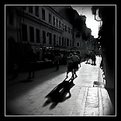
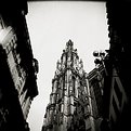
Critique By:
Aurore Lynch (K:1687)
8/1/2004 7:22:04 AM
Oh that's amazing... I thought of belgium before i even saw the title. Beautiful contrast and perspective. I would have liked to see this with more focus fall-off, this image is perfect for the effect. But, you can't control that, although you might consider getting a diana if you don't have one for these situations, i think the falloff is more pronounced. you put it in the blurry image project but it doesn't look blurry... are my eyes bad?? It could be fun to add some interest to the sky somehow... so many ways to do it even if you don't want to ps it... liquid emulsion could be a way to go.
Well, regardless of my picking, i think it's beautiful as it is. well done.
|
| Photo By: Kym Skiles
(K:1520)
|
|