|
|
Critique By:
Halid Izzet (K:373)
1/19/2003 3:28:49 PM
Thanks Ashley,
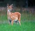
this is using a technique called Panning. Choose a relitively slow speed - try with 1/30th and 1/60th and follow the horse in the viewfinder as it approaches the jump. When its at the position you want, click the shutter release. it should be a smooth action and you should keep the camera trained on the horse even after shooting (like a cricket bat after hitting the ball)
hope it helps
halid
ps Visit my website for more www.thephotofinder.com
|
| Photo By: Halid Izzet
(K:373)
|
|
|
Critique By:
Halid Izzet (K:373)
10/28/2002 2:41:27 PM
thanks Terrance
|
| Photo By: Halid Izzet
(K:373)
|
|
|
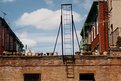
Critique By:
Halid Izzet (K:373)
6/12/2002 10:18:28 AM
Laurent,
This is a nice subject, and tells a story. Someone trying to make up for a much wished garden in my opinion.
The ladder is useful for the composition. I would have forgotten about the right building and put the ladder in the right third part of th eframe. For me its slightly too central as it is.
It would be nice to hear / read what you feel about the picture.
Halid
|
| Photo By: Gaudy
(K:0)
|
|
|
Critique By:
Halid Izzet (K:373)
6/7/2002 6:20:55 AM
Thanks David,
It was in Photoshop, but really very very simple to do. I figured that the red is the most important part of the picture, and so would benefit from being emphasised, and the skin tone would even complement it is increased too.
Halid
|
| Photo By: Halid Izzet
(K:373)
|
|
|
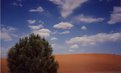
Critique By:
Halid Izzet (K:373)
5/17/2002 1:20:03 AM
I love the sky here "Gaudy" , and the smoothness of the sand. Was a polorisor used for the sky ? The clouds at the top centre really draw your eye into the centre of the picture. The main "subject" of the image (to my eye) seems to be the shrub which is a little soft. This could be the scan, or it could be intentional, but I would probably have used the maximun depth of field and kept it in focus.
Great to see you're first photo ! Hope to see many more.
Welcome to the club !!!!!
Halid
|
| Photo By: Gaudy
(K:0)
|
|
|
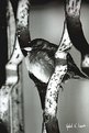
Critique By:
Halid Izzet (K:373)
5/15/2002 5:14:21 AM
Thanks for the comment Kim,
I think the smoothness of the background and the harshness of the rusting metalwork is a good contrast. The scan is a touch darker than the print I have.
Halid
|
| Photo By: Halid Izzet
(K:373)
|
|
|
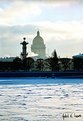
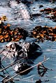
Critique By:
Halid Izzet (K:373)
5/15/2002 5:10:09 AM
Thanks Petros,
I actually don't see the tilt though. I even measured the principle line of the stone wall in the centre and its spot on. There are however many lines from the shadows and the steps comming down into the frozen water, which could be deceiving. Take another look and let me know if you disagree.
Thanks for commenting,
Halid
|
| Photo By: Halid Izzet
(K:373)
|
|
|
Critique By:
Halid Izzet (K:373)
5/15/2002 5:03:25 AM
Thanks Koen,
The lighting is completely natural, no reflectors, nothing. Quite hard sunlight that day, but it was the underside of the leaf, so it was only reflected fron the ground (lightish stones). I'm back in Cyprus next week, so I'll be looking out for another opportunity. I'll try putting a white reflector nice and close. Unfortunalely (and very infuriatingly) , my lab sliced a nice cut through this negative. The best I cold do was to get a scan of the 10x15 print which is not ideal. That's why I want to re-do it, and improve on things.
Talking of going to Cyprus, If anyone wants to see a picture of anything specific, let me know and I'll give it a shot. I'd quite like a mini-objective out there.
Halid
|
| Photo By: Halid Izzet
(K:373)
|
|
|
Critique By:
Halid Izzet (K:373)
5/13/2002 5:54:55 AM
Thanks Simon,
You've convinced me ! I think your version is stronger.
I'll get to croppong the original !
Thanks
Halid
|
| Photo By: Halid Izzet
(K:373)
|
|
|
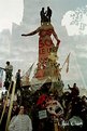
Critique By:
Halid Izzet (K:373)
5/8/2002 2:53:53 AM
Thanks very much for your comments Tony. This image is a double expo of the statue with hundreds of people on and around it, and a tree against which there is a protest board. I liked the confusion and chaos created by the image but with the message of the protest showing through It seemed, for me, very representational of the moment. I accept that an editor would never accept this (a little more chance perhaps in a very arty rather than current affairs publication). I have a picture of just the people at th etop of the statueon thir own, but felt that there was no setting, which i think is important is photo journalism. I like your ideas of looking out for different views (windows etc).
this was my very first journalism / reportage piece of work. so although I'm pleased with it, there is plenty of room for improvement !!
Thanks so much for your comments. Its great to have specialists like you commenting !
|
| Photo By: Halid Izzet
(K:373)
|
|
|
Critique By:
Halid Izzet (K:373)
5/7/2002 4:11:14 PM
Heres another one. I think the composition is more interesting here. I hope you dont mind my messing about a little Michael !!
Halid
|
| Photo By: Michael Busselle
(K:221)
|
|
|
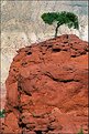
Critique By:
Halid Izzet (K:373)
5/7/2002 4:07:27 PM
I thought you'd like to see what its like in portrait mode, and with the blue sky.
What do you think - I really am not sure which is best- I like them all !!
|
| Photo By: Michael Busselle
(K:221)
|
|
|
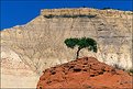
Critique By:
Halid Izzet (K:373)
5/7/2002 10:43:35 AM
Thanks very much for posting this Michael,
I agree with you about the blue, but I think this has a stronger composition ! I prefer this image. You can really get a feel for the texture of the red rock. Fantastic - Well done,
Halid
|
| Photo By: Michael Busselle
(K:221)
|
|
|
Critique By:
Halid Izzet (K:373)
5/7/2002 6:48:26 AM
beautiful simplicity and wonderful colours. Do you have a version in Portrait mode ?
Halid
|
| Photo By: Michael Busselle
(K:221)
|
|
|
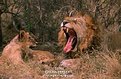
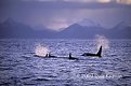
Critique By:
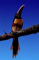
Halid Izzet (K:373)
5/7/2002 6:44:00 AM
Aman aman !!!!
Suha - Brilliant ! Beautifully composed, and great timimg. How close to you manage to get before disyturbing them (and HOW do you get so close ? Do you always use slides ?
Halid
|
| Photo By: Suha Derbent
(K:514)
|
|
|
Critique By:
Halid Izzet (K:373)
5/7/2002 6:36:14 AM
Thanks Koen, I appreciate the fact that you went to the trouble to see all 6 photographs. There is not an easy way to expose a series of more that 3 photos on the site without referring people to your portfolio.
Note to the editors - Perhaps a section for Reportage could be incorporated where several photos depicting a story could be grouped together ???
|
| Photo By: Halid Izzet
(K:373)
|
|
|
Critique By:
Halid Izzet (K:373)
5/6/2002 6:46:18 AM
I would tend to agree about the lock of hair in the top right - doesn't bother me at all. But the thumb, I'm afraid, does ! As Phillip said, it almost looks disjointed. Thats the only weakness I find. Lovely softness. Did you use a soft focus filter ? A little question from a relitively inexperienced portrait photographer - What is the difference between the effects you can get from
1 a short focus filter,
2 Slightly throwing the image out of focus at the time of the shoot
3 any effects in photoshop ? (which tool to use?)
Halid
|
| Photo By: Arthur John Grossman III
(K:1214)
|
|
|
Critique By:
Halid Izzet (K:373)
5/3/2002 3:36:05 PM
This is just superbe !! Its like one of those psychological pictures - Do you see the curved hip and buttock on the left os a torso on the right. At first all I could see was the buttock. Maybe I'm tired, but I love it !!!
Halid
|
| Photo By: António Vieira
(K:122)
|
|
|
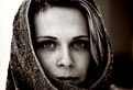
Critique By:
Halid Izzet (K:373)
5/3/2002 3:30:16 PM
Ok Guys ! I think the message is clear, I wont touch a single pixel ! thanks for all your comments. I just wish you could see the original print though ! This is a portrait of my girlfriend(as you might guess if you've seen some of the other portraits in my portfolio). She has bright bright pale blue eyes, and with the Russian Snow, they became almost grey !!! She didn't like the similarity I made to a wolf - so I take it back and replace it with Husky !!!
|
| Photo By: Halid Izzet
(K:373)
|
|
|
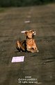
Critique By:
Halid Izzet (K:373)
4/30/2002 4:32:53 PM
Thanks Kim.
It was some old equipment that I have since replaced.
Olympus OM10 body with a 70-200 tamron lens. If my memory serves me correctly, I think it was an f8
Halid
|
| Photo By: Halid Izzet
(K:373)
|
|
|
Critique By:
Halid Izzet (K:373)
4/30/2002 4:15:34 PM
Thanks Suha,
the only thing is , that everytime I look at this photo, I just wish I had taken another with the head more centre picture ! I love it but it annoys hell out of me !!!
I like your Website by the way ! I can't get the video to work though.
Halid
|
| Photo By: Halid Izzet
(K:373)
|
|
|
Critique By:
Halid Izzet (K:373)
4/30/2002 3:50:17 PM
Thanks for the comment Howard. I think you are right - it works very well in B&W too. There is a certain smoothness in her skin which is emphasised with the monochrome.
Halid
|
| Photo By: Halid Izzet
(K:373)
|
|
|
Critique By:
Halid Izzet (K:373)
4/30/2002 3:41:29 PM
Fantastic images Suha,
This is a particular masterpiece !
Do you sell your work ?
Tebrik ederim !
Selam, Halid
|
| Photo By: Suha Derbent
(K:514)
|
|
|
Critique By:
Halid Izzet (K:373)
4/30/2002 10:39:06 AM
Thanks Barry, and thaks everyone else for the comments.
I'm honestly not sure of the need for highlights in the eyes though. The thing I find most appealing is the fact that her eyes are in themselves very illuminous, (almost like a wolf) and so don't need the artificial addition. The power behind her look is sooo much stronger in the original, I assure you.
I really appreciate all your comments - thanks again,
Halid
|
| Photo By: Halid Izzet
(K:373)
|
|
|
Critique By:
Halid Izzet (K:373)
4/28/2002 11:45:19 AM
I agree with Maggies comments, and would add that , for a pack shot, you really need to be HYPER selective with the bottles. It looks like the label of the left bottle is squint or the ground is not flat. Either way, as a Brand Manager, I would not choose this photo because of it.
I also feel that the black background is an opportunity missed for communicating an atmosphere for the brand.
Personally, I use two types of pack shots - The 1st - Just the bottle, and absolutely NOTHING ELSE, taken head on lense at the height of the centre of the main label. This is for placing on posters, billboards etc. The definition, clarity and colours need to be absolutely PERFECT. No defaults are acepted.
The second type are what I call "ambiance" photos - this is the bottle put in a setting. The angle taken can be more varied, with close ups on the label etc. The atmpsphere HAS to be desirable for the targetted consumer. This is where the marketeer communicates the brand territory and created a DESIRE for the product. Personally, I dont "feel" the ambiance you wanted.
Just my honest opinion, but I hope it helps,
Halid
|
| Photo By: Jason McClendon
(K:19)
|
|
|
Critique By:
Halid Izzet (K:373)
4/28/2002 11:13:12 AM
A very beutiful image Steve.
My only gripe would be that I feel the signature is far too large and far too "in the picture". If you really feel you have to include it, try a smaller font, and place it more in the corner. As it is, it really disctracts from the subject.
JMHO,
Halid
|
| Photo By: Steve Kaufman
(K:2748)
|
|
|
Critique By:
Halid Izzet (K:373)
4/28/2002 4:06:54 AM
I'm very very very very jealous !!!
Halid
|
| Photo By: Steve Chandler
(K:0)
|
|
|
Critique By:
Halid Izzet (K:373)
4/26/2002 3:28:18 AM
This is just fantastic !!!
How How How ?
We are all waiting to know !!!!!
Halid
|
| Photo By: Arthur John Grossman III
(K:1214)
|
|
|
Critique By:
Halid Izzet (K:373)
4/23/2002 7:58:05 AM
Thanks Ian,
In fact this photo was touched up in PS. The original background was very grey, the bird even more underexposed and a branch creeping into the top right corner. Its my first real PS piece of work and am quite happy. The blue sky is just two shades of blue merging into each other.
I'll post the original when I get home for comparison! (If my boss catches me surfing now she'd probably fire me !!!)
Thanks for the comment
Halid
|
| Photo By: Halid Izzet
(K:373)
|
|
|
Critique By:
Halid Izzet (K:373)
4/22/2002 4:33:04 PM
Oups !!! forgot the attatchment czech-box !!!!! Sorry - that was awful !!! he he ;-)
|
| Photo By: Halid Izzet
(K:373)
|
|