|
|
Critique By:
Nick Karagiaouroglou (K:127263)

12/31/2009 5:15:20 PM
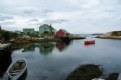
And what a view it is, Dave! The very strict palette, remaining on blue hues, seems to really describe the essence of the view. I think that even the reflection if the window in the top right of the image manages to still remain a part of it just because it stays in the blues in such a great DoF!
There is an excellent sense of the horizon and also a good sense for the shadows here. The image looks so very "alive" and "real", and it manages to convey the look and feel of "beeing there", "seeing all that with the own eyes". Some tiny amounts of oversharpening here and ther can't change the vivid character of this one.
Nick
|
| Photo By: Dave Stacey
(K:150877)
|
|
|
Critique By:
Nick Karagiaouroglou (K:127263)
12/31/2009 5:01:49 PM
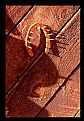
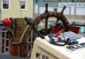
The extreme contrasts are indeed an eye magnet, Stan, but I think that they are exaggerated on the image. It is too much for my eye. But the good palette of gues is geat! Especially when they stay in the tune of the image and do not deviate from the main theme. Those great ornage tones really make it, even if there are some hard clipping effects and light exaggeration, here. The way the horseshoe looks is a bit too much for me. It has its charms as it looks as if was just taken from the fire, but for this kind of image... It gets a bit too much for me.
Nick
|
| Photo By: Stan Hill
(K:35352)
|
|
|
Critique By:
Nick Karagiaouroglou (K:127263)
12/31/2009 4:45:08 PM
You know Stan, I definitely know that with men like you the new generation will surely have something good to make it a good everyday there, or anywhere else on this world. To say that I admire such guys like you would be a real underestimation.
Cheers and keep en eye on those youngsters, ey? BTW, just out of curiosity, do they wonder, now and then, what that man might be doing by pressing this and that button on that camera? Just out of curiosity, that is.
To all of you,
Nick
|
| Photo By: Stan Hill
(K:35352)
|
|
|
Critique By:
Nick Karagiaouroglou (K:127263)
12/31/2009 4:36:38 PM
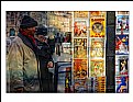
The mixture of real world with some kind of "comics scene" is exceptionally strong here, Malules! It is an everyday scene and yet also some picture of a comics novel, and the sharpness swings back and forth between reality and some imaginative place. There is some oversharpening on the area of the many different postcards (or whatever they are) on the right half of the image, but this seems to introduce exactly that "imaginative element". BTW, the way you remain so strict on the orange hues adds something more to this one.
The attenuations of light on the "real" left half is a bit extraneous to me. Did that really have to be?? :-/ In the technical sence it is exactly because of that, ahy I can't really see more of your original exposure. or was it aölready the original?
Cheers!
Nick
|
| Photo By: Malules Fernandez
(K:54810)
|
|
|
Critique By:
Nick Karagiaouroglou (K:127263)
12/29/2009 11:25:44 PM
The exposure balance is very good, Dave, and I guess that it was taken with a flashlight, wasn't it? So, considering this alone it is a very good one. All colors and gradients retained a very natural look and feel but also have a somewhat more "glossy attitude" that fits the overall celebrating atmosphere.
The compositions is also OK for me. Perhaps not sophistiated to the endth degree but the concentration in the main actor here works well and also allows much insight into the scene that actor was in.
The problem to me is that the details are better on the background tha on the actor. The textures of the tree are so great, but on the dog itself they seem to degenerate systematically as we proceed from its body toward its face. I guess that it is more clipping than anything else. Buring the dog a bit more it looks better to me. (Attachment.) So perhaps the flashlight could be better adjusted here?
Cheers!
Nick
|
| Photo By: Dave Stacey
(K:150877)
|
|
|
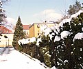
Critique By:
Nick Karagiaouroglou (K:127263)
12/29/2009 10:38:27 PM
Now, if that Santa could be a real burglar, Ania! Still the climbing silhouette does bring tension in the otherwise quite "milky" look of the rest. I keep that in mind and return to that after a couple of lines.
There is much to be aware of on this one, and the general idea was good too. It is only that the shot itself didn't exploit the total potential. The good exposure for that sense of winter and unclear atmosphere under snow is present, and the attenuations of sharpness do tell the overall look and feel. That's quite sure.
It is the composition, on the one hand, that still remains a bit "unfinished". Not just "raw" in the sense of busy but just unfinished. Some of the many sudden cuts would be good to have, but all of them together... they let it also get some kind of "snapshot-attitude", which contradicts the atmosphere that it looks you wanted to capture. In other words it looks as if you would like to have a somewhat "contemplative" one and you got a quick one instead, or vice versa. I think you should start taking time for composing.
On the other hand, though the scene could provide such a strong subject for an image, you seem to prefere to make it quite trivial. It could also contain a real deep ironical component but you stopped at the stage of "cheap humor". OK, somebody´s decoration and it started snowing... and then? Don't get me wrong, I could really get both thing form your idea - photographical and also satirical excitement, but for this to happen, the potential has to be exhausted.
Technically, the lack of contrast only enhances the latent atmosphere. It just needed a bit more power to let the atmosphere raise from the realms of latency. Thanks heavens they will keep Santa hanging for some more days and it will be snowing for some more days too.
Cheers!
Nick
|
| Photo By: Ania Zielińska-Hoşaf
(K:61374)
|
|
|
Critique By:
Nick Karagiaouroglou (K:127263)
12/28/2009 11:03:45 PM
As I told you, Ania, the "pixelosis" didn't came because of "downsizing the image in another program". (Except of course if you did the whole downsizing algorithm manually by selecting single pixels and arranging them as needed. ;-)) The problem here is an excess of sharpening - who knows in which step it came in.
In general, downsizing is a piece of a cake. You just get your imaging software, adjust the new dimensions and click "OK". That's all. Remember, downsizing is easy. Upsizing is another story. ;-)
Oh, and another hint. When uploading make sure to check the option "No sharpening" on the input page of UF. Or else it seems that the automatic processes of UF will do the amount of sharpeing that you checked. Which means that that option is not meant as an input about how much sharpening you already did, but rather as an option about how much *additional* sharpening you would like to have automatically from the upload processes of UF.
Cheers and keep on going.
Nick
|
| Photo By: Ania Zielińska-Hoşaf
(K:61374)
|
|
|
Critique By:
Nick Karagiaouroglou (K:127263)
12/28/2009 10:55:46 PM
You are very welcome, Ania!
About the unnecessary piece of the armchair, I guess that it doesn't "belong" there on the one hand, but on the other hand cropping as much off, as to have it completely off image would cut also too much of out protagonist here. So, if it about cropping then, let's say something like the attachment.
But when such cropps seem to be necessary for the image, then the even more important conclusion is something like "reverse engineering". It means that there has been place for an even better composition. So we keep that in mind as a hint for the next shots.
The flashlight effect is indeed visible here but as you say it did a good work in this case. It somehow put some enhancement on the main subject, even if the main subject covers almost the whole image. Somehow the whole image got a "glossy" appearance which fits well the celebrating package of the gifts.
Cheers!
Nick
|
| Photo By: Ania Zielińska-Hoşaf
(K:61374)
|
|
|
Critique By:
Nick Karagiaouroglou (K:127263)
12/28/2009 10:46:04 PM
Oh yes, now I see it and now I understand, Stan! Thanks to your info about the shot. Yes, the angle and the f/3.5 were ideal for that effect we see here. Thank you for telling me. BTW, I could imagine that as a method for portraits that are somewhat different than average.
As about christmas and new year, thanks a lot, though I don't cope with such things at all. They never said anything to me, but I do thank you for the wishes. And I wish you too (and especially the whole team of young bandids there ;-)) a great time, be it christmas, new year, whatever day and anything at all.
Cheers!
Nick
|
| Photo By: Stan Hill
(K:35352)
|
|
|
Critique By:
Nick Karagiaouroglou (K:127263)
12/28/2009 10:21:58 PM
You got a very good amount of fine details and also such a good exposure balance despite the hard light conditions here, Dave. The absence of noise at ISO 400 is pretty much an achievement for itself too. The good gradients kept again such a nice feel for the 3-dimensional attitude of the image but especially with those details everywhere, from highlights to shadows, the image almost went HDR. I am not as enthousiastic about composition but it is still a very solid and well done work!
Nick
|
| Photo By: Dave Stacey
(K:150877)
|
|
|
Critique By:
Nick Karagiaouroglou (K:127263)
12/26/2009 7:57:19 PM
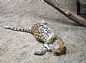
Though I am certainly no fan of such "sweet" images, I have to admit that you did it very very well, Ania. The subject is not really my case, I sincerely accept that. But this is not important when the implementation of the idea has worked so well like it did here. In other words, let's look for examle at the fine(st) details of the fur of the cat in the low lights and at the same time at the fine(st) textures of the highly reflective red band. Alone this is pretty much an achievement in exposure balance, not to speak about the well preserved gradients that tell us so much about the anaglyph, the 3D-sense of the scene. (One of the hardest disciplines of photograohy at all.)
BTW, did you use a flashlight here? If so, then... you used it very very well! After so many tries with a flash I couldn't post any image that even comes close to this one, really.
Timing and subject are up to anybody´s gusto, but the thing is: You got it so well done, so perfectly descriptive. And it should be noted here that I find such images (most of the time) quite boring. But my personal sense of "interesting" or "boring" is nothing in front of a good shot, no matter what the subject is.
Only one thing puzzles me a bit: Do you think that the wooden brown left edge is OK this way? What happens if we crop it off image? (Attachment.)
Anyway, the cat explores the gift, and I explore a good image. I am luckier, that is.
Cheers!
Nick
|
| Photo By: Ania Zielińska-Hoşaf
(K:61374)
|
|
|
Critique By:
Nick Karagiaouroglou (K:127263)
12/26/2009 7:40:31 PM
This was not "a bit of harm", Ania. This was... you executed it literally! You killed it by oversharpening! Normal downsizing doesn't do the criminal work that is visible on your posting. Thanks heavens you still have the original, which was far better than your posted one. It perhaps needed a *slight*, I repeat *slight* sharpening and not the overkill you applied, ey? ;-) On your original I see vision and ideas! The posted one is... well, much less than your original shot. And this is very good! For it shoes that you can do great work by just forgetting about senseless sharpness exaggerations.
So, now we can talk about good focus and also DoF in the photographical sense - not in the sense of insatiable lust for "sharpness" of our digital days. This is a long story and so we leave it aside for now. But beware the good, smooth but still so very definite lines of contours on your original shot. Compare them to the stair-stepping-jigsaw effects on the same lines on your post. (Look carefully, not with the quick "coarse" eye of photoshopography.) Then you will see why you overshot.
The original, for which I thank you so much, is far far superior to your post. A tiny bit of sharpness tickling was (perhaps, only perhaps!) necessary. (Attachment.)
I wouldn't take the time to examine it so closely if I wouldn't have this direct experience of your still latent talent, Ania. I see it in you tendencies and your visions on your images. But you see, talent alone may be some kind of "natural bless", but it needs to be cultivated. And this is not a subject of "modern myths" or anything else like that. It is just, take your camera, and shoot, and when you prepare the image for an upload remember real world. Except of course in case you want something less physical, but in this case it was not your intention, or was it?
Waitzing for your next steps. Continue. Cheers!
Nick
|
| Photo By: Ania Zielińska-Hoşaf
(K:61374)
|
|
|
Critique By:
Nick Karagiaouroglou (K:127263)
12/25/2009 7:29:29 PM
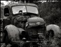
And indeed here I see the car moving, Andre, and mooving fast and furious. I am not so sure about the reason for thatbut I think that it does have to do with the standing people there and even with the branches too. They seem to enhance the difference between the standstill and the motion in some way. Stange how some additional element may change the overall perception, isn't it?
The good sense for metalic glare in such a contrast against the matte earthy colors of the ground makes the car look not only fast but also special in its look. The reflections on it are responsible for this, I guess.
Cheers!
Nick
|
| Photo By: Andre Denis
(K:66407)
|
|
|
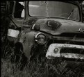
Critique By:
Nick Karagiaouroglou (K:127263)
12/25/2009 7:02:27 PM
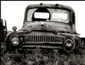
Very well done again, Andre! The exposure balance remained as exactly working as on the other ones too, and in this case the great amount of details and surface textures makes complete usage of it in order to appear interesting, real and in such a variety. We have every conceivable surface here from the almost still new a posished chrom rings around the lights to the completeley rusted parts elsewhere. This add much tension and contrast too.
The same good exposure balance allowed the truck to appear so well 3-dimensional sinse all gradients are present and strong. One can really see the anaglyph and so also the times in which the truck must have been produced. It really smells after the fifties, I would say. Perhaps even earlier.
A very nice protrait of the old thing again. Perhaps quite a "frontal" composition but I think that in this case the documentary character gets further enhanced by the unspectacular angle and perspective.
Cheers!
Nick
|
| Photo By: Andre Denis
(K:66407)
|
|
|
Critique By:
Nick Karagiaouroglou (K:127263)
12/25/2009 6:43:16 PM
It certainly does get the "nostalgic" look and feel, Andre! I think that exactly the fact that some of us had his joy and prode from something as "trivial" as a truck speaks for itself. It is finding so much in everyday life rather than waiting for the extra-super-hyper thing to happen.
Cheers!
Nick
|
| Photo By: Andre Denis
(K:66407)
|
|
|
Critique By:
Nick Karagiaouroglou (K:127263)
12/25/2009 6:40:35 PM
Exactly, Andre! It is something that can touch us in a more direct way, since we all cope, more or öess, with the same problems, hopes, or even sorrows and fears. It may even be much like imagining something that the owner of the truck said, or some day in his life, etc. Purely imaginative of course, but also familiar.
Nick
|
| Photo By: Andre Denis
(K:66407)
|
|
|
Critique By:
Nick Karagiaouroglou (K:127263)
12/25/2009 6:33:22 PM
The exposure balance and the DoF turned the image to something that one could even touch, Ania. The sense for stone and material textures is incredibly strong here, a fact that provides also enough power and dramatic appearance along with the perspective. The latter enhances the look and feel so well!
The composition has some flaws in the sense of such sudden cuts on the sides and the details exhibit the bafavior of oversharpening, which one can see on several contours as a stair-stepping effect. This diminishes again the natural look of stone, but the hues seem to correct at least a part of that visual behavior.
Cheers!
Nick
|
| Photo By: Ania Zielińska-Hoşaf
(K:61374)
|
|
|
Critique By:
Nick Karagiaouroglou (K:127263)
12/25/2009 6:25:25 PM
Hopefully there is enough snow when youn try again, Ania. I did check the original and it was exactly what I took into account considering that "playing in PS". It doesn't make any sense to try to "salvage" unseccesful shots by faking them one or the other way.
Cheers!
Nick
|
| Photo By: Ania Zielińska-Hoşaf
(K:61374)
|
|
|
Critique By:
Nick Karagiaouroglou (K:127263)
12/25/2009 6:22:48 PM
What kind of measuring of focal length is that, Ania? 2:p??
Cheers!
Nick
|
| Photo By: Ania Zielińska-Hoşaf
(K:61374)
|
|
|
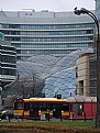
Critique By:
Nick Karagiaouroglou (K:127263)
12/25/2009 6:18:32 PM
Good for the sene of motion and a bit of "dizzy", Dave, but still I think that this one is problematic. It could fit your concept to get the spinning carousel along with more of the scene to the left and/or to the right. This could also eliminate the sudden cuts of objects on the right. But what I find really strange is that though the motion blur is so strong on the revolving objects/kids, the lights exhibit a much weaker behavior of that blurring. Or was perhaos the ceiling not moving with the rest of the carousel?
Cheers!
Nick
|
| Photo By: Dave Stacey
(K:150877)
|
|
|
Critique By:
Nick Karagiaouroglou (K:127263)
12/25/2009 6:13:27 PM
And beautiful thanks, Marta!
Cheers!
Nick
|
| Photo By: Nick Karagiaouroglou
(K:127263)
|
|
|
Critique By:
Nick Karagiaouroglou (K:127263)
12/25/2009 5:58:26 PM
Very good portrait and quite a good timing for that, Stan! Again the boy looks a bit like thinking of his next... eerrrm, say a somewhat "rebellious" action. ;-) The details and the gradients are very well formed on the image. For some reason I have the impression that his face is not as well within the DoF but this seems to be due to the extended parts with not so many details, like for example the cheeks. But looking a bit close one can also see the texture of the skin. Add the nice skin colors (which are so hard to get right) and so the portrait is quite a successful one, I must say.
Cheers!
Nick
|
| Photo By: Stan Hill
(K:35352)
|
|
|
Critique By:
Nick Karagiaouroglou (K:127263)
12/25/2009 5:44:04 PM
Another very good one of that place, Dave! The only thing that bothers me a bit is the missing tip of the front part of the boat and the sudden cut on the stone. I guess you could have either too much of the one or too little from the other from that angle. But the stone can be also cloned off easily without affecting the look and the atmosphere. Especially nice I find the many good details again, as also the rather "loaded" sky. Some small amount of underexposure might have anhanced the dramatic look of the latter, but of course it is questionable what would have happened to the houses then. So, the exposure balance is good as it is.
Cheers!
Nick
|
| Photo By: Dave Stacey
(K:150877)
|
|
|
Critique By:
Nick Karagiaouroglou (K:127263)
12/10/2009 9:03:47 PM
I also didn't really adjust it, Stan! I only opened the image in PS under my color profile and... voila! It changed without any kind of my own intervention. And this is what I think should be clarified a bit. The influence of the color profile. It seems to affect not only PS and other imaging software but also the way images are shown in browsers... I must get some more info, since I really don't know if you all see the images the way I see them on my monitor. :-/
As about Marty, one can really see that he considers such things very critically. Which is of course the best way to go.
Cheers!
Nick
|
| Photo By: Stan Hill
(K:35352)
|
|
|
Critique By:
Nick Karagiaouroglou (K:127263)
12/10/2009 8:43:20 PM
Hi Andre!
You master that key better and better from what I see. And so I am glad for any of your future uploads. You do variate and deviate and try this and that out, but that "touchable" quality reamains. And also some vague kind of a "quiet documentary attitude" on most of your images.
Cheers!
Nick
|
| Photo By: Andre Denis
(K:66407)
|
|
|
Critique By:
Nick Karagiaouroglou (K:127263)
12/10/2009 8:40:42 PM
They are indeed pieces of history, Andre. I couldn't say that any better. And they are also pieces of a not so "widely known" history. It is about the personal lives that were affected by and connected to them, I guwss, and so I can only find it great that you notice such pieces and present them to us. Such things might contain more humanism than all the monuments on this world taken together. ;-)
Well, in the meanwhile such images surely carry a big part of your personal signature. And I do also think that keeüing them on the "darker" side of things is the way to go here. Or just imagine such a truck in the middle of colorful gardens and sweet trees... it might also look good but the character of documenting would be lost, I guess. And with it also a big part of all dreams and fears of the people behind the truck (or any other object).
Cheers!
Nick
|
| Photo By: Andre Denis
(K:66407)
|
|
|
Critique By:
Nick Karagiaouroglou (K:127263)
12/10/2009 8:20:04 PM
Great idea and such a good partail DoF that enhanced the object of interest, Dave! Apart from some little "diffuser" look of the upper left part of the steering wheel the whole cockpit looks really good, crispy in details and also very rich in typical colors. The background supplements the main subject in a well fitting way too - it somehow enhances the whole nautical look and feel by confirming that it is a harbour!
The materials of the different parts, wood and metal, kept all their own character and since the sense for depth is so good over the whole image, I also have a very solid impression of the object.
Good work!
Nick
|
| Photo By: Dave Stacey
(K:150877)
|
|
|
Critique By:
Nick Karagiaouroglou (K:127263)
12/9/2009 9:28:16 PM
From what I can see, or better from what I can imagine, it must have been quite a good one in terms of an exposure balance that reveals the "white" of the winter, Ania. And also the attitude of "cold" and windy. Adding the good composition, as I imagine it on the original, it seems to be a real "wintery" one in the sense of a more "urban" look and feel.
But... this is not a photo. The way it stands in front of my eyes, it reminds me rather of some teenager's cheap and incompetent way to cause sensation at any cost. And the ovious reason for that maskarade is... the limited quality of the original, or isn't it? It has a good idea for an angel and prespective but that is all. You must try it again.
Nick
|
| Photo By: Ania Zielińska-Hoşaf
(K:61374)
|
|
|
Critique By:
Nick Karagiaouroglou (K:127263)
12/9/2009 9:11:03 PM
OK- Check it and tell me if you found it.
Cheers!
Nick
|
| Photo By: Ania Zielińska-Hoşaf
(K:61374)
|
|
|
Critique By:
Nick Karagiaouroglou (K:127263)
12/9/2009 9:08:05 PM
Well, if you can get such images with this camera now, Ania... I will really have to keep on watching your work when you get an SLR...
So, let's see.
Nick
|
| Photo By: Ania Zielińska-Hoşaf
(K:61374)
|
|


")