|
|
Critique By:
Steven vanHaaster (K:888)
3/23/2008 3:02:43 AM
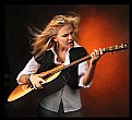
Hey matt. Thanks for the comment. I had a lot of fun shooting you guys. Shoot me an email if you ever have any questions or crazy ideas you want to talk about.
Cheers
Steve
|
| Photo By: Matt Pals
(K:1722)
|
|
|
Critique By:
Steven vanHaaster (K:888)
2/19/2007 6:45:05 AM
Hello John
Thank you for your comment. I agree with you on the fact that it looks processed. I originally shot it on a white seamless but the white was covered in black scuff marks and it took a lot of processing in PS to bring up the levels over the black marks. The kid was never removed from the BG and what you are seeing is the original BG but with about 5 screen layers. I purposely shot the image to blurr out the kid a little as i was trying to sell the bucket of chicken but blown up to poster size i totally agree that it is a little uncomfortable to not focus oin the kid. The reason that the kid looks cut out is because of the gausian blurr applied to one of the layers to give it that "glamourous" look to him, and the blurr is leaking out to the BG.
Thanks for the criticism.
PS. im sorry about the bike shot. i dont like it much either
|
| Photo By: Steven vanHaaster
(K:888)
|
|
|
Critique By:
Steven vanHaaster (K:888)
12/19/2006 6:08:40 PM
Usually i shoot the products infront of a white BG but this time i already had the shot from about a year ago, so i cut the image out of the shot and created a shadow. not the best way to do it but if done well it can work.
Cheers
Steve
|
| Photo By: Steven vanHaaster
(K:888)
|
|
|
Critique By:
Steven vanHaaster (K:888)
12/19/2006 6:08:39 PM
Usually i shoot the products infront of a white BG but this time i already had the shot from about a year ago, so i cut the image out of the shot and created a shadow. not the best way to do it but if done well it can work.
Cheers
Steve
|
| Photo By: Steven vanHaaster
(K:888)
|
|
|
Critique By:
Steven vanHaaster (K:888)
12/19/2006 12:05:42 AM
This is an amazing shot.
I love what you did to the tones. The light rays are amazing
Cheers
Steve
|
| Photo By: Nessa Gnatoush
(K:341)
|
|
|
Critique By:
Steven vanHaaster (K:888)
4/23/2006 8:02:23 PM
thanx lynda
I know exactly what you mean. Thats why i shot the photo, but the original diddlt look "grubby" enough so i added a textured paint to bring that out.
Cheers
Steve
|
| Photo By: Steven vanHaaster
(K:888)
|
|
|
Critique By:
Steven vanHaaster (K:888)
4/23/2006 3:31:16 AM
great color. Looks warm and inviting.
Nice work.
Steve
|
| Photo By: Lynda Wilson
(K:165)
|
|
|
Critique By:
Steven vanHaaster (K:888)
4/23/2006 3:29:35 AM
an amazing photo. The color is so vibrant.
Cheers
Steve
|
| Photo By: Todd Weeks
(K:7636)
|
|
|
Critique By:
Steven vanHaaster (K:888)
4/19/2006 3:44:12 AM
Thanx Hugo
Thank you for your critique. About the sky, it was photographed well exposed but was just a plain grey flat BG. when i decided to pull the sky i was happy with the results as it brings out the contrast of the barb wire.
Thanx for looking.
Cheers
Steve
|
| Photo By: Steven vanHaaster
(K:888)
|
|
|
Critique By:
Steven vanHaaster (K:888)
4/9/2006 12:39:04 AM
Hello Hugo
Thanx very much for your comment / critiques and personal opinion. As for the composition (cropped sides) i actually shot several different sizes and decided on tis one. I never thought about shooting it on an angle...that might have worked. I wish that i would have atleast included the rest of the point of the knife in the photo as it feels like i am cutting the head off of someone. As for the size and cropping of the image...i decided on this MCU over the wide as i felt that it told more of a story than the wide... this version seemed to give off the feeling of a couple together while the wide version just felt like an average product shot.
I added the Grainy/dusty look by adding contrast for a visually "different" look.
Thanks again for your comments i really enjoy hearing what others think and other views of my images.
Cheers
Steve
|
| Photo By: Steven vanHaaster
(K:888)
|
|
|
Critique By:
Steven vanHaaster (K:888)
3/10/2006 5:14:26 AM
This is a beautifull photo. I live the softness of the fog and the neutral color palette you went with
Cheers
Steve
|
| Photo By: Pavlo Pavlov
(K:30)
|
|
|
Critique By:
Steven vanHaaster (K:888)
3/8/2006 2:09:58 AM
Thanx again Claire.
This is a little more what i am trying to get across. Something good in a seemingly dark demonic place.
Thanx for your comments
Cheers
Steve
|
| Photo By: Steven vanHaaster
(K:888)
|
|
|
Critique By:
Steven vanHaaster (K:888)
3/7/2006 6:49:46 PM
Thanks Claire
I do agree that i do need to do something with the contrast of the B&W. I am still trying to decide what i am trying to say with this image. When i look at it i sence some kind of religious undertone. I dont know if that is what im trying to say though. I think that i will add a lot of contrast to the sky and add a little more "negative" mood to it.
Cheers
|
| Photo By: Steven vanHaaster
(K:888)
|
|
|
Critique By:
Steven vanHaaster (K:888)
3/7/2006 6:23:11 AM
This is a great photograph.
I love the deep blacks and the contrast. The compositioin is also quite nice. I would however digitally remove some of the contrast noise from the womans hands and face to give her a more femanine...smoothe...look.
Cheers
Steve
|
| Photo By: giovanni guido marchi
(K:27040)
|
|
|
Critique By:
Steven vanHaaster (K:888)
2/3/2006 5:04:14 AM
What a precious face...georgous eyes. Its funny that she took this as a self portrait. A shot your cherish forever.
Cheers
Steve
|
| Photo By: Janet B
(K:16139)
|
|
|
Critique By:
Steven vanHaaster (K:888)
2/2/2006 3:40:08 AM
thanks
your right... seems good in PS...bad compression?? it wasnt a good scan to start with.
|
| Photo By: Steven vanHaaster
(K:888)
|
|
|
Critique By:
Steven vanHaaster (K:888)
1/31/2006 5:16:43 AM
This is a great Close up. Very intimate.
Good work
Steve
|
| Photo By: Gonçalo Franco
(K:1773)
|
|
|
Critique By:
Steven vanHaaster (K:888)
1/31/2006 1:23:43 AM
Thanks G. Franco
What a beautifull place. id love to go back.
Cheers
Steve
|
| Photo By: Steven vanHaaster
(K:888)
|
|
|
Critique By:
Steven vanHaaster (K:888)
1/29/2006 12:51:57 AM
This is a pretty cool photo. Its too bad that you diddnt use some ND Grad filters on the sky in order to bring the exposure of the sky down to the same level as the trees to bring up the detail. Im sure that you could bring up the trees a little bit in PS.
Cheers
Steve
|
| Photo By: Glenn Madden
(K:101)
|
|
|
Critique By:
Steven vanHaaster (K:888)
1/28/2006 5:35:39 PM
Hello Berny...may i call you bernie? LOL
Thanks for the comment, i quite like the new mini my self. The reason that i left the ar in color is that in the B&W version there was no "POP" to it. There was really no center of attention. I kinda wish that the car were red or blue but hey, get what you get.
Cheers
Steve
|
| Photo By: Steven vanHaaster
(K:888)
|
|
|
Critique By:
Steven vanHaaster (K:888)
1/28/2006 5:08:36 AM
Hello Fred
He was good about having his picture taken. It appears that he actually posed to look as sad as he could. It also seems (i realised this just moments ago) that he is fairly clean. In the color version of this photo he is actually fairly "grubby" i think that when i pulled the highlights it cleaned some of that up. I see him in the same place every time that i go to the supermarket and this time i decided o photograph him.
|
| Photo By: Steven vanHaaster
(K:888)
|
|
|
Critique By:
Steven vanHaaster (K:888)
1/28/2006 1:21:02 AM
thanks for your suggestion. I do agree with the switch...now that i see that i dont know why i diddnt see it. Thanks
Steve
|
| Photo By: Steven vanHaaster
(K:888)
|
|
|
Critique By:
Steven vanHaaster (K:888)
1/27/2006 6:08:02 AM
This really is an impressive photo. The light and soft colors make it look cute and cuddly. But there is a deffinate look of feirceness in its eyes. Great composition and DOF. Good choice of lense.
Cheers
Steve
|
| Photo By: Naren Kunhody
(K:1339)
|
|
|
Critique By:
Steven vanHaaster (K:888)
1/27/2006 4:42:34 AM
Beautifull.
This is a great series. Great capture.
Cheers
Steve
|
| Photo By: Fred Lord
(K:4844)
|
|
|
Critique By:
Steven vanHaaster (K:888)
1/27/2006 4:40:02 AM
I have that exact same shot from when i was in italy a few years ago. But i must say...your has a lot more....feeling......than mine.
Cheers
Steve
|
| Photo By: Fred Lord
(K:4844)
|
|
|
Critique By:
Steven vanHaaster (K:888)
1/27/2006 4:38:18 AM
This is a great photo. I love the color / texture. I cant help but get the feeling that the picture is slightly off level.?
Love your work
Steve
|
| Photo By: Fred Lord
(K:4844)
|
|
|
Critique By:
Steven vanHaaster (K:888)
1/26/2006 6:16:59 PM
Thanks Alison
I do agree that the FG is a little dark. I may PS it and bring it up a little. Cheers
Steve
|
| Photo By: Steven vanHaaster
(K:888)
|
|
|
Critique By:
Steven vanHaaster (K:888)
1/26/2006 7:01:45 AM
WOW,! now this is a great shot. It looks so peacefull and calm. I feel that the few lights scattered in the background take away from the tranquility of the peice. I may recomend that you try cloning them out and see what you get. Just a thaught.
Love your work
Steve
|
| Photo By: Laurie Gould
(K:11942)
|
|
|
Critique By:
Steven vanHaaster (K:888)
1/26/2006 12:00:28 AM
Very well done, I like the PS that you did to this image. Nice choice on adding the contrast.
Cheers
Steve
|
| Photo By: Alison DuFlon
(K:36566)
|
|
|
Critique By:
Steven vanHaaster (K:888)
1/25/2006 11:59:00 PM
Very nice capture.
I like the motion effect at the edges.
Cheers
Steve
|
| Photo By: Carsten Nor
(K:794)
|
|


