|
|
Critique By:
michaelle . (K:3807)
5/15/2009 5:31:23 PM
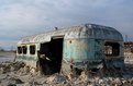
Wow, this is an old one!!! This was shot in the first year or so that I had picked up a camera. Look! it was even shot with film!!! Wow!!!
|
| Photo By: michaelle .
(K:3807)
|
|
|
Critique By:
michaelle . (K:3807)
3/19/2006 12:11:12 AM
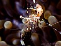
The colors and sharpness of this little guy are amazing. I am always amazed with those photographers that shoot underwater, what a challenge! As such, the environment being what it is, the background is a little busy for such a translucent creature, and he doesn't quite "pop" like he should. Not sure if there is a way, other than through Photoshop, to darken the lighter tones in the background so that he really stands out. Again, a fun and amazing picture that just needs a little touch in order to bring it to the top of the pile.
|
| Photo By: Bob Whorton
(K:2740)
|
|
|
Critique By:
michaelle . (K:3807)
3/19/2006 12:02:41 AM
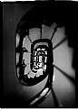
I like the idea of the image, and the tones range nicely from pure black to white. However, the texture on the image seems to pull my eye away from the details and distracts me from the circular motion of the composition. Also, I love shallow depth of field, but I think a little more DOF throughout in this image would have helped again to bring the eye through the image. Overall, while I have a few personal taste comments, the image is well composed and the tones throughout are lovely.
|
| Photo By: Carlos Gutierrez
(K:1805)
|
|
|
Critique By:
michaelle . (K:3807)
12/3/2005 11:49:28 PM
Please do not take this as too critical, but this is something I had to learn the hard way, and I still do not always get it right. While I would have to agree that the eyes are absolutely beautiful, when a photographer presents their work, it should represent the whole image. In essence, we are talking about the "big picture" here. So your best work is what should be presented... if you do not feel like editing out a distracting background, then save the image and come back to it when you have more time and patience, not show it to others in a half-done manner. Once the image is pristine in your eyes, then proudly display it for others to see. Your portfolio has some absolutely beautiful images, respect yourself and the craft, and give yourself time to create an image that shows how fantastic you are.
|
| Photo By: Melanie Reynolds
(K:9096)
|
|
|
Critique By:
michaelle . (K:3807)
12/3/2005 8:40:28 PM
I really like how the blue highlights in the beetle are complimented by the orange of the flower, and the green adds a nice "grounding" to the whole image. The beetle is a little central in the frame for my taste, but the DOF helps to offset the static feeling that central subjects can sometimes elicit. Overall, great use of color and DOF to make the subject pop!
|
| Photo By: Sidney Esteves Pimenta
(K:111)
|
|
|
Critique By:
michaelle . (K:3807)
11/27/2005 2:33:58 AM
Ann,
I really like how you captured the "stair-step" effect of the horizontal lines of the branches as they intersect with the verticle tree trunks. The greens in the image are very inviting, and give the viewer the feeling of a lush forest with birds in the trees and little bits of sun breaking through the canopy. I have tried many time to try and capture this feeling, and have never been successful. Very well done!
|
| Photo By: Ann Nida
(K:45248)
|
|
|
Critique By:
michaelle . (K:3807)
11/27/2005 2:06:54 AM
Ferran,
Thank you for your comment. The work was done in PS, as you suspected... I used a texture layer and modify the blending to multiply. I then use a selective erase tool at light opacity to bring the main aspects of the image back into the frame. Its all just a matter of playing  Thanks again! Thanks again!
|
| Photo By: michaelle .
(K:3807)
|
|
|
Critique By:
michaelle . (K:3807)
11/27/2005 12:43:05 AM
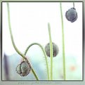
I really enjoy the colors, DOF, and lines of this image. As we are moving into fall, the images seem to be getting warmer and darker, but this image breaths fresh spring into the colder days. The contrast of the purplish hairs against the green stems is what gives so much texture to an otherwise very muted color palette, and gives the eyes something to move over and contemplate. My only corrective comment would be that I am not sure that the "dead-on" composition of the center bloom helps with the overall flow. The stem seems to go up and end abruptly, and only through some thought does the viewer see the bud below it belongs to the stem. The other stems seem to flow beautifully through the frame, so that is why this one stem seems to stand out to me. Again, a wonderful image that evokes memories of spring. Well done!
|
| Photo By: Gerhard Reider
(K:509)
|
|
|
Critique By:
michaelle . (K:3807)
11/27/2005 12:32:28 AM
Shawn,
I am so sorry for you loss... but, rest assured, he knows and feels your love even now...
|
Photo By: Shaun Rullens
(K:2732)

|
|
|
Critique By:
michaelle . (K:3807)
11/13/2005 1:18:06 AM
hmmm... well will try to attach the image again... not sure why it did not attach the first time...
|
| Photo By: Michael Alexander
(K:5293)
|
|
|
Critique By:
michaelle . (K:3807)
11/13/2005 1:14:20 AM
The easiest fix for this would have been to use fill flash when the picture was taken. That would have helped tremendously in balancing out the backlight conditions. However, the image is very workable in PS, and is a wonderful capture worth trying to save. So, I went a little further than the previous two posts... first I used the levels command to bring up the mid-tones a little bit, then because that washed out some of the color, brought up the saturation a tad. Then I duplicated the layer (selected only the picture of Sydney - not the frame) and applied Flaming Pear's Aetherize filter, using only the blur slider. This gives her some glow. However, the eyes needed to be tack sharp, so I erased the blur layer over just over her eyes. I then selected her pupils and color corrected them and increased the saturation a tad. Using a soft dodge brush set at highlights and 4%, I lighted the whites of her eyes. After that, I increased the size of the dodge brush and slightly lightened the apple of the darker cheek and her forehead to further give her "glow". I know it seems like a lot of work to do, but the changes are well worth it.
|
| Photo By: Michael Alexander
(K:5293)
|
|
|
Critique By:
michaelle . (K:3807)
2/28/2005 11:20:16 PM
Sara,
What a wonderful idea! I removed the grain with NeatImage Pro, added some dodging and burning to give a little more "glow" to the skin and added a blur layer to soften the whole image (except I erased the blur from the eyes and mouth). I also cropped it down to a standard 8x10 format. Let me know what you think... I was trying to get more of a soft feel with warm light for the image. The colors in the attachment are a little "off" due to having to get the .jpg down to a very small size.
|
| Photo By: Sara Cosby
(K:2704)
|
|
|
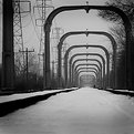
Critique By:
michaelle . (K:3807)
2/16/2005 1:36:35 AM
Personally I think both the framing and the tones you have chosen are very effective... Usually, in black and white images, one likes to see white whites and black blacks, but in this image the overall flatness of the tones adds to the mood of the image. I like how you can still see the details in the towers overhead and how the snow, even with the limited depth of field in the foreground, has texture. I don't think that adding any more vignette to the corners would add to this image, and think that you have very effectively captured the mood.
|
| Photo By: Michael Alexander
(K:5293)
|
|
|
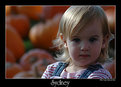
Critique By:
michaelle . (K:3807)
1/16/2005 12:12:43 AM
So much thought for such a small child, and you did a wonderful job of capturing his intensity in the moment. This is the kind of picture that speaks of a childs inside, very nice!
|
| Photo By: Robert Stokes
(K:4509)
|
|
|
Critique By:
michaelle . (K:3807)
1/15/2005 9:53:07 PM
Love the eyes - you did a great job of catching their focus. I am not sure about the dark object over her shoulder, it pulls my eyes away from her features and I think that her jaw line would have been more accented without it. The tones are beautiful, and the look very very sexy.
|
| Photo By: Mark Orchard
(K:110)
|
|
|
Critique By:
michaelle . (K:3807)
1/9/2005 5:30:15 PM
I really like the abstract vision of the reflections in the water, and the orange of the lamp is a nice accent. I might have saturated the water color a little bit more using Selective Color in PS, but totally understand if you are a purist regarding no enhancements using PS. Really nice shot.
|
| Photo By: Tony Quinlan
(K:2094)
|
|
|
Critique By:
michaelle . (K:3807)
1/9/2005 5:24:49 PM
Obviously it is the shadows that make this image work so well. Wonderfully seen and very original!
|
| Photo By: Alper Tecer
(K:7007)
|
|
|
Critique By:
michaelle . (K:3807)
1/9/2005 3:29:50 PM
LOL! No... just a heck of a lot pickier about what I post.
Thanks everyone for your great comments!
|
| Photo By: michaelle .
(K:3807)
|
|
|
Critique By:
michaelle . (K:3807)
11/20/2004 2:54:20 PM
I think you have a great idea going here. The selective color of the boy is very nice, but for me a little to overstated. I would consider desaturating him just a tad so that he "blends" with the desaturated background a little bit more. Also, you might consider cropping out the left frame. While it is very interesting, it really is not adding to the main subject in a supportive way and competes with the boy.
I hope you don't mind, but I played around with this just a tad in PS to try and illustrate what the crop would look like. Also included the recommended desaturation of the boy.
|
| Photo By: frédéric SALVERT
(K:1020)
|
|
|
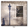
Critique By:
michaelle . (K:3807)
10/10/2004 12:44:17 AM
I have tried to capture shots like this so many times and have failed miserably... You, on the other hand, have done a wonderful job of capturing the abstract nature of the shadows... the subtle tonality really adds to the impact. I like it!
|
| Photo By: éléanor le gresley
(K:80)
|
|
|
Critique By:
michaelle . (K:3807)
8/14/2004 4:12:02 PM
I love playing with the vaseline technique, and you have certainly have fun with it as well. One of the things I like to do is to leave portions of the filter uncovered by the vaseline so as to have contrasts between the sharp areas and the smeared areas. The outcomes can be very textural.
With regards to this image, I find it strangly calming. It has an almost hypnotizing quality to it. I am usually not much of an abstracts fan, but this one is fun.
|
| Photo By: Phil M
(K:11526)
|
|
|
Critique By:
michaelle . (K:3807)
8/8/2004 10:27:57 PM
Ahhhh... Holgas... they can make the most provacative images... the light is perfect and the lower frame focus is wonderful... well done.
|
| Photo By: matt fruge
(K:83)
|
|
|
Critique By:
michaelle . (K:3807)
2/23/2004 2:04:50 PM
Alisa,
Great contrasts between the fluidity of the light on the tarps and the static horizontal of the bars... I would take out the very top of the image as it is a little hot and the composition seems to flow more without it... but that is just my opinion :-) Really wonderfully seen!
Michaelle
|
| Photo By: Alisa Mudge
(K:7511)
|
|
|
Critique By:
michaelle . (K:3807)
2/9/2004 4:35:52 AM
Donna,
Fabulous, dahling, fabulous! :-)
I have incorporated your ideas in the attached image. The only thing that I am not so sure about is whether the cropped version still gives the sense of vastness to this valley.
As always, looking forward to your comments.
Michaelle
|
| Photo By: michaelle .
(K:3807)
|
|
|
Critique By:
michaelle . (K:3807)
1/27/2004 9:00:18 AM
Or if you still want some color...
|
| Photo By: Alisa Mudge
(K:7511)
|
|
|
Critique By:
michaelle . (K:3807)
1/27/2004 8:45:26 AM
Alisa,
I love the subject... but would prefer to see the textures rather than the colors. I've attached a Micky-ized version. Going grunge on this one...
|
| Photo By: Alisa Mudge
(K:7511)
|
|
|
Critique By:
michaelle . (K:3807)
1/14/2004 8:32:51 PM
Donna,
I think I like the black and white tiles... it adds to the very retro graphic feel that the neon gives to the image. Taking out the tiles would not be hard, but the image would have a very different feel to it. Attached it the same thing in all black except for the neon (and a crop). This was a quicky job, but you can see how the overall tone of the image changes...
After looking at both, i still think I prefer the tiles, but with the crop as suggested. Really a cool shot - especially considering you did not have a lot of options.
|
| Photo By: Donna Johnson
(K:9906)
|
|
|
Critique By:
michaelle . (K:3807)
1/14/2004 8:18:46 PM
Alisa,
Maybe the title, "its a dog's world" would be more appropriate - lends itself to the fact that the window and what is outside of the window is in focus rather than Harley. I would agree that seletive focus on Harley would have been nice, but then this would have been a totally different image then. More of a doggy portrait rather than looking ou the window with Harley and trying to see what he sees....
Just a thought...
Michaelle
|
| Photo By: Alisa Mudge
(K:7511)
|
|
|
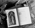
Critique By:
michaelle . (K:3807)
1/12/2004 4:57:52 PM
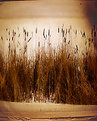
I really like the arrangement you chose - its random enough to be believable, but still organized to carry the eye around the frame. I would have to second the opinion on the image being a touch bright for the subject - maybe lowering the values in PS and then selectively dodging in critical texture into the shadows? Also, not to be commonplace, but this might look very nice in a sepia tone to go with the "old" feeling of the "found things".
Again, the arrangement is perfect, and this image is definately worth exploring. Very nice.
|
| Photo By: Robert Stokes
(K:4509)
|
|
|
Critique By:
michaelle . (K:3807)
1/12/2004 4:52:25 PM
Donna,
The DOF is perfect on this... You nailed the subject and left enough depth of field for the ocean to place him in his element, yet not compete with him as the central figure. Excellent!
|
| Photo By: Donna Johnson
(K:9906)
|
|