|
|
Critique By:
George Tam (K:416)
11/26/2006 6:54:05 PM
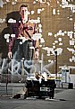
Whoever set the rules that in order for an image to be great or even acceptable, it has to be sharply focused, not grainy, brilliant in color, or that the subject is presented wholly? Some of the most intriguing images are those that went against convention. Is this a great abstract? Not to my eyes. The reason, however, is not that it broke the rules, but despite of breaking the rules. In my opinion, the image is not yet fully developed in its visual language. At this point, it is just a random collection of "words", but it's a good start. I suggest that he plays with them a little more and see what else he will get. Whether one likes the image or not, I commend Brian for thinking out of the box and taking creative risk.
|
| Photo By: Brian Veleker
(K:17)
|
|
|
Critique By:
George Tam (K:416)
9/28/2006 7:08:59 AM
[IMG]http://smilies.vidahost.com/contrib/edoom/sun_smiley.gif[/IMG]
|
| Photo By: George Tam
(K:416)
|
|
|
Critique By:
George Tam (K:416)
7/7/2006 3:09:45 PM
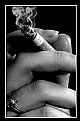
Very pretty lady, Steve. Perhaps you could post one in color that accentuates her eyes. A person has no idea they are green in looking at a b&w photo.
|
Photo By: Steve Eaton
(K:232)

|
|
|
Critique By:
George Tam (K:416)
6/11/2006 6:25:19 PM
The image could benefit from better lighting. This could still be accomplished using available light by using a reflector of some kind and would bring out the intensity and texture of the strawberry. As it stands, the strawberry is in shadow and rather dark. I would also clean up dirt/imperfections on the Corel plate by cloning them out during post-processing.
|
| Photo By: Andre Denis
(K:66407)
|
|
|
Critique By:
George Tam (K:416)
6/5/2006 7:04:44 AM
I agree with Miles's comment...tigher shot with better exposure...bring down the exposure, so the hair won't be blown out and use a reflector to light the face. You may also choose to expose for the hair and use a flash to light the face. Otherwise, a trade-off is inevitable. Either the face will be exposed correctly and the hair will be blown out or the the hair will be exposed correctly and the face will be too dark.
In terms of angle, the perspective gives the impression that the photographer had stumbled upon the subject. While she is an attractive model, the expression on her face is one of surprise or fear.
|
| Photo By: Phil Cassell
(K:1054)
|
|
|
Critique By:
George Tam (K:416)
5/13/2006 7:57:48 AM
Here's a woman who is comfortable inside her own skin. Good for her.
|
| Photo By: Joe Ciccone
(K:3684)
|
|
|
Critique By:
George Tam (K:416)
5/12/2006 7:35:57 AM
I think you may find that cropping off the ring or taking it off before the shoot would make the composition stronger. By doing so, the fingers are no longer just fingers but intertwinging bodies filled with tension.
|
| Photo By: Dizzy De Silva
(K:212)
|
|
|
Critique By:
George Tam (K:416)
12/26/2005 11:27:22 AM
Hai, I like the angle from which you shot the picture. I like how you framed it in such a way as to reveal the activity inside the church. It makes me want to peek inside to see what is happening. I always enjoyed photojournalism, so I look forward to checking out more images from your gallery.
-George
|
| Photo By: Hai Thanh
(K:1396)
|
|
|
Critique By:
George Tam (K:416)
12/7/2005 5:12:58 AM
What an intriguing shot, Pat. Nicely executed. I agree with Kiarang's comment about the juxtaposition of colors. Had I not been browsing through your gallery, I would have missed this gem. Well done. -George
|
| Photo By: Patrick Ziegler
(K:21797)
|
|
|
Critique By:
George Tam (K:416)
12/5/2005 4:30:23 PM
Hi Mark. You did a good job in drawing the focus on the subject. It immediately grabbed my attention in its presentation. Unfortunately, I was not able to make an emotional connection to the object. That was the important ingredient that was missing for me here. However, it is still effective in a visual level.
|
| Photo By: Mark Hamilton
(K:8387)
|
|
|
Critique By:
George Tam (K:416)
11/27/2005 6:34:12 AM
Ann, I like the way the rocks seem to be suspended on the surface of the water. It is always interesting to read the background information of the photograph, especially when the photographer describes problems that he/she encountered and the creative process that went into making the shot. I think it adds so much more to the image alone. Thanks for sharing.
|
| Photo By: Ann Nida
(K:45248)
|
|
|
Critique By:
George Tam (K:416)
11/17/2005 5:29:37 AM
Cool find, David.
|
| Photo By: D W
(K:2560)
|
|
|
Critique By:
George Tam (K:416)
11/14/2005 3:09:11 PM
Wonderful capture, Darek.
|
| Photo By: Satori 77
(K:713)
|
|
|
Critique By:
George Tam (K:416)
11/14/2005 4:31:05 AM
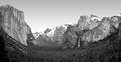
I actually prefer the color image more, Ann. After looking at some many b&w interpretations of Yosemite, it's good to be reminded of how splendid it is in its natural colors.
As for Douglas, I think his unsolicited post of his own image is in bad taste. It's obvious that he was just looking for another opportunity to promote his own work with no real intention to be helpful. I am a new member here. Even though I've been here for only a few days, I've already noticed a pattern of condescending comments from him to various photographers. What a shame to see a person with so much potential in photography but possesses so little in self-esteem.
|
| Photo By: Ann Nida
(K:45248)
|
|
|
Critique By:
George Tam (K:416)
11/13/2005 5:40:29 PM
I'm glad you didn't take it personally, Angela. It was very gracious of you to have responded the way you did. Best regards.
|
| Photo By: Angela Freed
(K:10061)
|
|
|
Critique By:
George Tam (K:416)
11/13/2005 3:13:15 PM
Enough of the compliments. I just want to know if Melanie would marry me! Kidding aside, I want to say congratulations on a gorgeous image.
|
| Photo By: Melanie Reynolds
(K:9096)
|
|
|
Critique By:
George Tam (K:416)
11/13/2005 5:20:41 AM
Thanks for stopping by and look, Claudia and Slava.
|
| Photo By: George Tam
(K:416)
|
|
|
Critique By:
George Tam (K:416)
11/13/2005 5:17:32 AM
Wonderfully photographed, Roland.
|
| Photo By: Roland Lacson
(K:12214)
|
|
|
Critique By:
George Tam (K:416)
11/13/2005 4:40:43 AM
Well done, Richie.
|
| Photo By: Richie Do
(K:26)
|
|
|
Critique By:
George Tam (K:416)
11/13/2005 4:25:57 AM
The model was an excellent choice. She is very photogenic, Angela. The titled composition and pose are fantastic as well. Having said that, I would like to respectful disagree with others who said that the image is sharp. It appears that the hands was the area of focus at the time the photo was taken, but unfortunately not the face. My guess is that you attempted to compensate for that by sharpening the face with photoshop. While it was a good try, it does look a bit oversharpened. Besides that, the highlights in the hands area are a bit blown out and could benefit from toning down. I hope that I didn't sound too critical. Good effort overall, Angela.
|
| Photo By: Angela Freed
(K:10061)
|
|
|
Critique By:
George Tam (K:416)
11/13/2005 4:00:26 AM
I like the painterly quality very much. I agree with the others' comments about the tight placement of the objects. Nonetheless, the colors are very pleasing to the eyes. Great effort, Adam.
|
| Photo By: ADAM ORZECHOWSKI
(K:7957)
|
|
|
Critique By:
George Tam (K:416)
11/12/2005 6:33:26 AM
Thanks for your honest comments, Christopher and Ferran. I appreciate it.
|
| Photo By: George Tam
(K:416)
|
|
|
Critique By:
George Tam (K:416)
11/11/2005 2:38:18 PM
Thank you, Fedrico. To answer your question, Moe, this is a close-up of an opened sketch book.
|
| Photo By: George Tam
(K:416)
|
|
|
Critique By:
George Tam (K:416)
11/11/2005 3:19:41 AM
Thank you for taking a look, Cytte & Mervo.
|
| Photo By: George Tam
(K:416)
|
|
|
Critique By:
George Tam (K:416)
11/10/2005 6:19:28 AM
Thank you for your kind words, LeAnne and Simone. I appreciate it!
|
| Photo By: George Tam
(K:416)
|
|


 Das")