|
|
Critique By:
Steve Hennerley (K:5776)
1/6/2010 10:31:43 AM
Nice pic Shaun
Love the selective focus on the grasses - might have been nice to ahve that cenral big stalk thet really draws in your eye in sharper focus - but still a great artistic shot.
Love the warm earth tones though
more more more!!
|
| Photo By: Shaun Mills
(K:6)
|
|
|
Critique By:
Steve Hennerley (K:5776)
1/6/2010 10:24:50 AM
Nice photo!
Good composition, though horizon is slightly out (don't worry - it gets me most times too!)
Looks a tiny bit oversharpened (can see some halo-ing around the trees) but the tones are great.
Fially, might be just the size of the photo here on UF but the reflections on the water in the FG look a little distracting - maybe tone them down a little in PS
Overall though - a great shot - keep em coming :)
|
| Photo By: Shaun Mills
(K:6)
|
|
|
Critique By:
Steve Hennerley (K:5776)
4/23/2007 2:17:21 AM
Hi Nikki,
I have emailed to your address, but not had a response. Hopefully you provided the correct address?
Thanks
Steve
|
| Photo By: Steve Hennerley
(K:5776)
|
|
|
Critique By:
Steve Hennerley (K:5776)
3/12/2007 8:56:39 PM
Hi Nikki...
What relation are you to Sheila?
Steve
|
| Photo By: Steve Hennerley
(K:5776)
|
|
|
Critique By:
Steve Hennerley (K:5776)
3/28/2006 1:16:48 PM
Ahh... seattle - my favourite US city - only spent a couple of nights there - but great memories... Difficult to tire of the architecture round the needle... I think you have captured a very unique view of this oft-photographed landmark - truly well done!
|
| Photo By: Mattia L.
(K:7625)
|
|
|
Critique By:
Steve Hennerley (K:5776)
3/28/2006 9:30:29 AM
nice hi-key, and nice idea ... BUT...
I'm pretty sure that anyonre outside the photography hobby/profession would say "huh? three minutes? and why's the clock only got one proper hand?"
great idea - but I doubt joe public would get that it was a long exposure.
Having said that - composition and minimalism is great - and to anyone who 'gets' the subject matter - very clever....
Can't help but wonder the significance of the time 2:11-2:14 ... 
Steve
|
| Photo By: brian underdown
(K:-960)
|
|
|
Critique By:
Steve Hennerley (K:5776)
3/28/2006 8:54:04 AM
Hi Dennis...
the clouds are luminescent because the moon actually WAS shining behind them.... in fact the moon in both imges was in the same place.
The problems were that to expose the clouds meant overexposing the moon (white blob) and to expose the moon meanth the clouds were invisible (underexposed).
I took two pictures of the same with a slow shutter to expose the clouds, and then a fast (ie daylight settings) exposure to get the detail in the moon.
There was a little bit of work in PS getting it to look good - but not as much as you might think.
Thank you so much for your comments!!!
Steve
|
| Photo By: Steve Hennerley
(K:5776)
|
|
|
Critique By:
Steve Hennerley (K:5776)
3/22/2006 10:06:45 AM
Hi Keith -
fantastic capture - your lighting in awesome - the pin sharp image and the black bg almost makes this look too perfect - almost like a computer generated 3d image. This really does fit the project very well....
Steve
|
| Photo By: Keith Naylor
(K:13064)
|
|
|
Critique By:
Steve Hennerley (K:5776)
3/22/2006 9:38:31 AM
Hi Dennis -
Great perspective - the reflections make a very interesting graduation of the blue tones - very nicely viewed.
One very small suggestion - looks to me to be a degeee or so off CCW. A slight CW rotation would improve the balance of the image imho.
Steve
|
Photo By: Dennis Hendricksen
(K:4817)

|
|
|
Critique By:
Steve Hennerley (K:5776)
2/7/2006 12:18:33 AM
Hi Nicole...
I think most of us fairly new t digital photography have been there with focusing!
When I was using a P&S (and if I use my trusty old CoolPix 4300 today) I try to keep a mind on the focussing - the simplest way for 90% of p&s cameras and most compositions (potentially not highly contrasted or strongly backlit scenes) is to ensure your subject is centre frame and then half-press your shutter to lock the focus (and exposure) - most will automatially focus to centre frame.
You can then re-frame to the desired composition and all should be well.
Another way to do this is to focus on something the approximate correct distance and then switch to manual focus (some cameras have an option to 'single shot' focus and then keep that setting)
I look forward to seeing more of your work!
Thanks
Steve
|
| Photo By: Nicole Davis
(K:409)
|
|
|
Critique By:
Steve Hennerley (K:5776)
2/6/2006 9:31:16 PM
Hi Mary Sue...
I don't have the fie with me at work to check 100% - but you can be pretty sure that it was all the way over to the stop at 18mm.
Obviously, panos are WIIIIIDDDEEEEE - that's the point... so a short focal length makes your job easier.
Just for interest - I'm sure you picked it up - but the hill/road on the left is the same as the one on the right - the angle of view for the whole image is around 180 deg
Go out and give it a go - use 16mm and try to keep the camera very level and pointed straight at the horizon to minimise distortion (and keep the horizon reasonably stright) Obviously - you should always use a tripod.... (oops!).
The absolutely critical part is to ensure you are on full manual and you have everything set to manual - Aperture, shutter, White Balance. Use a small aperture to get a wide dof.
If you use PS CS2, the photomerge automation is great for lining your shots up - though it does not always give the best blending - I prefer to do this by hand.
Good Luck!!
Steve
|
| Photo By: Steve Hennerley
(K:5776)
|
|
|
Critique By:
Steve Hennerley (K:5776)
2/6/2006 11:45:08 AM
Hi Serdar -
An incredibly intense capture - I just switched browser windows whilst it was loading and actually got a little startled by the intensity of the cats eyes!
Good close crop and nice PS work - not sure it fits the silhouettes and abstracts project though!!
Thanks for sharing
Steve
|
| Photo By: serdar koc
(K:577)
|
|
|
Critique By:
Steve Hennerley (K:5776)
2/6/2006 11:42:11 AM
Hi Brian -
I like what you have done with this.. and I do like the spot colouring - though I am not certain on the colour of the umbrella! (seems out of place)
I do think it is a shame that the fisherman is not in the scene to add the human element - though I am guessing that the fisherman is yourself?
The umbrealla looks kinda low (ie flat) which is slightly puzzling.
Great concept though - I am really nit-picking to find the faults - takes me back a few years to when I was an avid fisherman in my late teens in the UK.
all the best
Steve
|
| Photo By: brian underdown
(K:-960)
|
|
|
Critique By:
Steve Hennerley (K:5776)
2/6/2006 11:36:41 AM
The colour of the water is awesome - siming me much of 'Huka falls' here in New Zealand - the power of nature in strongly constricted rapdis such as this is just awesome....
Steve
|
| Photo By: Annemette Rosenborg Eriksen
(K:55244)
|
|
|
Critique By:
Steve Hennerley (K:5776)
2/6/2006 11:33:37 AM
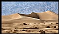
Hi Elenora -
Interesting variation in colour here - is that as shot or a composite?
Great contrast and detail in the fg - the blue haze gives an odd 'cool' feel to the hottest place on earth!!!
All the best
Steve
|
| Photo By: eleonora frago
(K:2472)
|
|
|
Critique By:
Steve Hennerley (K:5776)
2/6/2006 11:28:22 AM
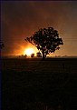
Hi Tracey -
I hope your home and family were safe from the fire. I did not pick that there was a fire involved in the photo - just a fantastic atmospheric sunset - though it is obvious when you explain it.
I might be tempted to clone out the power lines though as this is the only thing that takes my attention away from a superbly captured image.
All the best - and hoping you are safe
Steve
|
| Photo By: Tracey Main
(K:7290)
|
|
|
Critique By:
Steve Hennerley (K:5776)
2/6/2006 10:48:35 AM
Hi Mrinal
I am guessing you are referring to http://www.usefilm.com/Image.asp?ID=740853
There are many different ways to do this - and usually the decision will be made by the photograph. The simplest way to add some desaturated parts to your image is simply to use the 'sponge' brush in photoshop - that is how I quickly modified your image.
Usually however - you will want some more control - especially over the contrast and tonality of your black and white image.
If I do this, I often use two layers - one full colour, and a copy of that layer - which I turn black and white - or maybe use a duo/tri/quadtone effect (such as the mock selenium effect I have used on http://www.usefilm.com/Image.asp?ID=1021460 )
The trick is then to cut out the colour bits you don;t want to show the mono layer underneath (or vice versa if you prefer)
The final trick missing in so many of these effects is to give a bit of blending around the edges.
Again there are countless ways to do this - though my preferred is to use a combination of the sponge brush in parts and a final very slight blur round the edges (sampling all layers of course)
This is only a guide to how it can be done (how I did the image you referred to) - there are many ways to get to the same point - though my personal golden rule is that it must look like it belongs - oh - and I think the bondaries work better if they happen in a shadowed area - as both colour and mono fade into black....
Hope this gives you some idea - i just developed my own technique - I used to just mask the colour bit and desaturate the rest - but I don't believe in destructive processes anymore! - layers are your friend...
Good luck - looking forward to seeng more of your work!
Steve
|
| Photo By: Mrinal Rana
(K:87)
|
|
|
Critique By:
Steve Hennerley (K:5776)
2/6/2006 5:21:29 AM
Hi Danielle -
I love the concept of this - great vision (pun intended!) with huge potential. Unfortunately - I do really think it loses from having the broken glass unsharp.
I would have tried a smaller aperture - though that may have not resulted in the nice dof of your son's face.
A second alternative would have been to shoot both the window and your son seperately - using a white background for the window. You should then have been able to overlay the two in PS.
I agree with Susie though - his expression is perfect!
All the best
Steve
|
| Photo By: Danielle Toews
(K:1035)
|
|
|
Critique By:
Steve Hennerley (K:5776)
2/6/2006 5:12:12 AM
Hi Nicole.
I think it is a shame no-one commented on this image - because I think the viewpoint, subject and composition - as well as the grainy presentation have a lot of promise.
I do think however - that much of the positives are lost by a the confusion that the apparent subject of this photo is a press-stud on the baby's clothing!
Really - the bg in sharp focus does nothing to add to this shot in my humble opintion. I think this shot would have been great set up exactly the same, with the same DOF - but with the feet themselves in focus.
unfortunately - the shot as it is presented looks like an 'accident'.
I hope that you will take my criticism as constructive - I really do think there is a great potential here!
All the best
Steve
|
| Photo By: Nicole Davis
(K:409)
|
|
|
Critique By:
Steve Hennerley (K:5776)
2/6/2006 4:43:45 AM
Hi Mary Sue!
Thank you so much for your comment - asfter looking again I agree with you - the balance would be much better - especially sin ce the people in the shot would then be both sides too - will do just what you suggest!
This was certainly spru of the moment - I was on the hill (North Head on Auckland's North Shore - it is an old WWII naval station and gun emplacement) with my mother and her sister who were visiting from England. I had forgotted my tripod, and just had my camera with me - UF's panorama upgrade had just happened and I had the urge to stitch so to speak...
So I set my cam to manual and shot the photos you see above all handheld - was kinda tricky - cos all the boats you see were moving pretty fast - So had pretty much no time between shots.
Was fairly pleased with the result - though it's not as even as I would have liked.
Was stictched together in CS2 using the photomerge tool - but all the blending was done by hand - I find that the automatic blending tends to leave annoying diagonal lines everywhere.
Thanx for your comment!
Steve
|
| Photo By: Steve Hennerley
(K:5776)
|
|
|
Critique By:
Steve Hennerley (K:5776)
2/5/2006 12:39:41 PM
Hi jeroen,
nicely composed with great dof - well done for getting the shot without spooking the bird.
The image looks a little soft and lacks contrast - though I am sure this is the fault of the scan rather othan the photograph.
It's a shame its face is in shadow though.
Steve
|
| Photo By: Jeroen Wenting
(K:25317)
|
|
|
Critique By:
Steve Hennerley (K:5776)
2/5/2006 12:04:12 PM
Hi Mrinal...
Realy like this shot.. it looks like you have desaturated the background is this tru? I like the effect - it really makes the read ans yellows of the rusty benches stand out. I do think the canvas sheet or whatever it is in the background confuses the scene a little though.
To illustrate the point, i have desaturated that part in the attatched image, please see if you like the effect - i think it makes the subject pop out from the bg a little more - following from your apparent original idea..
Nice capture
All the best
Steve
|
| Photo By: Mrinal Rana
(K:87)
|
|
|
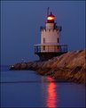
Critique By:
Steve Hennerley (K:5776)
2/5/2006 11:50:13 AM
Hi Sandra,
Nicely lit and captured photo - the reflections really make it quite something. There's somwething that I can't quite place that seems to spoil the composition a little - I think it might be that the rocks actually lead my eye past the subject and straight into the small slightly distracting lights - which seem to steal the scene away.
One other thing is that the image is rotated slightly anticlockwise - immediately evident on the (off) horizontal line in water but also on the lighthouse itself.
I do like the image though - plase do not be offended by my comments
All the best
Steve
|
| Photo By: Sandra Berry
(K:8352)
|
|
|
Critique By:
Steve Hennerley (K:5776)
1/21/2006 12:43:38 PM
Ahh Hugo... Seattle - my most favourite of the US west coast cities. I visited the US a few years ago and spent a month travelling around the west/northwest. Seattle was the only city that felt like 'home'. The mountain was 'up' when I was there too - this is apparently quite rare - disappointingly though - I had little in the way of decent photographic equipment at the time (an APS p&s and a camborder with vga stills). This is the 'classic' viewpoint of the city - made all that much better by the angle of the sun (afternoon/evening I assume looking at the angle).
I was so suprised when I visited - I had seen many shots of this famous lanmark - and always assumed that it was in fact 'somewhere near' the buildings by it in the pic - as you well know - it's a good distance away in truth!
Love the city, and love the photo Hugo. Only comment I have is that it seems (and it may be exaggerated by elements of the scene) to be rotated slightly - verts seem slightly off clockwise.
All the best
Steve
|
| Photo By: Hugo de Wolf
(K:185110)
|
|
|
Critique By:
Steve Hennerley (K:5776)
1/17/2006 10:56:16 AM
Hi Kemal -
Interesting shot/composite with lots going on. I do like the 'widescreen' aspect - give a very dynamic and 'cinematic' feel to it all.
Not certain the lighting angle seems right to me - although it is well lit where it needs to be. Only other thing is I think it would be better if the man's hand was not out of frame.
Got my attention though - certainly seems like the sort of image an advertiser mught go for or commission.
Steve
|
| Photo By: Kemal Kekeva
(K:3958)
|
|
|
Critique By:
Steve Hennerley (K:5776)
1/17/2006 10:45:00 AM
Ah mervo - so sad you had to give up the bike - it will come back you know.... motorcycling is a bug not so easily cured - sits at the base of your skull.... and will rear it head again at around mid springtime - when other bikers are getting out there - or - like me - when a friend gets a new bike...!!!
I have a Honda CBR1100XX Blackbird now - will post some pix soon....
Steve
|
| Photo By: Steve Hennerley
(K:5776)
|
|
|
Critique By:
Steve Hennerley (K:5776)
1/17/2006 10:36:12 AM
Thanks Hugo! - Yes - she's our first - due April
Cheers
Steve
|
| Photo By: Steve Hennerley
(K:5776)
|
|
|
Critique By:
Steve Hennerley (K:5776)
1/12/2006 12:53:19 PM
I Agree John - your version is much better. One suggestion, I like the textures in the sky above the shelter in the original - it is a shame this is lost in the final version.
Incredible perspectives though - I gotta get me an ultra wide lens!
Steve
|
| Photo By: John Lamb
(K:9687)
|
|
|
Critique By:
Steve Hennerley (K:5776)
1/12/2006 2:56:59 AM
Hi mohamed -
I like the unusual composition - the selective focus here works well. The sharp focus of the rocks/seaweed, with the unsharp cat, and then the motion blurred water, really makes this a great example for the 'blurry image' project.
Steve
|
| Photo By: Mohamed Banna
(K:34237)
|
|
|
Critique By:
Steve Hennerley (K:5776)
1/12/2006 2:52:56 AM
Hi John - interesting perspective - makes for a great composition. The inclusion of the Oamaru sign given an interesting contrast to the mirroed background. Seamless PS work though - well done
Steve
|
| Photo By: John Lamb
(K:9687)
|
|