|
|
Critique By:
ukasz roth (K:47)
8/28/2004 9:20:29 AM
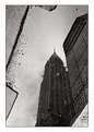
the natural light was insufficient. it was too dark so had no choise.I had a tripod but if I had used it this person going up would have to stand there for a long time.so I used flash.if I cropped the left side of photo this bright triangle in the corner would look strange.nevermind.maybe it looks unnatural but I like it anyway :-)
|
| Photo By: ukasz roth
(K:47)
|
|
|
Critique By:
ukasz roth (K:47)
8/27/2004 10:40:45 AM
thanks but what do you mean by telling "more hight" ?? I will be grateful if you explain me
|
| Photo By: ukasz roth
(K:47)
|
|
|
Critique By:
ukasz roth (K:47)
8/24/2004 7:46:09 PM
nice colors and generally very climatic but the quality... low contrast, too bright and I don`t know what else is exactly wrong on the technical site but something is...
nice industrial architecture but it isn`t fully shown
|
| Photo By: Hermen Pen
(K:9168)
|
|
|
Critique By:
ukasz roth (K:47)
8/16/2004 11:02:10 AM
it looks like a painting. nice contrasts of textures. this thing on the left is a little bit unsharp <<>>
|
| Photo By: Gábor Koscsó
(K:-229)
|
|
|
Critique By:
ukasz roth (K:47)
5/22/2004 9:56:10 AM
quite nice. Looks like a painting but it is just a desert of photoshop. The worst thing in this photo which I really hate is the huge signature.It is too big and awful!
|
| Photo By: Bob Jarman
(K:3145)
|
|
|
Critique By:
ukasz roth (K:47)
5/14/2004 8:18:08 PM
beautiful girl but the make up is too strong... and I hate frames...
generally it is just a decent photo of a beautiful girl. Nothing special and original
|
| Photo By: Ján HRONSKÝ alias ?ltý D
(K:1292)
|
|
|
Critique By:
ukasz roth (K:47)
5/14/2004 6:49:05 PM
very beautiful photo. The girl looks preety and mature but I suppose she is still a child. nice composition. her look is very deep...
|
| Photo By: Elizabeth O'Neal
(K:4436)
|
|
|
Critique By:
ukasz roth (K:47)
5/13/2004 1:51:46 PM
what does it mean candle mode???could anyone explain me?? my mail: ukaszzzzz@o2.pl
|
| Photo By: Petri Tuohimaa
(K:0)
|
|
|
Critique By:
ukasz roth (K:47)
5/11/2004 4:40:47 PM
The composition is quite good there are nice contrasts but the blacks aren`t black!also that bright spot in the centre is very bad for the photo. I would suggest to cut a little, very little on the top and on the left of image. It would help composition.But exept that i like it
|
| Photo By: Andrea Pedone
(K:99)
|
|
|
Critique By:
ukasz roth (K:47)
5/10/2004 6:25:40 PM
nice composition. I like it but I think it would look better in B&W.I would love to have a possibility to fly over this or any other bridge. It has to be a great inspiration :-)
|
| Photo By: Thilo Bayer
(K:50358)
|
|
|
Critique By:
ukasz roth (K:47)
5/10/2004 4:19:25 PM
nice car :-)
|
| Photo By: Andrew Michael
(K:86)
|
|
|
Critique By:
ukasz roth (K:47)
5/9/2004 8:32:14 PM
wygląda jak wiśniewski ;-)
|
| Photo By: Ola Jasiñska
(K:435)
|
|
|
Critique By:
ukasz roth (K:47)
5/9/2004 8:11:48 PM
very good, dynamic. I like the composition and brown tones. but I don`t like the text on the right side and the frame.
|
| Photo By: robert jedrusik
(K:806)
|
|
|
Critique By:
ukasz roth (K:47)
5/9/2004 5:46:37 PM
I like the perspective and the composition of this photo. Also the portrait is very good.Old, sick and poor man. Psychologic portrait. Great job!
|
| Photo By: Aris Michalopoulos / OsirisiS
(K:1916)
|
|
|
Critique By:
ukasz roth (K:47)
5/9/2004 12:05:25 PM
I like it very much
|
| Photo By: Lisa Paully
(K:1735)
|
|
|
Critique By:
ukasz roth (K:47)
5/4/2004 7:24:58 PM
thanks.what do you mean by writing angle???
|
| Photo By: ukasz roth
(K:47)
|
|
|
Critique By:
ukasz roth (K:47)
5/3/2004 3:23:34 PM
nice
romantic...
|
| Photo By: Tamara L
(K:1387)
|
|
|
Critique By:
ukasz roth (K:47)
5/3/2004 3:18:32 PM
it isn`t so great. nice bird, but nothing else...
|
| Photo By: Amna Al Shamsi
(K:21795)
|
|